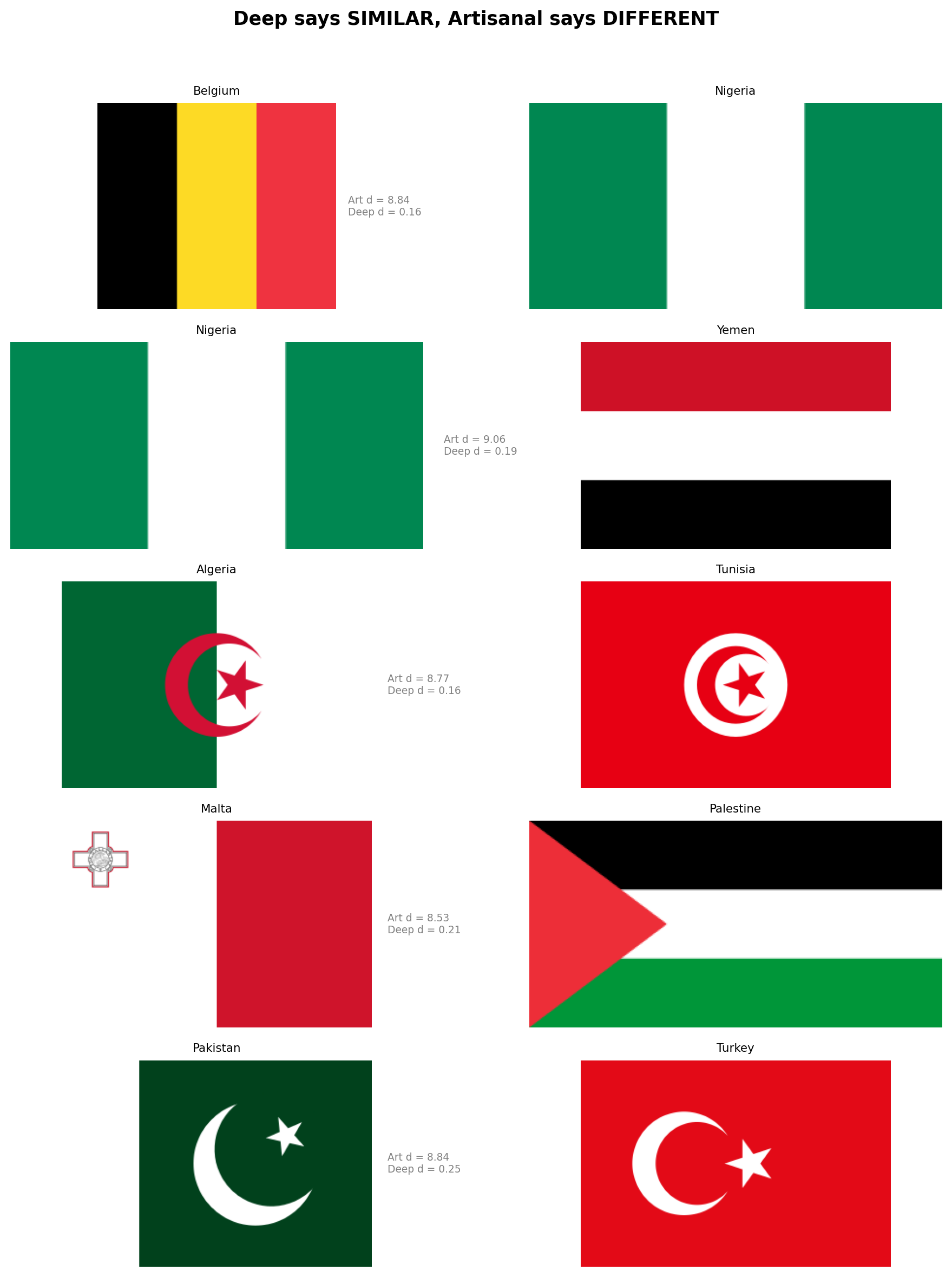
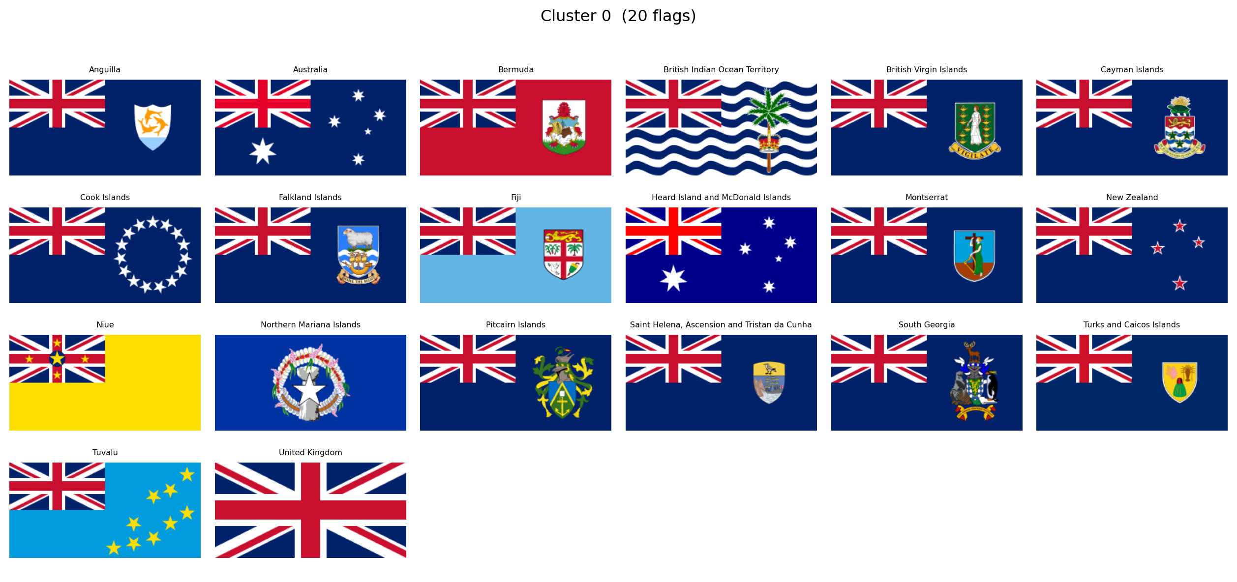
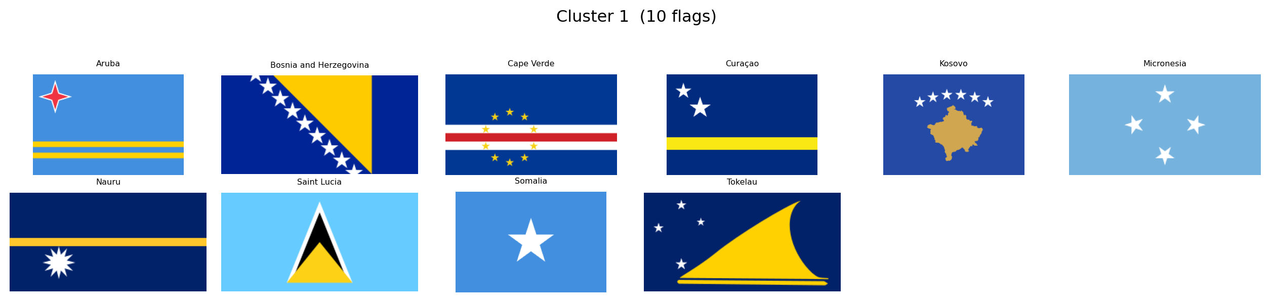
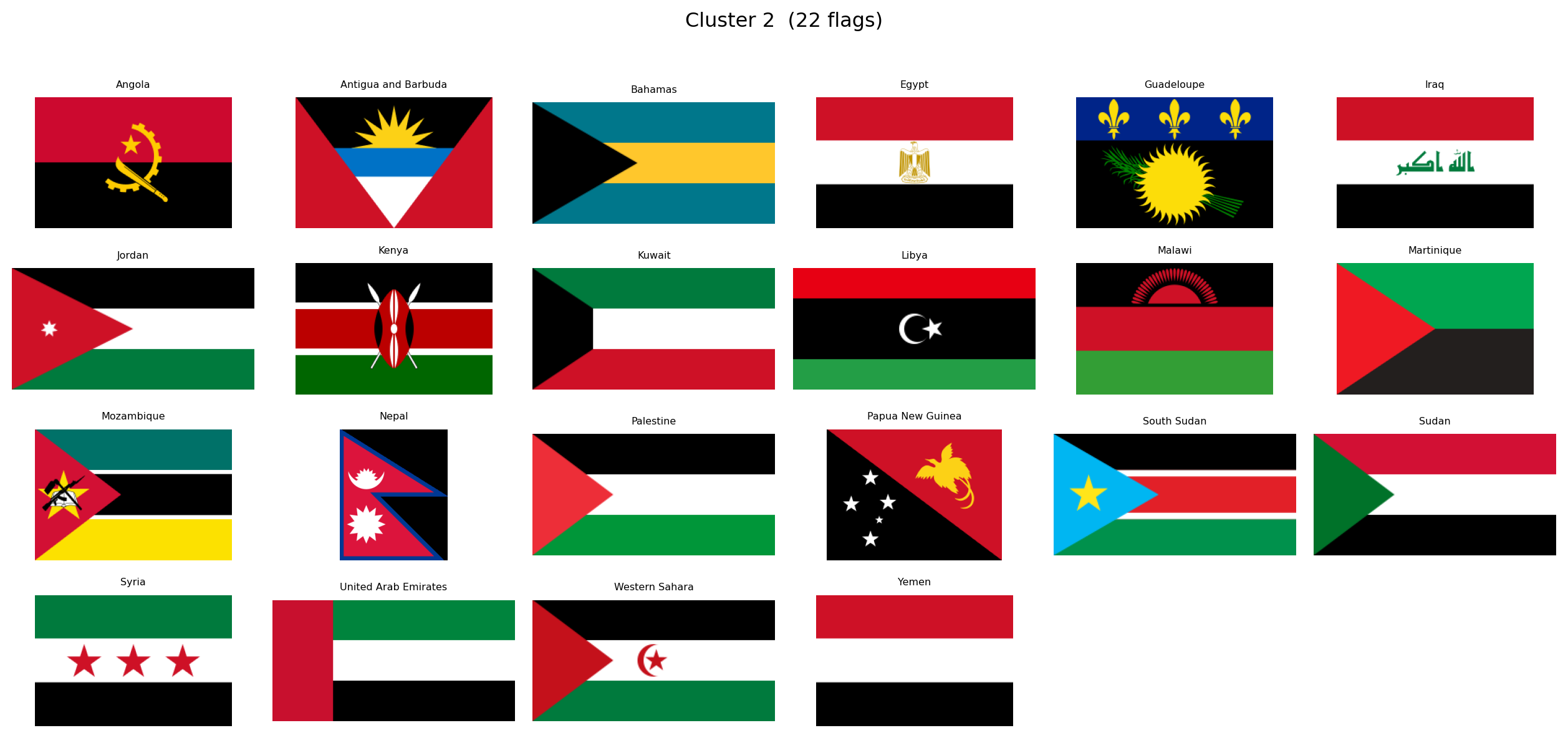
---
title: "Computational Vexillology"
subtitle: "Decoding National Aesthetics Through Data Science"
author: "Alejandro Treny"
date: today
format:
html:
theme: flatly
code-fold: true
code-tools: true
toc: true
toc-location: left
toc-depth: 3
number-sections: true
smooth-scroll: true
page-layout: article
# CAMBIO CRUCIAL: De 'true' a 'false'
embed-resources: false
# OPCIONAL: Organiza las librerías en una carpeta limpia
lib-dir: libs
mainfont: "Palatino, Georgia, serif"
include-in-header:
- text: |
<style>
.content { max-width: 860px; margin-left: auto; margin-right: auto; }
#quarto-content > * { max-width: 860px; }
.cell-output-display { max-width: 900px; margin-left: auto; margin-right: auto; }
</style>
execute:
warning: false
message: false
---
## Introduction {.unnumbered}
What if we could treat national flags not as art, but as **high-dimensional data**? Every pixel encodes a decision: a color chosen, a symbol placed, a geometry defined. Collectively, the \~200 sovereign flags of the world form a rich visual corpus shaped by centuries of history, religion, revolution, and geography.
This project, **Computational Vexillology**, sets out to answer a provocative question:
> *Does the design of a country's flag predict its destiny?*
We will convert every flag into a mathematical fingerprint using two complementary lenses:
- **Computer Vision** (OpenCV, scikit-image): extracting explicit, interpretable metrics like color warmth, visual entropy, and structural geometry.
- **Deep Learning** (ResNet50): extracting latent style embeddings that capture abstract patterns a human might miss.
With these fingerprints in hand, we will:
1. **Map the Design Universe**, using UMAP to project flags into a 2D space where visually similar flags cluster together.
2. **Rediscover History**, testing whether unsupervised clustering can "accidentally" recover colonial empires, religious blocs, and pan-regional movements.
3. **Test Scientific Hypotheses**, correlating flag aesthetics with geography, economics, and politics.
The entire analysis is contained in this document: reproducible code, interactive visualizations, and statistical findings in a single artifact.
### Research Questions
Several hypotheses will guide our exploration. Among them:
- **Solar Determinism**: do countries closer to the equator use "hotter" colors (reds, yellows) while northern nations prefer cooler palettes?
- **Complexity of Development**: does national wealth correlate with flag simplicity, mirroring the minimalist trend in modern corporate branding?
- **The Revolutionary Diagonal**: are diagonal lines and dynamic geometries more common in flags born from revolution or inequality?
- **The Colonial Ghost**: can an algorithm, grouping flags purely by visual similarity, rediscover the footprint of the British Empire or the Crescent bloc?
These are starting points, not boundaries. As the data reveals its structure, we will follow wherever it leads.
```{python}
#| label: setup
#| code-summary: "Import core libraries"
import numpy as np
import pandas as pd
import requests
import matplotlib.pyplot as plt
import plotly.express as px
import cairosvg
from PIL import Image
from pathlib import Path
from itables import show as itshow
import io
import warnings
warnings.filterwarnings("ignore")
print(f"NumPy: {np.__version__}")
print(f"Pandas: {pd.__version__}")
print(f"Pillow: {Image.__version__}")
print("CairoSVG: ✓")
```
With our environment ready, we begin by assembling the visual corpus.
## Building the Flag Corpus
The first phase of this project is purely visual. Before introducing any socio-economic or geographic data, we want to let the flags speak for themselves. What patterns emerge when we look at 250 national designs as raw geometry and color?
Our source is [FlagCDN](https://flagcdn.com), a public CDN that serves every national flag in **SVG format**, giving us precise vector definitions of colors and shapes rather than lossy rasterized pixels. We pair these with a minimal country index from the [REST Countries API](https://restcountries.com), just enough to label each flag with a name and ISO code.
### Country Index
We first build a lightweight index of all countries: just the ISO alpha-2 code, the common name, and independence status. This gives us the list of flags to download and a way to label them. All other metadata (coordinates, inequality, population) will be loaded later when we turn to hypothesis testing.
```{python}
#| label: fetch-index
#| code-summary: "Build country index from REST Countries API"
fields = "name,cca2,independent"
response = requests.get(f"https://restcountries.com/v3.1/all?fields={fields}")
countries_raw = response.json()
df_index = pd.DataFrame([
{
"code": c["cca2"].lower(),
"name": c["name"]["common"],
"independent": c["independent"],
}
for c in countries_raw
]).sort_values("name").reset_index(drop=True)
print(f"{'Total entries:':<25} {len(df_index)}")
print(f"{'Independent states:':<25} {df_index['independent'].sum()}")
print(f"{'Territories/other:':<25} {(~df_index['independent']).sum()}")
itshow(df_index, lengthMenu=[5, 10, 25, 50], pageLength=5)
```
The API returns 250 entries: 195 recognized independent states and 55 territories or dependencies. Every entry has a unique two-letter ISO code that will serve as our primary key throughout the analysis.
### Downloading Flags as SVG
We download flags in **SVG** (Scalable Vector Graphics) rather than PNG. SVGs encode colors as exact hex values and shapes as mathematical paths, which means our color analysis operates on precise definitions rather than compression artifacts. When pixel-level processing is needed later (for neural networks, for instance), we rasterize the SVGs at a controlled resolution using `cairosvg`.
```{python}
#| label: download-flags
#| code-summary: "Download SVG flags from FlagCDN"
flag_dir = Path("data/flags_svg")
flag_dir.mkdir(parents=True, exist_ok=True)
success, failed = 0, []
for code in df_index["code"]:
path = flag_dir / f"{code}.svg"
if path.exists():
success += 1
continue
try:
r = requests.get(f"https://flagcdn.com/{code}.svg", timeout=10)
if r.status_code == 200:
path.write_bytes(r.content)
success += 1
else:
failed.append(code)
except Exception:
failed.append(code)
print(f"SVG flags downloaded: {success} / {len(df_index)}")
if failed:
print(f"Failed: {failed}")
```
### A First Look
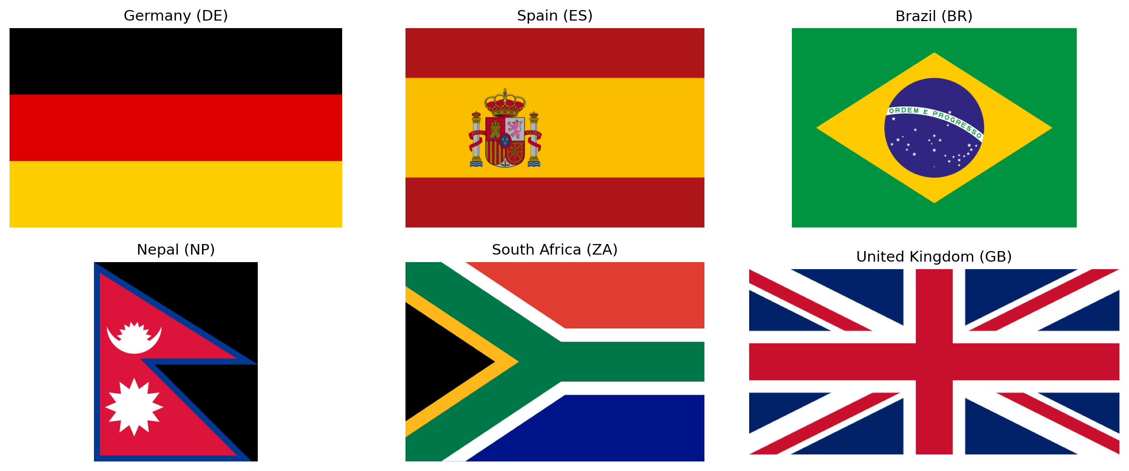
To confirm the pipeline works, let's rasterize a handful of flags and display them. This also illustrates the diversity of aspect ratios we are dealing with: most flags are 2:3 or 1:2 rectangles, but Nepal's double-pennant is an entirely different shape.
```{python}
#| label: flag-preview
#| code-summary: "Preview a sample of downloaded flags"
#| fig-cap: "A sample of six flags rasterized from SVG at 640px width. Note the variation in aspect ratios."
sample_codes = ["de", "es", "br", "np", "za", "gb"]
sample_names = {c: df_index.loc[df_index["code"] == c, "name"].values[0] for c in sample_codes}
fig, axes = plt.subplots(2, 3, figsize=(12, 5))
for ax, code in zip(axes.flat, sample_codes):
svg_path = flag_dir / f"{code}.svg"
png_data = cairosvg.svg2png(url=str(svg_path), output_width=640)
img = Image.open(io.BytesIO(png_data)).convert("RGB")
ax.set_facecolor("#f0f0f0")
ax.imshow(np.array(img), aspect="equal")
ax.set_title(f"{sample_names[code]} ({code.upper()})", fontsize=11)
ax.axis("off")
plt.tight_layout()
plt.show()
```
All 250 flags are now stored locally as SVGs. In the next section we begin **feature extraction**: converting each flag into a numerical fingerprint that captures its color palette, visual complexity, and geometric structure.
## Feature Extraction
A flag is an image. An image is a grid of pixels. To compare flags mathematically, we need to reduce each image to a fixed-length vector of numbers, a **fingerprint**, where each number captures one meaningful property of the design. The choice of *which* properties to measure is the most important decision in the entire project, because downstream analyses (distances, clusters, hypothesis tests) can only discover patterns that our features are capable of encoding.
We draw our feature set from three sources:
- **Vexillological design principles**, particularly the five rules published by the North American Vexillological Association (NAVA) in *Good Flag, Bad Flag*: keep it simple, use meaningful symbolism, use two or three basic colors, no lettering or seals, and be distinctive or be related.
- **Flag design taxonomy**, as catalogued by Wikipedia's *List of National Flags by Design* and *Flag Families*: the systematic classification of flags by structural elements (stripes, crosses, triangles, crescents, stars) and by historical lineage (Pan-African, Pan-Arab, Pan-Slavic, Nordic Cross, British Ensign, etc.).
- **Computer vision fundamentals**: standard image descriptors from information theory (Shannon entropy), edge detection (Canny), and line detection (Hough Transform) that quantify visual properties without any domain-specific assumptions.
The result is a set of **19 features** organized into five families. Below we describe each family, the metrics it contains, and the scientific or design rationale behind each one.
### Family 1: Color Palette (8 metrics)
Color is the most immediately visible property of any flag. The heraldic tradition defines a strict vocabulary of **tinctures**: metals (gold/argent, rendered as yellow and white) and colors (gules/red, azure/blue, vert/green, sable/black, purpure/purple). Nearly every national flag draws its palette from this classical set.
We measure color in the **HSV** (Hue, Saturation, Value) color space rather than RGB. HSV separates chromatic content (hue) from brightness (value) and intensity (saturation), which makes it much easier to define categories like "red" or "warm" in a way that matches human perception.
The eight color palette metrics are:
| Metric | Definition | Why it matters |
|--------|-----------|----------------|
| `warmth_score` | Fraction of chromatic pixels with warm hues (reds, oranges, yellows) | Directly tests the **Solar Determinism** hypothesis: do equatorial nations favor hotter colors? |
| `coolness_score` | Fraction of chromatic pixels with cool hues (blues, greens) | The complement of warmth. Nordic and maritime nations may cluster here. |
| `red_pct` | Fraction of total pixels that are red | Red is the single most common flag color worldwide, associated with blood, revolution, and courage. |
| `blue_pct` | Fraction of total pixels that are blue | Blue symbolizes sky, sea, freedom, and vigilance. Common in maritime and democratic traditions. |
| `green_pct` | Fraction of total pixels that are green | Green appears in Pan-African, Pan-Arab, and Islamic flag traditions. Also associated with land and agriculture. |
| `yellow_pct` | Fraction of total pixels that are yellow/gold | Gold represents wealth, sun, and generosity in heraldic terms. Dominant in African and South American flags. |
| `white_pct` | Fraction of total pixels that are white/silver | White symbolizes peace, purity, and snow. Also serves as a background or fimbriation (border) color. |
| `black_pct` | Fraction of total pixels that are black | Black represents determination, heritage, and mourning. Prominent in Pan-African and revolutionary flags. |
### Family 2: Color Complexity (3 metrics)
NAVA's third principle states: *"Use two or three basic colors from the standard color set."* This is a measurable claim. A flag with two dominant colors is simpler and more recognizable than one with seven. Beyond counting colors, we also want to know how much those colors *contrast* with each other (high contrast aids recognition at a distance, which is the entire functional purpose of a flag), and whether the palette leans toward the aggressive end of the spectrum.
| Metric | Definition | Why it matters |
|--------|-----------|----------------|
| `palette_complexity` | Number of significant color clusters found by K-Means quantization of the flag's pixel data. This is not the number of colors a human would name (Afghanistan = 4 to the eye, but 7 at the pixel level due to its detailed emblem). It measures chromatic variety including gradients, shading, and fine artwork. | Operationalizes NAVA's "2-3 colors" rule at the pixel level. Flags with detailed coats of arms, seals, or multi-shade emblems will score higher than clean geometric designs. |
| `color_contrast` | Maximum perceptual color distance (CIEDE2000) between any two dominant color clusters. Values typically range from 0 to 100, though highly chromatic pairs can slightly exceed 100. | High contrast (e.g. black on white, red on green) makes a flag readable from far away. Low contrast suggests a monochromatic or analogous palette. |
| `aggression_index` | Combined area fraction of red and black pixels | Tests the **Revolutionary Diagonal** hypothesis: are flags born from violent independence movements more red-and-black? Also correlates with the Pan-African color tradition. |
### Family 3: Visual Complexity (3 metrics)
How "busy" is a flag? A tricolor with three solid blocks of color is among the simplest possible designs. A flag with a detailed coat of arms, animals, text, and ornamental borders is visually complex. NAVA's first principle (*"Keep it simple: the flag should be so simple that a child can draw it from memory"*) and fourth principle (*"No lettering or seals"*) both relate to complexity.
We measure complexity from three complementary angles:
| Metric | Definition | Why it matters |
|--------|-----------|----------------|
| `visual_entropy` | Shannon entropy of the grayscale intensity histogram, in bits | An information-theoretic measure of pixel diversity. Simple flags (few gray levels) have low entropy; intricate designs (many gray levels from gradients, shadows, and detail) have high entropy. |
| `edge_density` | Fraction of pixels detected as edges by the Canny algorithm | A geometric measure of complexity. More edges mean more shapes, boundaries, and fine detail in the design. A solid tricolor has very few edges; a flag with a detailed eagle emblem has many. |
| `spatial_entropy` | Entropy of color distribution across a spatial grid (the flag divided into a 4x4 grid of cells) | Distinguishes between *distributed* complexity (patterns spread across the entire flag, like the USA's stars-and-stripes) and *localized* complexity (a single emblem on a plain background, like Japan's circle on white). Two flags can have identical `visual_entropy` but very different `spatial_entropy`. |
### Family 4: Geometric Structure (4 metrics)
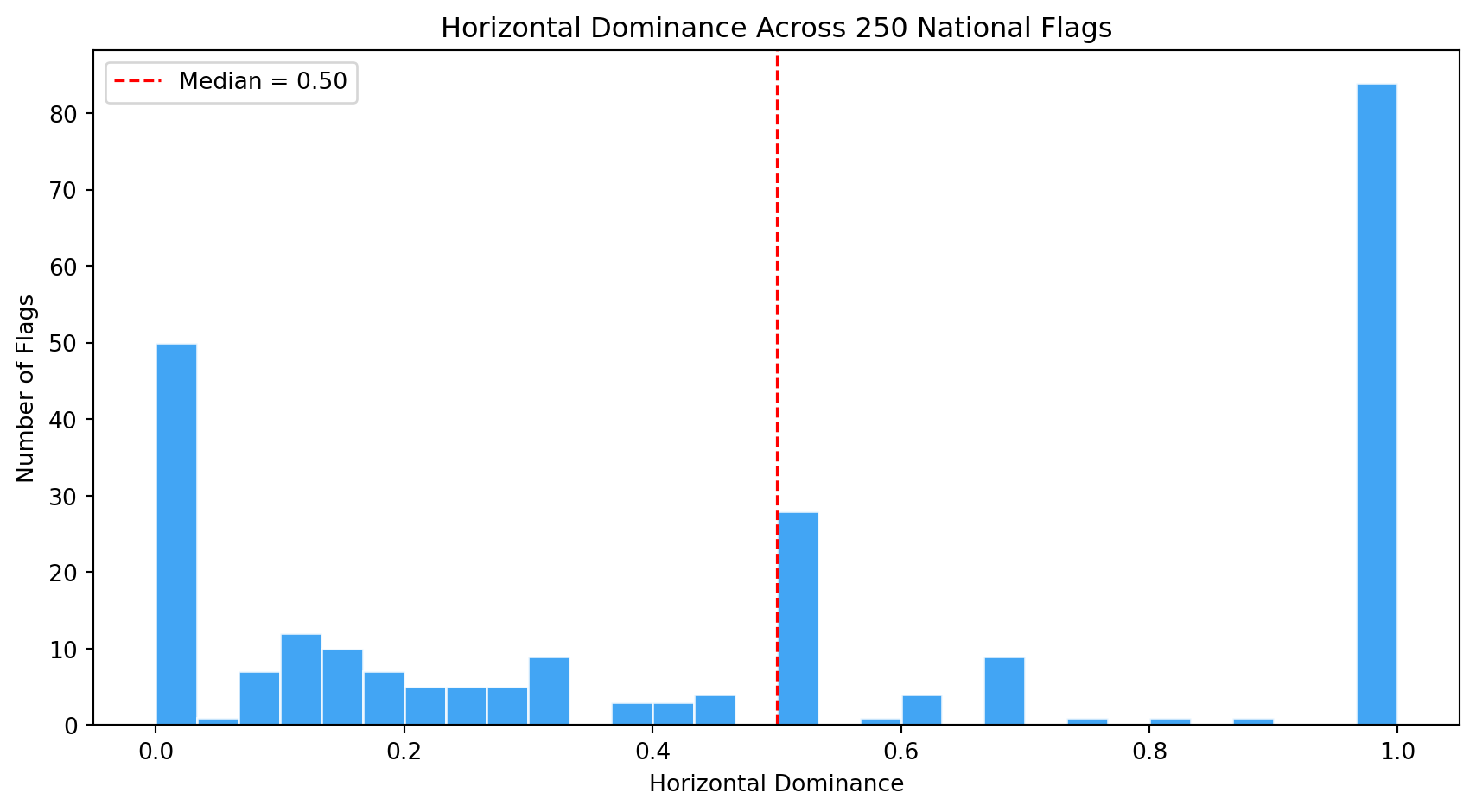
Flag designs fall into well-known structural families: horizontal stripes (tribands, tricolors), vertical stripes, diagonal divisions, crosses, and more. These structural patterns carry historical meaning. Horizontal tricolors descend from the Dutch and French revolutionary traditions. Nordic crosses mark Scandinavian identity. Diagonal stripes are rarer and more dynamic, often signaling a break from colonial templates.
We detect dominant line angles in each flag using the **Hough Transform**, a classical computer vision algorithm that finds straight lines in an image. By classifying detected lines by their angle, we can quantify whether a flag's geometry is primarily horizontal, vertical, or diagonal. We also measure bilateral symmetry, since most flags are designed to look the same when reflected horizontally.
| Metric | Definition | Why it matters |
|--------|-----------|----------------|
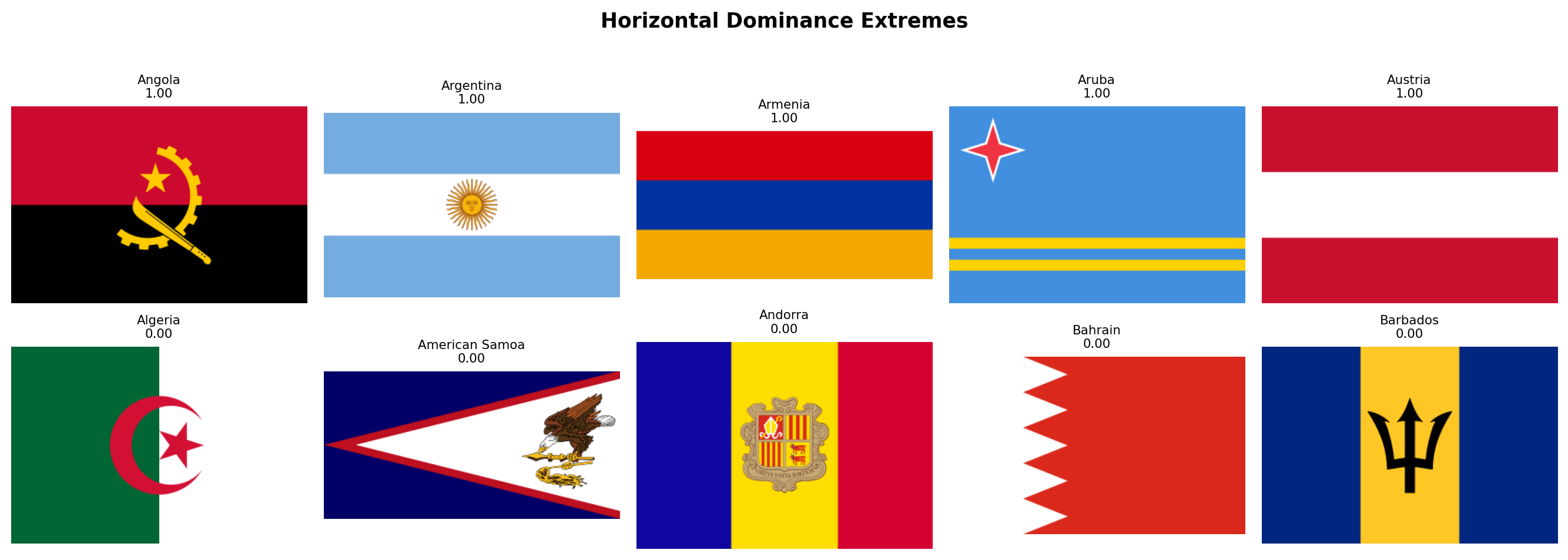
| `horizontal_dominance` | Fraction of strong Hough lines that are near-horizontal (within 10 degrees of the horizon) | Captures membership in the triband/tricolor family, the single largest design family in the world. |
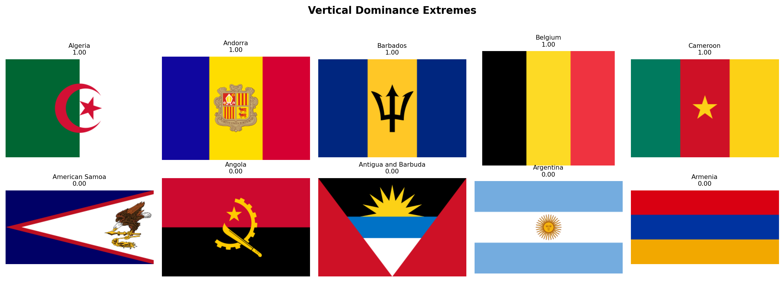
| `vertical_dominance` | Fraction of strong Hough lines that are near-vertical (within 10 degrees of the vertical axis) | Distinguishes vertical tricolors (French tradition: France, Italy, Belgium, Ireland) from horizontal tribands. |
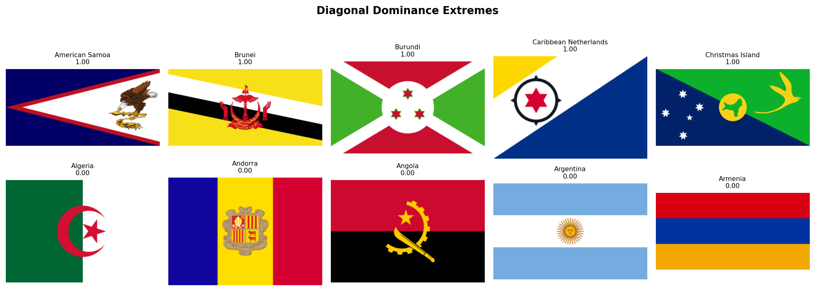
| `diagonal_dominance` | Fraction of strong Hough lines that are neither horizontal nor vertical (the middle angular zone between 10 and 80 degrees) | Rare and visually dynamic. Tests the **Revolutionary Diagonal** hypothesis: flags like Tanzania, Namibia, and the DRC use diagonals. |
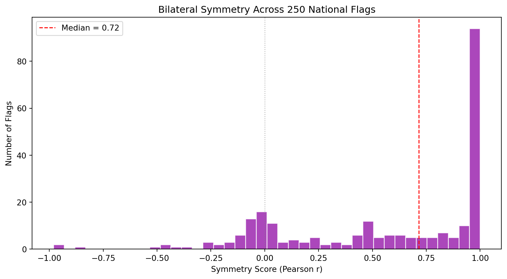
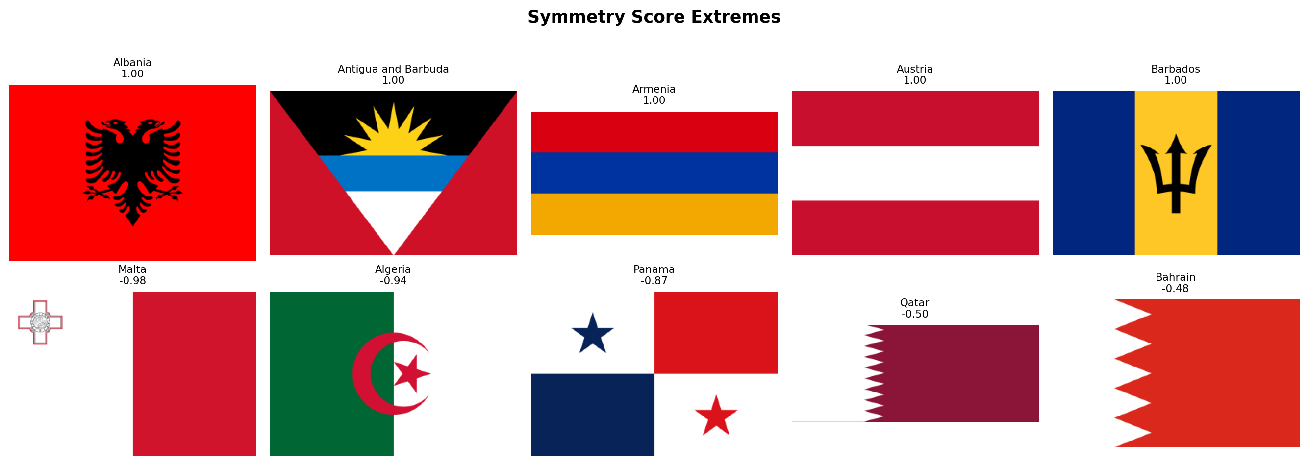
| `symmetry_score` | Pixel-wise correlation between the flag and its horizontal mirror image | Most flags are designed to be read from both sides. Asymmetric flags (Nepal, Bhutan, flags with off-center emblems like Portugal or Sri Lanka) are structural outliers. |
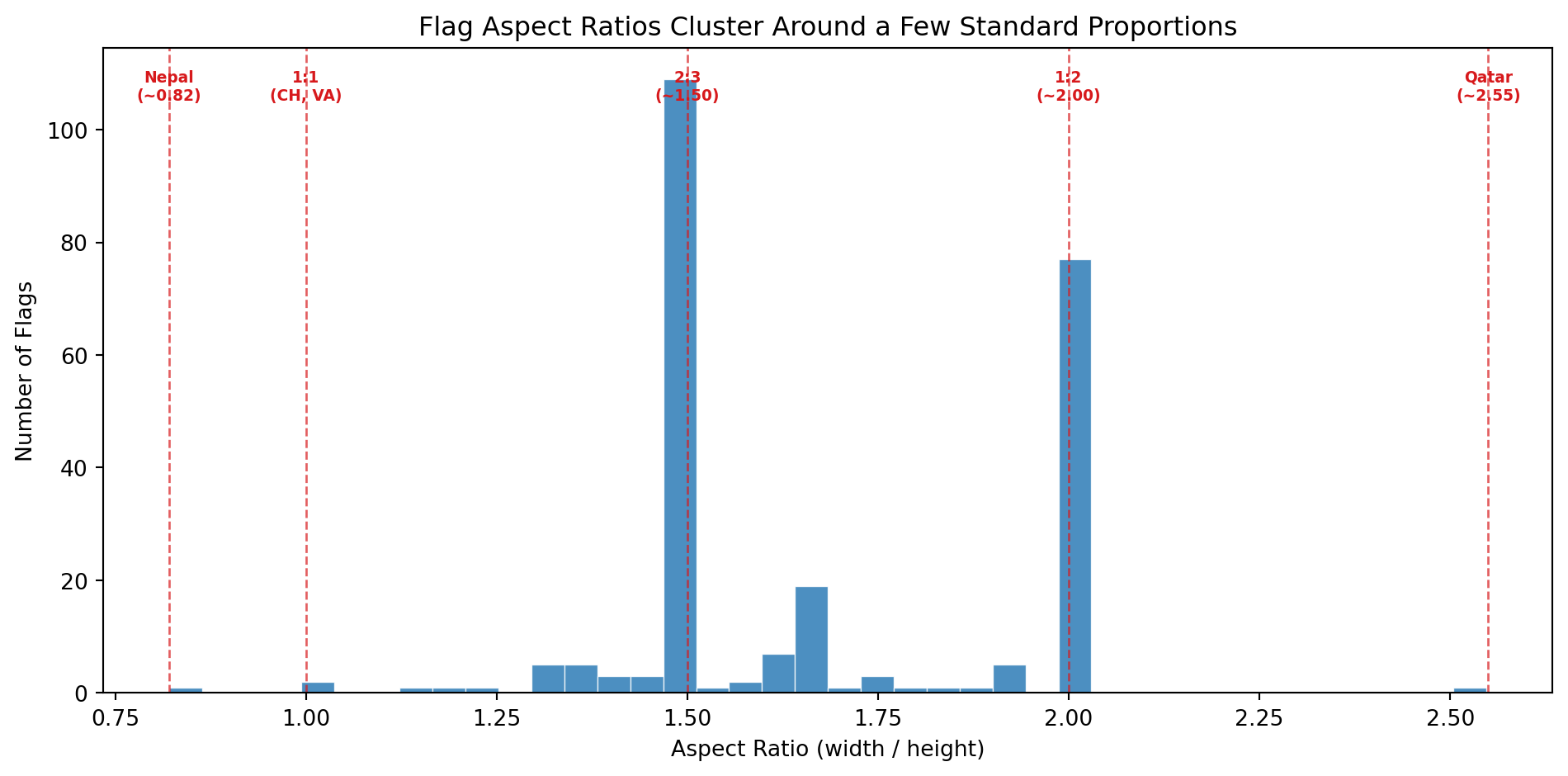
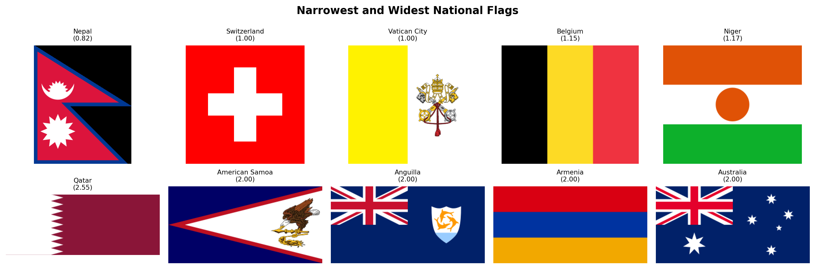
### Family 5: Aspect Ratio (1 metric)
The shape of a flag is one of its most fundamental design decisions, yet it is often overlooked in computational analyses that resize all flags to a fixed square.
| Metric | Definition | Why it matters |
|--------|-----------|----------------|
| `aspect_ratio` | Width divided by height of the rasterized flag | Most flags have a 2:3 ratio (~1.50) or 1:2 (~2.00). Switzerland and Vatican City are square (1.00). Qatar is extremely elongated (~2.55). Nepal is the only flag taller than wide (~0.82). This single number separates entire design traditions. |
### Summary
Altogether, these **19 features** span the space of what makes a flag visually distinctive. They are organized so that each family answers a different question:
| Family | Question | N |
|--------|----------|---|
| Color Palette | *What colors does this flag use?* | 8 |
| Color Complexity | *How chromatically complex is the palette, and how do its colors contrast?* | 3 |
| Visual Complexity | *How busy is the design?* | 3 |
| Geometric Structure | *What shapes and symmetries define its layout?* | 4 |
| Aspect Ratio | *What is the flag's shape?* | 1 |
| **Total** | | **19** |
In the following subsections we implement each family as a Python function, extract all metrics for every flag, and visualize the results one family at a time.
### Rasterization Helper
Before extracting any features, we need a utility function to convert SVG flags into pixel arrays. SVGs are vector graphics (mathematical descriptions of shapes), but our computer vision algorithms operate on **rasters** (grids of pixels). The function below uses `cairosvg` to render each SVG at a fixed width and returns a NumPy array in RGB format.
We choose a default width of 320 pixels. This is large enough to preserve fine detail (small stars, thin stripes) but small enough to keep computation fast across 250 flags. The height is determined automatically by the SVG's native aspect ratio, which means Nepal's flag will be taller than wide and Qatar's will be very elongated. This is intentional: we want to preserve the true geometry of each flag rather than distorting it into a fixed square.
```{python}
#| label: rasterize-helper
#| code-summary: "SVG to pixel array conversion"
import cv2
from scipy.stats import entropy as shannon_entropy
from skimage.feature import canny
from skimage.transform import hough_line, hough_line_peaks
def rasterize_flag(svg_path, width=320):
"""Convert an SVG flag file into a NumPy RGB array.
Parameters
----------
svg_path : str or Path
Path to the .svg file.
width : int
Target width in pixels. Height is computed from the SVG's
native aspect ratio, so the flag is never distorted.
Returns
-------
np.ndarray
RGB image as a uint8 array of shape (H, W, 3).
"""
png_data = cairosvg.svg2png(url=str(svg_path), output_width=width)
img = Image.open(io.BytesIO(png_data)).convert("RGB")
return np.array(img)
```
## Color Palette
We now implement the first metric family. The function below takes an RGB image and returns eight numbers describing its color composition.
**How it works, step by step:**
1. **Convert RGB to HSV.** The HSV color space separates hue (the "name" of the color, like red or blue), saturation (how vivid the color is), and value (how bright it is). This separation lets us define color categories using simple numeric ranges on the hue channel, which would be very awkward in RGB.
2. **Build a chromatic mask.** Not every pixel carries meaningful color information. Very dark pixels (low value) look black regardless of their hue, and very pale pixels (low saturation, high value) look white. We exclude these achromatic pixels when computing warmth and coolness scores, so that a flag with a large white area does not dilute its chromatic profile.
3. **Classify hues.** OpenCV encodes hue on a 0-179 scale (not 0-360). Red wraps around: hues near 0 *and* near 179 are both red. We define each color category as a range of hue values combined with minimum saturation and value thresholds to avoid false positives (a very dark, desaturated pixel with hue=120 is not really "green").
4. **Compute area fractions.** Each metric is simply the count of pixels matching a category divided by the total number of pixels (for individual colors) or by the number of chromatic pixels (for warmth/coolness).
```{python}
#| label: color-palette-fn
#| code-summary: "Color palette extraction function"
def compute_color_palette(img_rgb):
"""Extract 8 color palette metrics from an RGB flag image.
All hue ranges are defined for OpenCV's 0-179 hue scale.
Saturation and value thresholds prevent false classifications
in near-black or near-white regions.
Returns a dict with keys:
warmth_score, coolness_score,
red_pct, blue_pct, green_pct, yellow_pct, white_pct, black_pct
"""
# Step 1: convert to HSV color space
img_hsv = cv2.cvtColor(img_rgb, cv2.COLOR_RGB2HSV)
h = img_hsv[:, :, 0] # hue: 0-179
s = img_hsv[:, :, 1] # saturation: 0-255
v = img_hsv[:, :, 2] # value: 0-255
total_pixels = img_rgb.shape[0] * img_rgb.shape[1]
# Step 2: chromatic mask (exclude near-black and near-white)
# A pixel is "chromatic" if it has meaningful saturation and is not
# too dark. Near-white pixels (high V, low S) are excluded by the
# saturation threshold alone; we do NOT cap V because pure saturated
# colors like RGB(255,0,0) have V=255 and must be counted.
chromatic = (s > 25) & (v > 40)
n_chromatic = max(chromatic.sum(), 1) # avoid division by zero
# Step 3: classify hues into warm and cool families
# Warm: reds (wrapping around 0/179), oranges, yellows (H < 30 or H > 160)
# Cool: greens and blues (H between 35 and 140). We start at 35 rather
# than higher to capture dark greens (like Pakistan's or Norfolk Island's)
# whose hue sits around H=70-75 in OpenCV's scale.
warm_mask = ((h <= 30) | (h >= 160)) & chromatic
cool_mask = ((h >= 35) & (h <= 140)) & chromatic
# Step 4: individual color masks with tighter thresholds
# Red wraps around: H <= 10 OR H >= 170, plus strong saturation and brightness
red_mask = ((h <= 10) | (h >= 170)) & (s > 80) & (v > 50)
# Orange occupies a narrow hue band between red and yellow
# (included in warmth but not tracked separately)
# Yellow: H 20-35, must be bright and saturated to distinguish from brown
yellow_mask = ((h >= 20) & (h <= 35)) & (s > 60) & (v > 100)
# Green: H 35-85, moderate saturation minimum
green_mask = ((h >= 35) & (h <= 85)) & (s > 40) & (v > 40)
# Blue: H 85-135, moderate saturation minimum
blue_mask = ((h >= 85) & (h <= 135)) & (s > 40) & (v > 40)
# Black: very low brightness regardless of hue
black_mask = (v < 40)
# White: very low saturation AND very high brightness
white_mask = (s <= 20) & (v >= 230)
return {
"warmth_score": round(warm_mask.sum() / n_chromatic, 4),
"coolness_score": round(cool_mask.sum() / n_chromatic, 4),
"red_pct": round(red_mask.sum() / total_pixels, 4),
"blue_pct": round(blue_mask.sum() / total_pixels, 4),
"green_pct": round(green_mask.sum() / total_pixels, 4),
"yellow_pct": round(yellow_mask.sum() / total_pixels, 4),
"white_pct": round(white_mask.sum() / total_pixels, 4),
"black_pct": round(black_mask.sum() / total_pixels, 4),
}
```
### Extraction
We iterate over every flag in our corpus, rasterize it, and compute the eight color palette metrics. The result is a DataFrame where each row is a flag and each column is a metric.
```{python}
#| label: extract-color-palette
#| code-summary: "Run color palette extraction on all flags"
records = []
for _, row in df_index.iterrows():
svg_path = flag_dir / f"{row['code']}.svg"
if not svg_path.exists():
continue
img = rasterize_flag(svg_path)
metrics = {"code": row["code"], "name": row["name"]}
metrics.update(compute_color_palette(img))
records.append(metrics)
df_palette = pd.DataFrame(records)
print(f"Color palette extracted: {df_palette.shape[0]} flags x {df_palette.shape[1]} columns")
itshow(df_palette, lengthMenu=[5, 10, 25, 50], pageLength=5)
```
### Color Landscape Overview
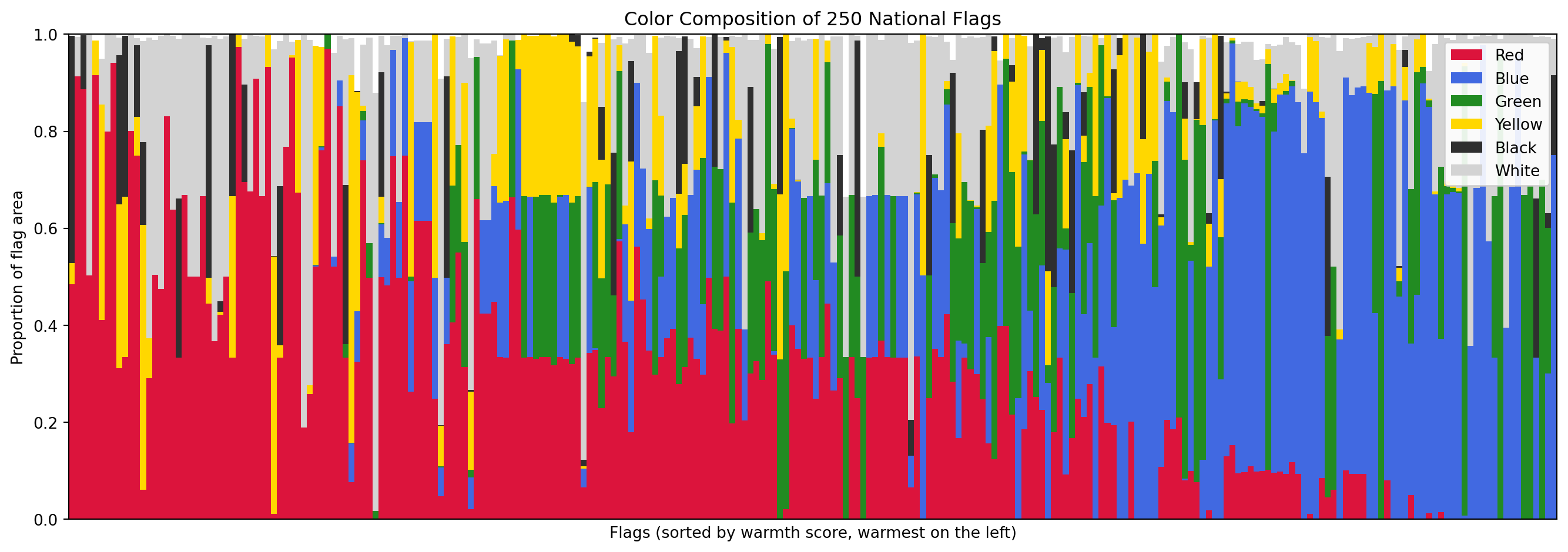
Before looking at individual metrics, let's get an overview of the entire color landscape. The stacked bar chart below shows the six major color proportions for every flag, sorted from warmest to coolest. Each vertical sliver is one flag; the height of each color band shows how much of the flag's area that color occupies.
```{python}
#| label: color-palette-stacked
#| code-summary: "Stacked bar chart of color composition across all flags"
#| fig-cap: "Color composition of all 250 flags, sorted by warmth score. Each vertical bar is one flag. The six bands show the proportion of the flag's area occupied by each major color."
color_cols = ["red_pct", "blue_pct", "green_pct", "yellow_pct", "black_pct", "white_pct"]
palette_colors = {
"red_pct": "#DC143C", "blue_pct": "#4169E1", "green_pct": "#228B22",
"yellow_pct": "#FFD700", "black_pct": "#2F2F2F", "white_pct": "#D3D3D3"
}
df_sorted = df_palette.sort_values("warmth_score", ascending=False).reset_index(drop=True)
fig, ax = plt.subplots(figsize=(14, 5))
bottom = np.zeros(len(df_sorted))
for col in color_cols:
ax.bar(range(len(df_sorted)), df_sorted[col], bottom=bottom,
color=palette_colors[col], label=col.replace("_pct", "").title(), width=1.0)
bottom += df_sorted[col].values
ax.set_xlabel("Flags (sorted by warmth score, warmest on the left)")
ax.set_ylabel("Proportion of flag area")
ax.set_title("Color Composition of 250 National Flags")
ax.legend(loc="upper right", framealpha=0.9)
ax.set_xlim(-0.5, len(df_sorted) - 0.5)
ax.set_ylim(0, 1)
ax.set_xticks([])
plt.tight_layout()
plt.show()
```
### Summary Statistics
The table below shows the distribution of each color palette metric across all 250 flags. Pay attention to the means and the spread (std): they tell us which colors dominate the world's flags on average and how much variation exists.
```{python}
#| label: color-palette-stats
#| code-summary: "Descriptive statistics for all 8 color palette metrics"
palette_metrics = ["warmth_score", "coolness_score", "red_pct", "blue_pct",
"green_pct", "yellow_pct", "white_pct", "black_pct"]
df_palette[palette_metrics].describe().round(4)
```
### Warmth vs Coolness
The warmth and coolness scores partition the chromatic content of each flag into two opposing camps. Since a pixel can be warm, cool, or neither (e.g., purple, which sits between red and blue), these two scores do not necessarily sum to 1. The scatter plot below shows each flag as a point in warmth-coolness space, with its dominant color indicated by marker color.
```{python}
#| label: warmth-vs-coolness
#| code-summary: "Interactive scatter plot of warmth vs coolness for every flag"
#| fig-cap: "Each dot is a flag. Flags in the top-left are dominated by warm colors (reds, oranges, yellows). Flags in the bottom-right are cool (blues, greens). Flags near the origin have mostly achromatic palettes (white, black)."
# Determine the dominant color for each flag (for marker coloring)
dom_cols = ["red_pct", "blue_pct", "green_pct", "yellow_pct", "white_pct", "black_pct"]
dom_labels = {
"red_pct": "Red", "blue_pct": "Blue", "green_pct": "Green",
"yellow_pct": "Yellow", "white_pct": "White", "black_pct": "Black"
}
dom_color_scale = {
"Red": "#DC143C", "Blue": "#4169E1", "Green": "#228B22",
"Yellow": "#FFD700", "White": "#999999", "Black": "#2F2F2F"
}
df_warmth_plot = df_palette.copy()
df_warmth_plot["dominant_color"] = df_palette[dom_cols].idxmax(axis=1).map(dom_labels)
fig = px.scatter(
df_warmth_plot, x="warmth_score", y="coolness_score",
color="dominant_color",
color_discrete_map=dom_color_scale,
hover_name="name",
hover_data={"warmth_score": ":.2f", "coolness_score": ":.2f", "dominant_color": True},
labels={"warmth_score": "Warmth Score", "coolness_score": "Coolness Score",
"dominant_color": "Dominant Color"},
title="Flag Color Temperature: Warmth vs Coolness",
opacity=0.75, width=800, height=600,
)
# Diagonal reference line (warm = cool)
fig.add_shape(type="line", x0=0, y0=1, x1=1, y1=0,
line=dict(color="#ccc", width=1, dash="dash"))
fig.update_layout(xaxis_range=[-0.05, 1.05], yaxis_range=[-0.05, 1.05])
fig.show()
```
### Which Colors Dominate?
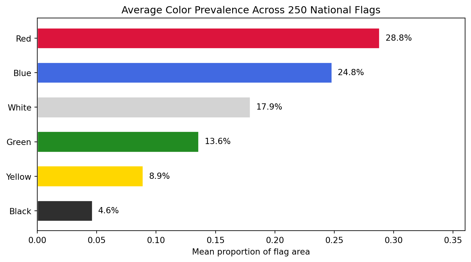
The bar chart below aggregates: for each of the six major colors, what is the *average* proportion across all 250 flags? This tells us the "global average flag" color recipe.
```{python}
#| label: color-prevalence
#| code-summary: "Average color prevalence across all 250 flags"
#| fig-cap: "Mean proportion of each color across all 250 flags. Red and white dominate, followed by blue. Yellow and green are less common, and black is the rarest major color."
mean_colors = df_palette[color_cols].mean().sort_values(ascending=True)
color_labels = [c.replace("_pct", "").title() for c in mean_colors.index]
bar_colors = [palette_colors[c] for c in mean_colors.index]
fig, ax = plt.subplots(figsize=(8, 4.5))
bars = ax.barh(color_labels, mean_colors.values, color=bar_colors, edgecolor="white", height=0.6)
# Add percentage labels on each bar
for bar, val in zip(bars, mean_colors.values):
ax.text(bar.get_width() + 0.005, bar.get_y() + bar.get_height() / 2,
f"{val:.1%}", va="center", fontsize=10)
ax.set_xlabel("Mean proportion of flag area")
ax.set_title("Average Color Prevalence Across 250 National Flags")
ax.set_xlim(0, mean_colors.max() * 1.25)
plt.tight_layout()
plt.show()
```
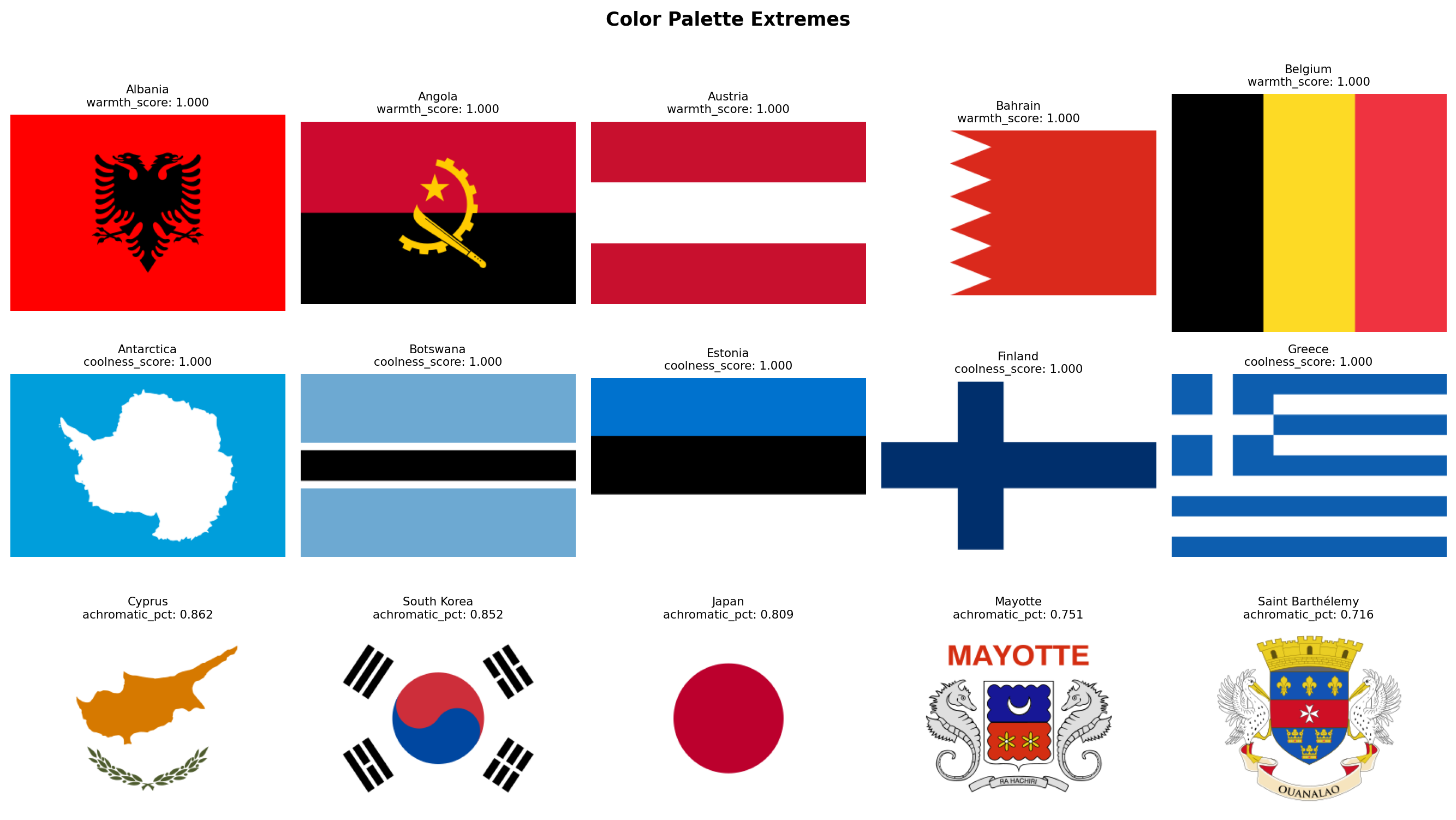
### The Warmest and Coolest Flags
Finally, let's look at the actual flags sitting at the extremes. Which flags are the most dominated by warm colors? Which are the coolest? And which flags have almost no chromatic content at all (dominated by white and black)?
```{python}
#| label: extreme-warmth-coolness
#| code-summary: "Display the warmest, coolest, and most achromatic flags"
#| fig-cap: "Top row: the 5 flags with the highest warmth scores. Middle row: the 5 flags with the highest coolness scores. Bottom row: the 5 flags with the highest combined white + black area (most achromatic)."
# Achromatic dominance: how much of the flag is white + black (non-chromatic)
df_palette["achromatic_pct"] = df_palette["white_pct"] + df_palette["black_pct"]
groups = [
("warmth_score", True, "Warmest Flags"),
("coolness_score", True, "Coolest Flags"),
("achromatic_pct", True, "Most Achromatic Flags"),
]
fig, axes = plt.subplots(3, 5, figsize=(14, 8))
for row_idx, (metric, largest, title) in enumerate(groups):
subset = df_palette.nlargest(5, metric) if largest else df_palette.nsmallest(5, metric)
for col_idx, (_, flag_row) in enumerate(subset.iterrows()):
ax = axes[row_idx, col_idx]
img = rasterize_flag(flag_dir / f"{flag_row['code']}.svg", width=320)
ax.set_facecolor("#f0f0f0")
ax.imshow(img, aspect="equal")
score = flag_row[metric]
ax.set_title(f"{flag_row['name']}\n{metric}: {score:.3f}", fontsize=8)
ax.axis("off")
axes[row_idx, 0].set_ylabel(title, fontsize=9, rotation=0, labelpad=70, va="center")
plt.suptitle("Color Palette Extremes", fontsize=13, fontweight="bold", y=1.01)
plt.tight_layout()
plt.show()
```
### Discussion
Several patterns stand out from the data.
**Red is the world's flag color.** With a mean of 28.8% of flag area, red leads every other color. 39 flags dedicate more than half their area to red, led by China (97.4%), Morocco (97.0%), and Turkey (94.1%). This is consistent with heraldic tradition, where *gules* (red) is the most popular tincture, and with the cross-cultural associations of red: blood, courage, revolution, and sacrifice.
**Blue is close behind, but distributed differently.** Blue averages 24.8%, nearly tied with red, but it behaves differently. 108 flags (43% of the corpus) contain essentially zero blue, while 49 flags are more than half blue. Blue appears in an all-or-nothing pattern: when a flag uses blue, it tends to use a *lot* of it. The blue-dominant list reads like a map of the Pacific Ocean (Micronesia, Palau, Nauru, Australia, New Zealand) plus the British Ensign family (flags with Union Jacks on blue fields).
**White is a supporting color, not a leading one.** At 17.9%, white is the third most common color on average, but only 15 flags are majority-white. The white-dominant flags are revealing: Cyprus, Japan, South Korea, Israel, and Georgia are all flags with a simple symbol on a plain white field. White functions less as a "color" and more as negative space.
**Green clusters in specific traditions.** Green averages 13.6%, and 145 flags (58%) use essentially no green at all. But the green-dominant flags tell a clear story: Saudi Arabia (95.9%), Turkmenistan (83.7%), Bangladesh (79.0%), and Pakistan (68.8%) all belong to the Islamic design tradition. Brazil (69.1%) and Nigeria (66.9%) represent the Pan-African and Latin American strands respectively. Green is the most "culturally loaded" color in the corpus.
**Yellow and black are rare and specialized.** Yellow averages only 8.9%, and only 4 flags dedicate more than half their area to it. Black averages 4.6%, and no flag in the world is majority-black (Libya comes closest at 48.7%, followed by Papua New Guinea at 48.0%). Black appears most prominently in the Pan-African tricolor tradition (black-red-green or black-yellow-green) and in European tribands (Germany, Belgium).
**The warm-cool balance is remarkably even.** Mean warmth (0.515) and mean coolness (0.484) are nearly equal, suggesting that the world's flags, taken as a whole, are chromatically balanced. However, the distribution is bimodal rather than normal: 45 flags are purely warm (warmth > 0.95) and 22 are purely cool (coolness > 0.95), while 171 flags (68%) mix both warm and cool hues. Very few flags are chromatically neutral.
**The Solar Determinism hypothesis has an early lead.** The purely warm flags include many equatorial and tropical nations (Vietnam, Turkey, Morocco, China, Indonesia, Kyrgyzstan), while the purely cool flags include Scandinavian (Finland, Iceland), maritime (Micronesia, Palau, Nauru), and temperate nations (Estonia, Greece, Israel). This is suggestive, but not yet conclusive. We will need geographic coordinates and a proper statistical test to evaluate this hypothesis rigorously in the hypothesis testing section.
**A note on coverage.** Our six named color categories (red, blue, green, yellow, white, black) collectively account for 98.6% of all pixels across 250 flags. The remaining 1.4% falls into transitional regions that no single category claims: orange (H 11-19 in OpenCV, straddling red and yellow), muted tones produced by anti-aliasing at stripe boundaries, grays that are too saturated for the white mask but too desaturated for any chromatic mask, and the occasional purple. Ireland and Ivory Coast are the most affected: their orange stripes occupy a third of the flag area and are not counted by any individual color percentage. Crucially, these pixels are *not* lost to the analysis, the `warmth_score` and `coolness_score` metrics do cover the full chromatic range, as do the K-Means-based metrics in Family 2. The gap is confined to the six named-color breakdowns, which are intentionally strict to avoid false positives.
With the color palette extracted and explored, we have a clear picture of **what colors** each flag uses and how the world's flags distribute across the warm-cool spectrum. In the next section, we move to **Color Complexity**: not just *which* colors a flag uses, but *how many* and *how contrastingly*.
## Color Complexity
Family 1 told us *which* colors appear in each flag. Family 2 asks a different question: **how chromatically complex** is the flag's palette, and **how much do its colors contrast** with each other?
This family operationalizes two of NAVA's five principles. Principle 3 says *"Use two or three basic colors from the standard color set."* We can now test that rule quantitatively: do most flags actually use 2-3 colors, or is there a long tail of complex palettes? Principle 1 says *"Keep it simple"*, and a flag with high color contrast between its dominant blocks is visually simpler (more readable at a distance) than one where colors blur together.
We also introduce the **aggression index**, a compound metric that combines the area of red and black pixels. These two colors carry the heaviest symbolic weight in flag design: red for blood and revolution, black for mourning, resistance, and Pan-African identity. Their combined area gives us a single number to test the **Revolutionary Diagonal** hypothesis later.
**How it works, step by step:**
1. **Color quantization with K-Means.** We reduce each flag's millions of possible RGB values to a small set of representative colors by running K-Means clustering with `k=8` in RGB space. After clustering, we discard clusters that represent less than 1.5% of the total area (noise, anti-aliasing artifacts). We chose 1.5% rather than a higher threshold because some flags have small but important symbols, China's yellow stars, for instance, occupy only about 2.5% of the flag area. The number of surviving clusters is `palette_complexity`. Note that this is *not* the number of colors a human would name when looking at the flag. A human sees Afghanistan as a 4-color flag (black, red, green, white), but the emblem's fine artwork introduces brown, gold, and intermediate shades that push the pixel-level count to 7. This is intentional: `palette_complexity` measures how chromatically varied the design actually is, not how many colors appear in the official specification.
2. **Perceptual color contrast.** For each pair of dominant color clusters, we convert from RGB to the CIELAB color space and compute the CIEDE2000 color difference ($\Delta E_{00}$). Unlike luminance-only measures (such as the WCAG contrast ratio), CIEDE2000 accounts for differences in hue and saturation as well as lightness, so two colors that are equally dark but very different in hue, such as red and green, correctly score as highly contrastive. We report the maximum $\Delta E_{00}$ across all pairs of dominant colors. Values typically range from 0 (identical colors) to approximately 100 (black vs white), though maximally different chromatic pairs can slightly exceed 100.
3. **Aggression index.** Simply the sum of `red_pct` and `black_pct` from Family 1. We compute it here rather than deriving it later so that Family 2's DataFrame is self-contained.
```{python}
#| label: color-complexity-fn
#| code-summary: "Color complexity extraction function"
from sklearn.cluster import MiniBatchKMeans
from skimage.color import rgb2lab, deltaE_ciede2000
def compute_color_complexity(img_rgb, red_pct, black_pct):
"""Extract 3 color complexity metrics from an RGB flag image.
Parameters
----------
img_rgb : np.ndarray
RGB image array of shape (H, W, 3).
red_pct : float
Pre-computed red area fraction from Family 1 (avoids recomputation).
black_pct : float
Pre-computed black area fraction from Family 1.
Returns
-------
dict with keys: palette_complexity, color_contrast, aggression_index
"""
# Step 1: flatten pixels and run K-Means with k=8
pixels = img_rgb.reshape(-1, 3).astype(np.float64)
kmeans = MiniBatchKMeans(n_clusters=8, random_state=42, n_init=3, batch_size=1024)
labels = kmeans.fit_predict(pixels)
centers = kmeans.cluster_centers_ # shape (8, 3)
# Compute the proportion of pixels in each cluster
total = len(labels)
proportions = np.array([(labels == i).sum() / total for i in range(8)])
# Step 2: keep only clusters above the 1.5% noise threshold.
# We use 1.5% rather than a higher cutoff because some flags have
# small but visually important symbols (e.g., China's yellow stars
# occupy ~2.5% of the flag area, and Micronesia's white stars ~2.4%).
# A threshold of 3% would erase these, collapsing the flag to 1 color.
significant = proportions >= 0.015
n_distinct = int(significant.sum())
sig_centers = centers[significant]
sig_proportions = proportions[significant]
# Step 3: compute maximum perceptual color distance (CIEDE2000)
# We convert each dominant color to CIELAB and compute delta-E between all
# pairs. Unlike WCAG luminance contrast, CIEDE2000 captures differences in
# hue and saturation as well as lightness, so red vs green (both dark)
# correctly scores as highly contrastive.
max_contrast = 0.0
if len(sig_centers) >= 2:
# rgb2lab expects (H, W, 3) float64 in [0, 1]
lab_colors = rgb2lab(sig_centers.reshape(1, -1, 3) / 255.0)[0] # shape (N, 3)
for i in range(len(lab_colors)):
for j in range(i + 1, len(lab_colors)):
de = deltaE_ciede2000(
lab_colors[i].reshape(1, 1, 3),
lab_colors[j].reshape(1, 1, 3),
)[0, 0]
if de > max_contrast:
max_contrast = de
# Step 4: aggression index = red + black area from Family 1
aggression = round(red_pct + black_pct, 4)
return {
"palette_complexity": n_distinct,
"color_contrast": round(max_contrast, 2),
"aggression_index": aggression,
}
```
### Extraction
We now run the extraction loop. Since the aggression index reuses `red_pct` and `black_pct` from Family 1, we pull those values from `df_palette` rather than recomputing them.
```{python}
#| label: extract-color-complexity
#| code-summary: "Run color complexity extraction on all flags"
records_complexity = []
for _, row in df_palette.iterrows():
svg_path = flag_dir / f"{row['code']}.svg"
if not svg_path.exists():
continue
img = rasterize_flag(svg_path)
metrics = {"code": row["code"], "name": row["name"]}
metrics.update(compute_color_complexity(img, row["red_pct"], row["black_pct"]))
records_complexity.append(metrics)
df_complexity = pd.DataFrame(records_complexity)
print(f"Color complexity extracted: {df_complexity.shape[0]} flags x {df_complexity.shape[1]} columns")
itshow(df_complexity, lengthMenu=[5, 10, 25, 50], pageLength=5)
```
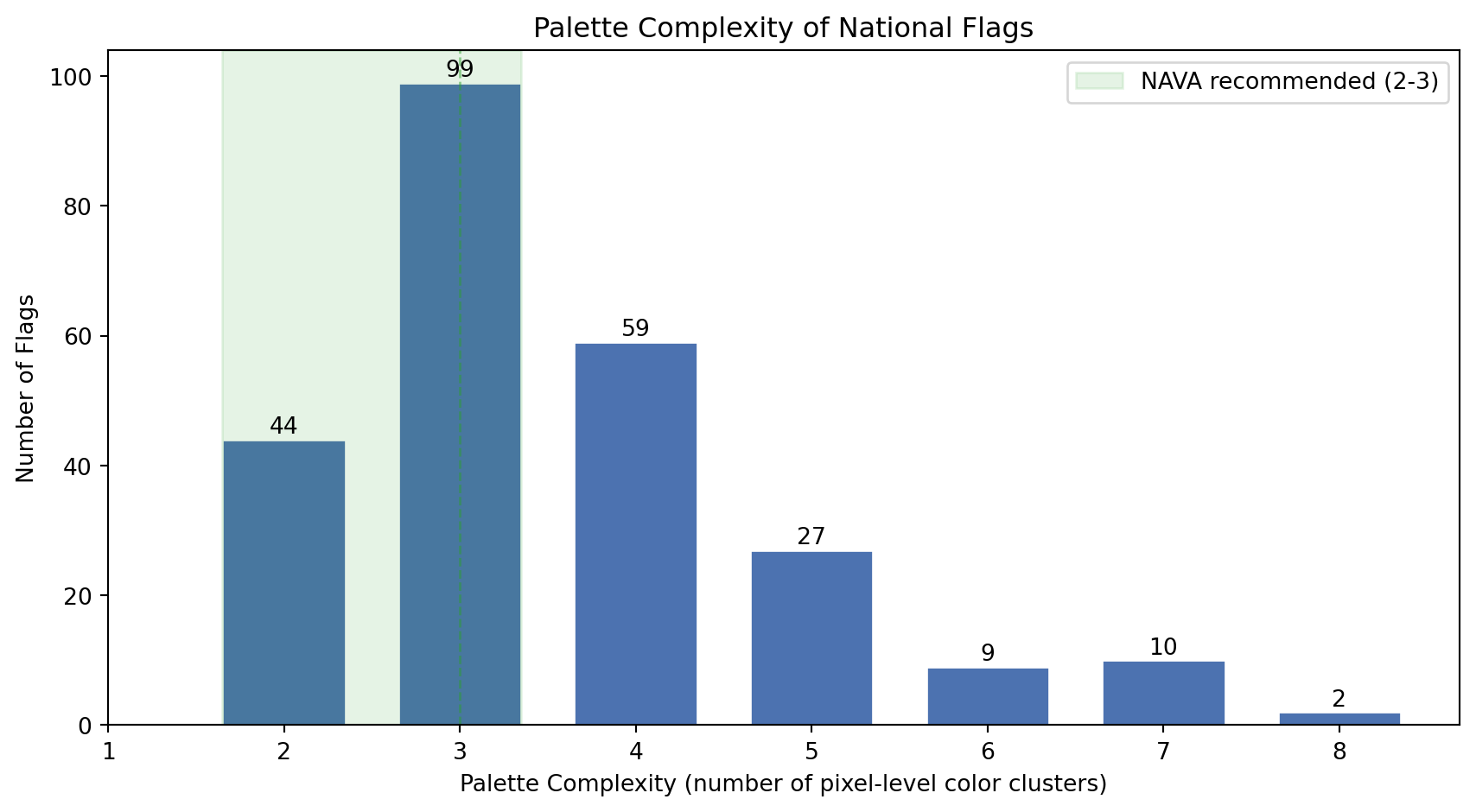
### Palette Complexity
NAVA's third principle recommends 2-3 colors. Our `palette_complexity` metric captures something broader: the number of distinct color clusters at the pixel level, including shading and emblem detail. Let's see how the world's flags distribute on this scale.
```{python}
#| label: palette-complexity-histogram
#| code-summary: "Distribution of palette complexity across all flags"
#| fig-cap: "Distribution of palette complexity (number of significant pixel-level color clusters) across all 250 flags. The dashed green band marks NAVA's recommended range of 2-3 colors. Flags with detailed emblems or coats of arms push the count above 5."
fig, ax = plt.subplots(figsize=(9, 5))
counts = df_complexity["palette_complexity"].value_counts().sort_index()
bars = ax.bar(counts.index, counts.values, color="#4C72B0", edgecolor="white", width=0.7)
# Highlight NAVA's recommended zone (2-3 colors)
ax.axvspan(1.65, 3.35, alpha=0.12, color="#2ca02c", label="NAVA recommended (2-3)")
ax.axvline(3, color="#2ca02c", linestyle="--", linewidth=1, alpha=0.5)
# Label each bar with its count
for bar in bars:
height = bar.get_height()
ax.text(bar.get_x() + bar.get_width() / 2, height + 1,
str(int(height)), ha="center", fontsize=10)
ax.set_xlabel("Palette Complexity (number of pixel-level color clusters)")
ax.set_ylabel("Number of Flags")
ax.set_title("Palette Complexity of National Flags")
ax.legend(loc="upper right")
ax.set_xticks(range(1, 9))
plt.tight_layout()
plt.show()
```
```{python}
#| label: color-count-stats
#| code-summary: "NAVA compliance statistics"
n = len(df_complexity)
n_nava = ((df_complexity["palette_complexity"] >= 2) & (df_complexity["palette_complexity"] <= 3)).sum()
n_under = (df_complexity["palette_complexity"] < 2).sum()
n_over = (df_complexity["palette_complexity"] > 3).sum()
median_colors = df_complexity["palette_complexity"].median()
mean_colors = df_complexity["palette_complexity"].mean()
print(f"NAVA-compliant (2-3 colors): {n_nava} flags ({n_nava/n:.0%})")
print(f"Fewer than 2 colors: {n_under} flags")
print(f"More than 3 colors: {n_over} flags ({n_over/n:.0%})")
print(f"Median colors: {median_colors:.0f}")
print(f"Mean colors: {mean_colors:.1f}")
```
The numbers tell us something interesting: while NAVA recommends 2-3 colors, `palette_complexity` often exceeds that range. This does not mean most flags are badly designed. It reflects the gap between official color specifications and pixel-level reality. Afghanistan officially has 4 colors, but its emblem renders as 7 pixel clusters. A clean tricolor like France scores exactly 3. The metric correctly separates *geometrically simple* designs from *artistically detailed* ones, which is precisely the dimension we want to capture.
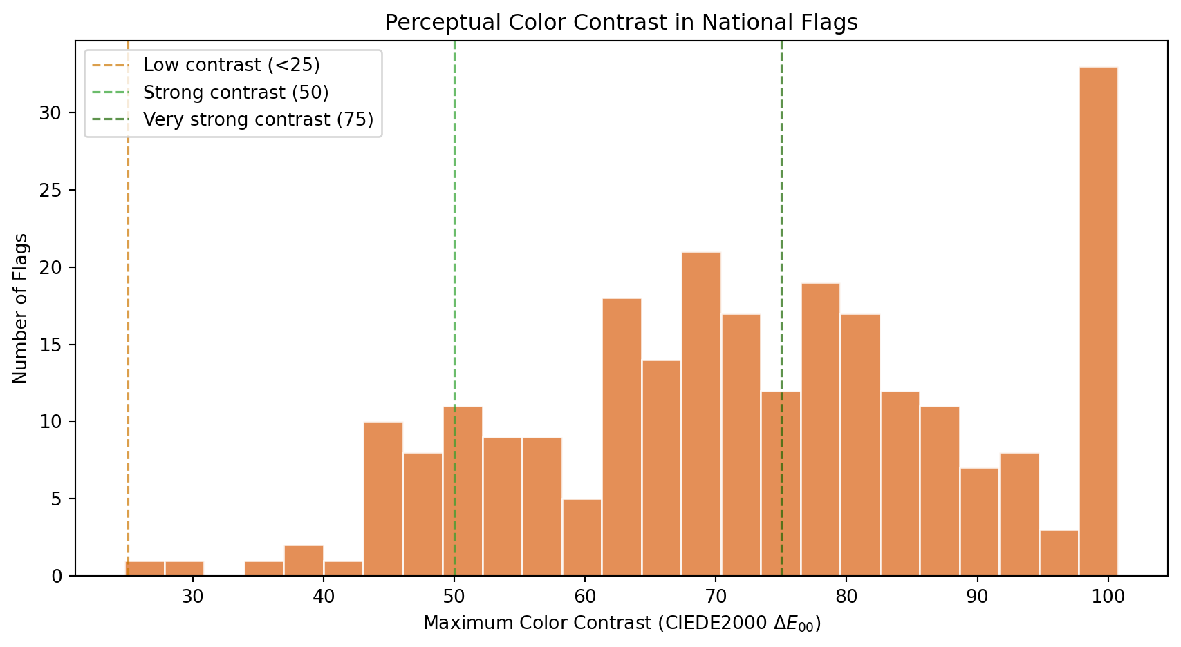
### Color Contrast
How different are a flag's dominant colors from each other? High contrast (e.g., white on black, red on green, blue on yellow) makes a flag readable from far away, which is the original functional purpose of a flag: identification at a distance on a battlefield or a ship. Low contrast suggests a monochromatic or analogous palette that prioritizes subtlety over raw visibility.
We measure contrast using **CIEDE2000** ($\Delta E_{00}$), the international standard for perceptual color difference. Unlike luminance-only measures (such as the WCAG contrast ratio, which only captures lightness differences), CIEDE2000 operates in the CIELAB color space and accounts for hue and saturation as well as lightness. This means red vs dark green, two colors with nearly identical luminance but very different hues, correctly scores as highly contrastive.
```{python}
#| label: contrast-histogram
#| code-summary: "Distribution of maximum perceptual color contrast"
#| fig-cap: "Distribution of the maximum CIEDE2000 color difference between any two dominant colors. A value of 0 means all dominant colors are perceptually identical. Pure black vs white scores approximately 100, though maximally different chromatic pairs (like deep blue vs vivid yellow) can slightly exceed that. Values above 50 indicate strongly distinct palettes."
fig, ax = plt.subplots(figsize=(9, 5))
ax.hist(df_complexity["color_contrast"], bins=25, color="#E07B39",
edgecolor="white", alpha=0.85)
# Perceptual distance reference thresholds
ax.axvline(25, color="#cc7700", linestyle="--", linewidth=1.2, alpha=0.7, label="Low contrast (<25)")
ax.axvline(50, color="#2ca02c", linestyle="--", linewidth=1.2, alpha=0.7, label="Strong contrast (50)")
ax.axvline(75, color="#1a6600", linestyle="--", linewidth=1.2, alpha=0.7, label="Very strong contrast (75)")
ax.set_xlabel("Maximum Color Contrast (CIEDE2000 $\Delta E_{00}$)")
ax.set_ylabel("Number of Flags")
ax.set_title("Perceptual Color Contrast in National Flags")
ax.legend(loc="upper left")
plt.tight_layout()
plt.show()
```
```{python}
#| label: contrast-stats
#| code-summary: "Perceptual contrast statistics"
high_contrast = (df_complexity["color_contrast"] >= 75).sum()
strong_contrast = ((df_complexity["color_contrast"] >= 50) & (df_complexity["color_contrast"] < 75)).sum()
moderate_contrast = ((df_complexity["color_contrast"] >= 25) & (df_complexity["color_contrast"] < 50)).sum()
low_contrast = (df_complexity["color_contrast"] < 25).sum()
print(f"Very strong contrast (>= 75): {high_contrast} flags ({high_contrast/n:.0%})")
print(f"Strong contrast (50-75): {strong_contrast} flags ({strong_contrast/n:.0%})")
print(f"Moderate contrast (25-50): {moderate_contrast} flags ({moderate_contrast/n:.0%})")
print(f"Low contrast (< 25): {low_contrast} flags ({low_contrast/n:.0%})")
print(f"Mean color contrast: {df_complexity['color_contrast'].mean():.1f}")
print(f"Median color contrast: {df_complexity['color_contrast'].median():.1f}")
```
Flag designers are instinctive contrast engineers. The distribution reveals that most national flags achieve strong perceptual separation between their dominant colors, which makes sense: a flag that cannot be distinguished at 200 meters fails its primary purpose.
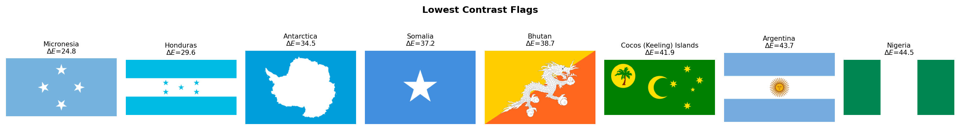
The few flags with low contrast deserve individual attention. Let's see which they are:
```{python}
#| label: lowest-contrast-flags
#| code-summary: "Flags with the lowest perceptual color contrast"
#| fig-cap: "The 8 flags with the lowest CIEDE2000 color contrast. These designs use colors that are perceptually close to each other, whether through similar hues, similar lightness, or both."
low_df = df_complexity.nsmallest(8, "color_contrast")
fig, axes = plt.subplots(1, 8, figsize=(16, 2.5))
for ax, (_, row) in zip(axes, low_df.iterrows()):
img = rasterize_flag(flag_dir / f"{row['code']}.svg", width=320)
ax.set_facecolor("#f0f0f0")
ax.imshow(img, aspect="equal")
ax.set_title(f"{row['name']}\n$\Delta E$={row['color_contrast']:.1f}", fontsize=8)
ax.axis("off")
plt.suptitle("Lowest Contrast Flags", fontsize=11, fontweight="bold")
plt.tight_layout()
plt.show()
```
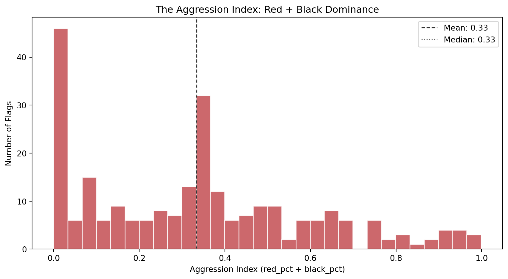
### The Aggression Index
The aggression index combines the two most symbolically intense colors in flag design: red (blood, revolution, sacrifice) and black (mourning, resistance, heritage). A high aggression index does not literally mean the country is aggressive. It captures a specific *aesthetic posture*: the visual weight of colors historically associated with struggle and defiance.
```{python}
#| label: aggression-histogram
#| code-summary: "Distribution of the aggression index (red + black area)"
#| fig-cap: "Distribution of the aggression index across 250 flags. The index ranges from 0 (no red or black at all) to nearly 1 (almost entirely red and black). The bimodal shape suggests two design populations: flags that avoid red/black entirely, and flags that lean heavily into them."
fig, ax = plt.subplots(figsize=(9, 5))
ax.hist(df_complexity["aggression_index"], bins=30, color="#C44E52",
edgecolor="white", alpha=0.85)
ax.axvline(df_complexity["aggression_index"].mean(), color="#333",
linestyle="--", linewidth=1.2, label=f"Mean: {df_complexity['aggression_index'].mean():.2f}")
ax.axvline(df_complexity["aggression_index"].median(), color="#666",
linestyle=":", linewidth=1.2, label=f"Median: {df_complexity['aggression_index'].median():.2f}")
ax.set_xlabel("Aggression Index (red_pct + black_pct)")
ax.set_ylabel("Number of Flags")
ax.set_title("The Aggression Index: Red + Black Dominance")
ax.legend(loc="upper right")
plt.tight_layout()
plt.show()
```
Which flags sit at the extremes? The strip below shows the 8 most aggressive and 8 most peaceful designs:
```{python}
#| label: aggression-extremes
#| code-summary: "Most and least aggressive flags by the aggression index"
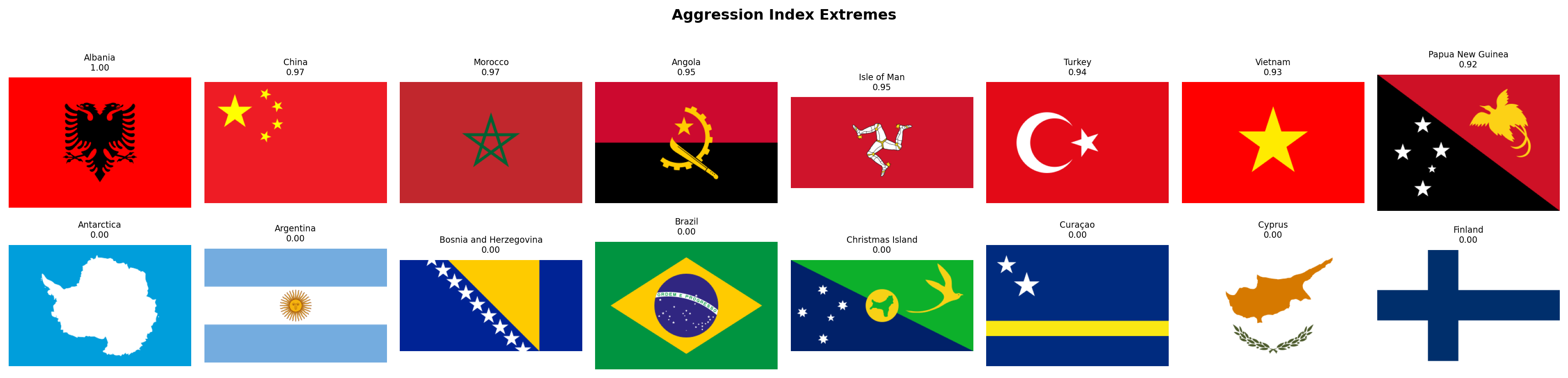
#| fig-cap: "Top row: the 8 flags with the highest aggression index (most red + black). Bottom row: the 8 flags with the lowest aggression index (least red and black). The aggressive row reads like a list of revolution and resistance; the peaceful row is dominated by blue, green, and yellow palettes."
fig, axes = plt.subplots(2, 8, figsize=(18, 4.5))
for row_idx, (subset, title) in enumerate([
(df_complexity.nlargest(8, "aggression_index"), "Most Aggressive"),
(df_complexity.nsmallest(8, "aggression_index"), "Most Peaceful"),
]):
for col_idx, (_, flag_row) in enumerate(subset.iterrows()):
ax = axes[row_idx, col_idx]
img = rasterize_flag(flag_dir / f"{flag_row['code']}.svg", width=320)
ax.set_facecolor("#f0f0f0")
ax.imshow(img, aspect="equal")
ax.set_title(f"{flag_row['name']}\n{flag_row['aggression_index']:.2f}", fontsize=7)
ax.axis("off")
axes[row_idx, 0].set_ylabel(title, fontsize=9, rotation=0, labelpad=65, va="center")
plt.suptitle("Aggression Index Extremes", fontsize=12, fontweight="bold", y=1.01)
plt.tight_layout()
plt.show()
```
### Complexity vs Contrast
Do flags with more colors also tend to have higher contrast, or is there a trade-off? The scatter plot below maps each flag in the space of color count vs contrast ratio, with the aggression index encoded as marker color (red = high aggression, blue = low). This gives us a three-dimensional view of color complexity in a single chart.
```{python}
#| label: complexity-vs-contrast
#| code-summary: "Interactive scatter: color count vs contrast, colored by aggression"
#| fig-cap: "Each dot is a flag. X-axis: palette complexity (pixel-level color clusters). Y-axis: maximum perceptual color contrast. Color: aggression index (red = high, blue = low). Flags in the upper-right are both chromatically complex and high-contrast. Flags in the lower-left are simple and low-contrast."
fig = px.scatter(
df_complexity, x="palette_complexity", y="color_contrast",
color="aggression_index",
color_continuous_scale="RdYlBu_r",
range_color=[0, 1],
hover_name="name",
hover_data={"palette_complexity": True, "color_contrast": ":.1f",
"aggression_index": ":.2f"},
labels={"palette_complexity": "Palette Complexity",
"color_contrast": "Max Color Contrast (CIEDE2000 ΔE₀₀)",
"aggression_index": "Aggression Index"},
title="Palette Complexity vs Color Contrast",
opacity=0.75, width=800, height=600,
)
fig.update_layout(xaxis=dict(dtick=1))
fig.show()
```
### Warmth Meets Aggression
Before moving on, let's bridge Family 1 and Family 2 with one final visualization. Is there a relationship between a flag's color *temperature* (warmth score) and its *aggression* (red + black area)? Intuitively there should be: warm flags tend to be red, and red is a major component of the aggression index. But the relationship is not guaranteed to be linear, since a flag can be warm through yellow/orange rather than red, and aggression also includes black.
```{python}
#| label: warmth-vs-aggression
#| code-summary: "Interactive scatter connecting Family 1 (warmth) to Family 2 (aggression)"
#| fig-cap: "Each dot is a flag. X-axis: warmth score (Family 1). Y-axis: aggression index (Family 2). The positive correlation confirms that warm flags tend to be aggressive, but the scatter reveals many exceptions: warm-but-peaceful flags (orange/yellow dominance) and cool-but-aggressive flags (flags that combine blue with significant black areas)."
# Merge Family 1 and Family 2 for cross-referencing
df_cross = df_palette[["code", "name", "warmth_score"]].merge(
df_complexity[["code", "aggression_index", "color_contrast"]], on="code"
)
corr = df_cross["warmth_score"].corr(df_cross["aggression_index"])
fig = px.scatter(
df_cross, x="warmth_score", y="aggression_index",
color="color_contrast",
color_continuous_scale="viridis",
hover_name="name",
hover_data={"warmth_score": ":.2f", "aggression_index": ":.2f",
"color_contrast": ":.1f"},
labels={"warmth_score": "Warmth Score (Family 1)",
"aggression_index": "Aggression Index (Family 2)",
"color_contrast": "Color Contrast (ΔE₀₀)"},
title=f"Color Temperature vs Aggression (Pearson r = {corr:.3f})",
opacity=0.75, width=800, height=600,
)
fig.update_layout(xaxis_range=[-0.05, 1.05], yaxis_range=[-0.05, 1.05])
fig.show()
```
### Discussion
Several findings emerge from Family 2.
**Palette complexity captures more than the "official" color count.** A human looking at Afghanistan's flag sees 4 colors (black, red, green, white). Wikipedia's specification lists 6 (counting two shades of red and two shades of green in the emblem). Our metric finds 7, because the emblem's fine artwork, mosque, wheat wreath, Arabic script, introduces browns, golds, and intermediate shades at the pixel level. This gap between human perception, official specification, and pixel reality is the point. We deliberately named this metric `palette_complexity` rather than "number of colors" to signal that it measures **chromatic variety in the rendered image**, not the count a person would give. Flags with clean geometric designs (tricolors, bicolors) score 2-3. Flags with detailed coats of arms or multi-shade emblems score 5-7. This is exactly the dimension that NAVA's simplicity principle targets: a flag that a child can draw from memory will have low palette complexity, while one requiring an artist will score high.
**Flag designers are master contrast engineers.** When measured with CIEDE2000 (which captures hue and saturation differences, not just lightness), most flags show strong perceptual separation between their dominant colors. Red-and-green flags like Bangladesh and Maldives, which would score near 1:1 on a luminance-only scale, correctly register as highly contrastive here because red and green sit on opposite sides of the CIELAB color space. Centuries before color science formalized these distinctions, flag designers were already exploiting the full perceptual gamut to maximize visibility at a distance.
**The aggression index is bimodal.** Flags cluster into two groups: those that avoid red and black (many Islamic, Pacific, and blue-tradition flags), and those that lean into them (Pan-African, revolutionary, and European flags). The bimodal distribution is a first hint that flags do not occupy a single design continuum but fall into distinct stylistic traditions.
**Warmth and aggression are correlated but not identical.** Warm flags tend to be aggressive (high red content drives both metrics), but the scatter reveals a meaningful population of exceptions. Warm-but-peaceful flags use orange and yellow instead of red (e.g., some Asian flags with gold). Cool-but-aggressive flags combine blue with black (e.g., Estonia). These exceptions are exactly the kind of flags that will become interesting outliers in clustering.
With both the palette and complexity of each flag now quantified, we have 11 features (8 + 3) describing the *color* dimension of flag design. In the next section, we shift from color to **geometry**: how busy is the design, and what structural patterns define it?
## Visual Complexity
Families 1 and 2 described the *color* of each flag. Family 3 asks a different question: **how visually complex is the design itself?** A tricolor with three solid blocks of color is among the simplest possible flag designs. A flag featuring a detailed coat of arms, animals, weapons, text, and ornamental borders is visually complex. NAVA's first principle, *"Keep it simple: the flag should be so simple that a child can draw it from memory"*, and fourth principle, *"No lettering or seals"*, both relate directly to this dimension.
We measure complexity from three complementary angles, each capturing something the others miss:
1. **Visual entropy** (Shannon entropy of the grayscale histogram). This is an information-theoretic measure. A perfectly uniform image has zero entropy; a perfectly random image has maximum entropy. Flags with few distinct gray levels (solid stripes) score low; flags with many gray levels (gradients, shadows, fine artwork) score high.
2. **Edge density** (fraction of edge pixels detected by the Canny algorithm). This is a geometric measure. Every boundary between colors, every line in an emblem, every contour of a coat of arms contributes an edge pixel. A simple tricolor has edges only at the stripe boundaries; a flag with a detailed eagle emblem is dense with edges.
3. **Spatial entropy** (entropy of the color distribution across a 4x4 grid). This captures *where* the complexity lives. Two flags can have identical visual entropy, but one distributes its complexity evenly (like the USA's stars and stripes) while the other concentrates it in one spot (like Japan's red circle on white). Spatial entropy distinguishes these two cases.
```{python}
#| label: visual-complexity-fn
#| code-summary: "Visual complexity extraction function"
def compute_visual_complexity(img_rgb):
"""Extract 3 visual complexity metrics from an RGB flag image.
Parameters
----------
img_rgb : np.ndarray
RGB image array of shape (H, W, 3).
Returns
-------
dict with keys: visual_entropy, edge_density, spatial_entropy
"""
# Step 1: convert to grayscale for entropy and edge detection.
# We use OpenCV's standard weighted formula (0.299R + 0.587G + 0.114B)
# rather than a simple average, because it better matches human
# brightness perception.
gray = cv2.cvtColor(img_rgb, cv2.COLOR_RGB2GRAY)
# Step 2: visual entropy -- Shannon entropy of the grayscale histogram.
# We compute a 256-bin histogram (one bin per possible gray value),
# normalize it to a probability distribution, and compute entropy.
# The result is in bits. Maximum possible is log2(256) = 8.0 bits for
# a perfectly uniform histogram (every gray value equally likely).
hist, _ = np.histogram(gray.ravel(), bins=256, range=(0, 256))
hist_prob = hist / hist.sum()
vis_entropy = float(shannon_entropy(hist_prob, base=2))
# Step 3: edge density -- Canny edge fraction.
# Canny is a multi-stage edge detector: it smooths the image with a
# Gaussian, computes gradients, applies non-maximum suppression, and
# uses hysteresis thresholding. The sigma parameter controls the
# smoothing scale. We use sigma=1.0, a standard choice that balances
# noise rejection with detail preservation.
edges = canny(gray, sigma=1.0)
edge_dens = float(edges.sum() / edges.size)
# Step 4: spatial entropy -- how uniformly is color complexity distributed?
# We divide the flag into a 4x4 grid of cells (16 cells total).
# For each cell, we compute the mean RGB color, then measure how
# diverse these 16 mean colors are using Shannon entropy on the
# distribution of unique color clusters.
h, w = img_rgb.shape[:2]
rows, cols = 4, 4
cell_h, cell_w = h // rows, w // cols
# Collect the mean color of each grid cell
cell_colors = []
for r in range(rows):
for c in range(cols):
cell = img_rgb[r*cell_h:(r+1)*cell_h, c*cell_w:(c+1)*cell_w]
cell_colors.append(cell.mean(axis=(0, 1)))
cell_colors = np.array(cell_colors) # shape (16, 3)
# Quantize cell colors into a small number of bins by rounding
# each channel to the nearest 32 (gives 8 levels per channel).
# Then count how many cells share the same quantized color.
quantized = (cell_colors / 32).astype(int)
# Convert to hashable tuples for counting
color_tuples = [tuple(q) for q in quantized]
from collections import Counter
counts = Counter(color_tuples)
probs = np.array(list(counts.values())) / len(color_tuples)
spat_entropy = float(shannon_entropy(probs, base=2))
return {
"visual_entropy": round(vis_entropy, 4),
"edge_density": round(edge_dens, 4),
"spatial_entropy": round(spat_entropy, 4),
}
```
### Extraction
We run the visual complexity extraction across all flags. This family does not depend on any previous results, so we iterate directly over the country index.
```{python}
#| label: extract-visual-complexity
#| code-summary: "Run visual complexity extraction on all flags"
records_visual = []
for _, row in df_palette.iterrows():
svg_path = flag_dir / f"{row['code']}.svg"
if not svg_path.exists():
continue
img = rasterize_flag(svg_path)
metrics = {"code": row["code"], "name": row["name"]}
metrics.update(compute_visual_complexity(img))
records_visual.append(metrics)
df_visual = pd.DataFrame(records_visual)
print(f"Visual complexity extracted: {df_visual.shape[0]} flags x {df_visual.shape[1]} columns")
itshow(df_visual, lengthMenu=[5, 10, 25, 50], pageLength=5)
```
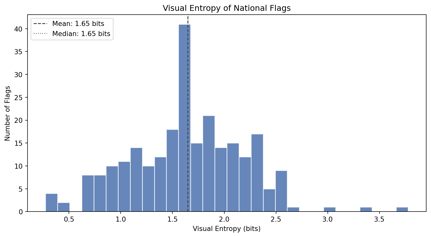
### Visual Entropy
How much *information* does a flag's grayscale image contain? A tricolor made of three solid blocks has very few distinct gray levels and low entropy. A flag with gradients, shading, emblem detail, and anti-aliased curves has many gray levels and high entropy.
```{python}
#| label: entropy-histogram
#| code-summary: "Distribution of visual entropy across flags"
#| fig-cap: "Distribution of visual entropy (Shannon entropy of the grayscale histogram, in bits). Low entropy means the flag has few distinct brightness levels (simple geometric designs). High entropy means the flag contains many brightness levels (detailed artwork, gradients, fine textures)."
fig, ax = plt.subplots(figsize=(9, 5))
ax.hist(df_visual["visual_entropy"], bins=30, color="#4C72B0",
edgecolor="white", alpha=0.85)
ax.axvline(df_visual["visual_entropy"].mean(), color="#333",
linestyle="--", linewidth=1.2,
label=f"Mean: {df_visual['visual_entropy'].mean():.2f} bits")
ax.axvline(df_visual["visual_entropy"].median(), color="#666",
linestyle=":", linewidth=1.2,
label=f"Median: {df_visual['visual_entropy'].median():.2f} bits")
ax.set_xlabel("Visual Entropy (bits)")
ax.set_ylabel("Number of Flags")
ax.set_title("Visual Entropy of National Flags")
ax.legend(loc="upper left")
plt.tight_layout()
plt.show()
```
```{python}
#| label: entropy-extremes
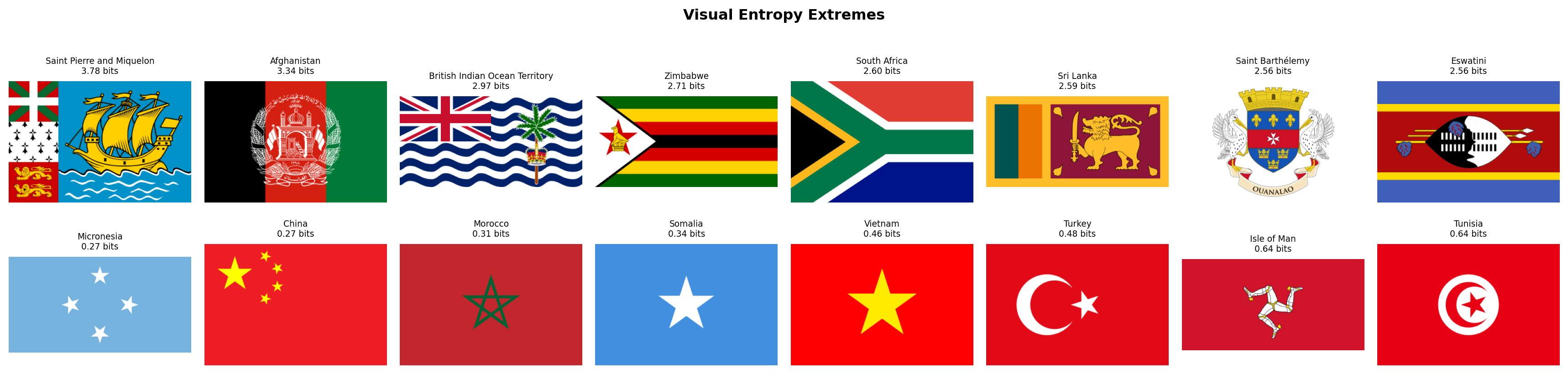
#| code-summary: "Flags with the highest and lowest visual entropy"
#| fig-cap: "Top row: the 8 flags with the highest visual entropy (most information-rich grayscale profiles). These flags contain detailed coats of arms, complex heraldry, or multi-element designs. Bottom row: the 8 flags with the lowest entropy (simplest grayscale profiles). These are clean geometric designs with very few distinct brightness levels."
fig, axes = plt.subplots(2, 8, figsize=(18, 4.5))
for row_idx, (subset, title) in enumerate([
(df_visual.nlargest(8, "visual_entropy"), "Most Complex"),
(df_visual.nsmallest(8, "visual_entropy"), "Simplest"),
]):
for col_idx, (_, flag_row) in enumerate(subset.iterrows()):
ax = axes[row_idx, col_idx]
img = rasterize_flag(flag_dir / f"{flag_row['code']}.svg", width=320)
ax.set_facecolor("#f0f0f0")
ax.imshow(img, aspect="equal")
ax.set_title(f"{flag_row['name']}\n{flag_row['visual_entropy']:.2f} bits", fontsize=7)
ax.axis("off")
axes[row_idx, 0].set_ylabel(title, fontsize=9, rotation=0, labelpad=65, va="center")
plt.suptitle("Visual Entropy Extremes", fontsize=12, fontweight="bold", y=1.01)
plt.tight_layout()
plt.show()
```
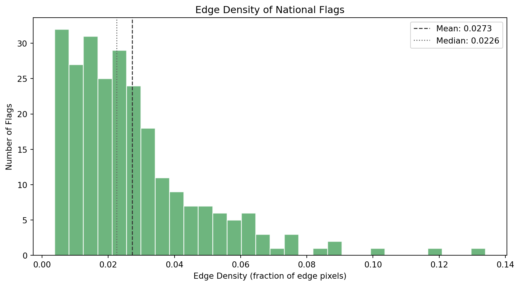
### Edge Density
Edge density tells us how many *boundaries* and *contours* exist in the flag's design. The Canny edge detector finds pixels where brightness changes sharply, stripe boundaries, emblem outlines, text contours, and ornamental detail.
```{python}
#| label: edge-histogram
#| code-summary: "Distribution of edge density across flags"
#| fig-cap: "Distribution of edge density (fraction of pixels detected as edges). Flags cluster in the low range: most designs are geometrically clean. A long right tail captures flags with detailed emblems, coats of arms, and ornamental borders."
fig, ax = plt.subplots(figsize=(9, 5))
ax.hist(df_visual["edge_density"], bins=30, color="#55A868",
edgecolor="white", alpha=0.85)
ax.axvline(df_visual["edge_density"].mean(), color="#333",
linestyle="--", linewidth=1.2,
label=f"Mean: {df_visual['edge_density'].mean():.4f}")
ax.axvline(df_visual["edge_density"].median(), color="#666",
linestyle=":", linewidth=1.2,
label=f"Median: {df_visual['edge_density'].median():.4f}")
ax.set_xlabel("Edge Density (fraction of edge pixels)")
ax.set_ylabel("Number of Flags")
ax.set_title("Edge Density of National Flags")
ax.legend(loc="upper right")
plt.tight_layout()
plt.show()
```
```{python}
#| label: edge-extremes
#| code-summary: "Flags with the highest and lowest edge density"
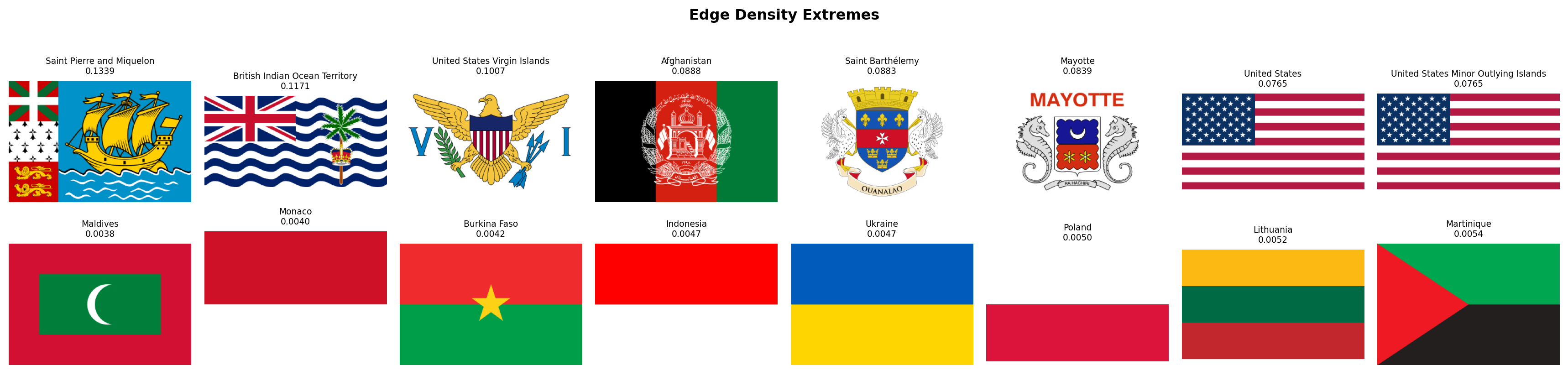
#| fig-cap: "Top row: the 8 flags with the highest edge density. These are the most geometrically detailed designs in the world's flag corpus: coats of arms, text, animals, intricate heraldic devices. Bottom row: the 8 flags with the lowest edge density. These are the cleanest, most minimal designs -- often bicolors or single-field flags with very few boundaries."
fig, axes = plt.subplots(2, 8, figsize=(18, 4.5))
for row_idx, (subset, title) in enumerate([
(df_visual.nlargest(8, "edge_density"), "Most Edges"),
(df_visual.nsmallest(8, "edge_density"), "Fewest Edges"),
]):
for col_idx, (_, flag_row) in enumerate(subset.iterrows()):
ax = axes[row_idx, col_idx]
img = rasterize_flag(flag_dir / f"{flag_row['code']}.svg", width=320)
ax.set_facecolor("#f0f0f0")
ax.imshow(img, aspect="equal")
ax.set_title(f"{flag_row['name']}\n{flag_row['edge_density']:.4f}", fontsize=7)
ax.axis("off")
axes[row_idx, 0].set_ylabel(title, fontsize=9, rotation=0, labelpad=65, va="center")
plt.suptitle("Edge Density Extremes", fontsize=12, fontweight="bold", y=1.01)
plt.tight_layout()
plt.show()
```
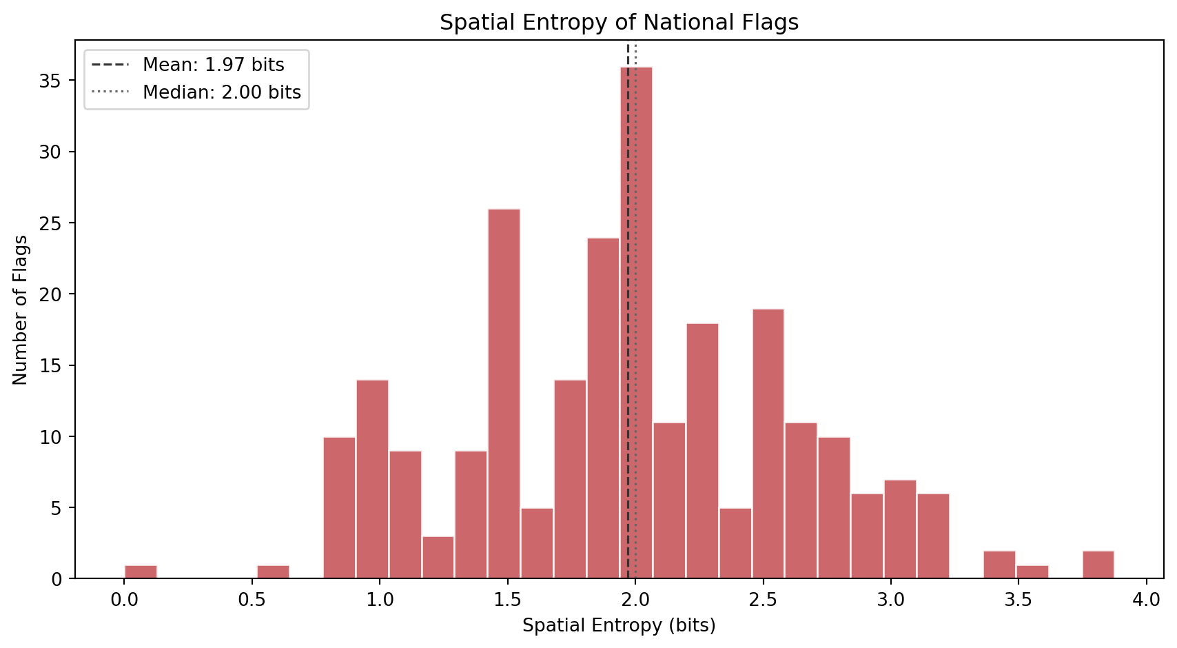
### Spatial Entropy
Where does the complexity *live* inside the flag? Spatial entropy answers this by dividing each flag into a 4x4 grid of cells, computing the mean color of each cell, and measuring how diverse those 16 cell colors are. A flag where all 16 cells have the same color (solid field) scores near zero. A flag where every cell is a different color (like a busy patchwork) scores high.
This metric distinguishes two flags that might have identical visual entropy but very different spatial structures. The USA has stars and stripes distributed across the entire flag (high spatial entropy). Laos has a central circle on a solid background (low spatial entropy). Both might have similar grayscale complexity, but their spatial distribution of detail is very different.
```{python}
#| label: spatial-histogram
#| code-summary: "Distribution of spatial entropy across flags"
#| fig-cap: "Distribution of spatial entropy (entropy of the 4x4 grid color distribution). Low values indicate uniform or single-element designs where most cells share the same color. High values indicate patterned or multi-region designs where the 16 grid cells show diverse colors."
fig, ax = plt.subplots(figsize=(9, 5))
ax.hist(df_visual["spatial_entropy"], bins=30, color="#C44E52",
edgecolor="white", alpha=0.85)
ax.axvline(df_visual["spatial_entropy"].mean(), color="#333",
linestyle="--", linewidth=1.2,
label=f"Mean: {df_visual['spatial_entropy'].mean():.2f} bits")
ax.axvline(df_visual["spatial_entropy"].median(), color="#666",
linestyle=":", linewidth=1.2,
label=f"Median: {df_visual['spatial_entropy'].median():.2f} bits")
ax.set_xlabel("Spatial Entropy (bits)")
ax.set_ylabel("Number of Flags")
ax.set_title("Spatial Entropy of National Flags")
ax.legend(loc="upper left")
plt.tight_layout()
plt.show()
```
```{python}
#| label: spatial-extremes
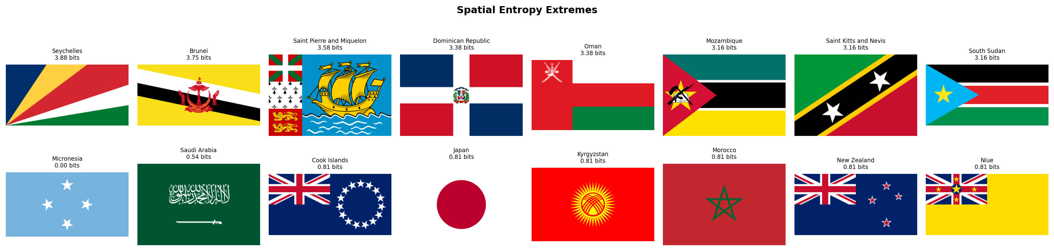
#| code-summary: "Flags with the highest and lowest spatial entropy"
#| fig-cap: "Top row: the 8 flags with the highest spatial entropy. These designs distribute complexity across the entire flag surface. Bottom row: the 8 flags with the lowest spatial entropy. These are the most spatially uniform designs, where nearly all grid cells share the same dominant color."
fig, axes = plt.subplots(2, 8, figsize=(18, 4.5))
for row_idx, (subset, title) in enumerate([
(df_visual.nlargest(8, "spatial_entropy"), "Most Distributed"),
(df_visual.nsmallest(8, "spatial_entropy"), "Most Uniform"),
]):
for col_idx, (_, flag_row) in enumerate(subset.iterrows()):
ax = axes[row_idx, col_idx]
img = rasterize_flag(flag_dir / f"{flag_row['code']}.svg", width=320)
ax.set_facecolor("#f0f0f0")
ax.imshow(img, aspect="equal")
ax.set_title(f"{flag_row['name']}\n{flag_row['spatial_entropy']:.2f} bits", fontsize=7)
ax.axis("off")
axes[row_idx, 0].set_ylabel(title, fontsize=9, rotation=0, labelpad=65, va="center")
plt.suptitle("Spatial Entropy Extremes", fontsize=12, fontweight="bold", y=1.01)
plt.tight_layout()
plt.show()
```
### Complexity Landscape
Let's combine all three metrics into a single view. The scatter plot below maps each flag in the space of edge density vs visual entropy, with spatial entropy encoded as marker color. This reveals how the three complementary dimensions of complexity relate to each other.
```{python}
#| label: complexity-landscape
#| code-summary: "Interactive scatter: edge density vs visual entropy, colored by spatial entropy"
#| fig-cap: "Each dot is a flag. X-axis: visual entropy (grayscale information content). Y-axis: edge density (geometric detail). Color: spatial entropy (how distributed the complexity is). Flags in the upper-right are both information-rich and edge-dense -- the most visually complex designs in the world."
fig = px.scatter(
df_visual, x="visual_entropy", y="edge_density",
color="spatial_entropy",
color_continuous_scale="magma",
hover_name="name",
hover_data={"visual_entropy": ":.2f", "edge_density": ":.4f",
"spatial_entropy": ":.2f"},
labels={"visual_entropy": "Visual Entropy (bits)",
"edge_density": "Edge Density",
"spatial_entropy": "Spatial Entropy (bits)"},
title="The Complexity Landscape of National Flags",
opacity=0.75, width=800, height=600,
)
fig.show()
```
### Palette Complexity Meets Visual Complexity
How does Family 2's `palette_complexity` (number of distinct color clusters) relate to Family 3's visual complexity? Flags with detailed coats of arms should score high on both: they have many colors *and* many edges. But clean geometric designs can have high color variety without high edge density (think of the South African flag: 6 colors, very few edges). This cross-family scatter tests whether color complexity and geometric complexity are redundant or complementary.
```{python}
#| label: palette-vs-edge
#| code-summary: "Interactive cross-family scatter: palette complexity vs edge density"
#| fig-cap: "Each dot is a flag. X-axis: palette complexity (Family 2). Y-axis: edge density (Family 3). Color: visual entropy (Family 3). The positive correlation confirms that flags with more colors also tend to have more edges, but the scatter is wide -- many flags with 3-4 colors span the full range of edge density, showing that the two metrics capture genuinely different design dimensions."
df_cross_visual = df_complexity[["code", "name", "palette_complexity"]].merge(
df_visual[["code", "visual_entropy", "edge_density", "spatial_entropy"]], on="code"
)
corr = df_cross_visual["palette_complexity"].corr(df_cross_visual["edge_density"])
fig = px.scatter(
df_cross_visual, x="palette_complexity", y="edge_density",
color="visual_entropy",
color_continuous_scale="viridis",
hover_name="name",
hover_data={"palette_complexity": True, "edge_density": ":.4f",
"visual_entropy": ":.2f"},
labels={"palette_complexity": "Palette Complexity (Family 2)",
"edge_density": "Edge Density (Family 3)",
"visual_entropy": "Visual Entropy (bits)"},
title=f"Color Complexity vs Geometric Complexity (Pearson r = {corr:.3f})",
opacity=0.75, width=800, height=600,
)
fig.update_layout(xaxis=dict(dtick=1))
fig.show()
```
### Discussion
Several findings emerge from Family 3.
**Most flags are simple.** Visual entropy clusters in a narrow band, and edge density is heavily right-skewed: the median flag has very few edge pixels. This confirms NAVA's observation that simplicity is the dominant design principle in flag design worldwide. The few flags with high edge density stand out as clear outliers, these are almost always flags with detailed coats of arms, heraldic devices, or text inscriptions that violate NAVA's "keep it simple" and "no lettering or seals" principles.
**Edge density is the sharpest discriminator.** While visual entropy captures grayscale diversity (which can be elevated by gradients and subtle shading), edge density directly measures the number of sharp boundaries in the design. The most edge-dense flags are immediately recognizable as the world's most visually intricate designs, while the least edge-dense are the cleanest geometric compositions.
**Spatial entropy reveals structural families.** Flags with high spatial entropy distribute their complexity across the entire surface (striped patterns, multi-panel designs, star fields). Flags with low spatial entropy concentrate all their detail in one region or repeat the same color everywhere. This metric will be particularly useful for distinguishing between "busy but structured" designs (like the USA) and "busy but concentrated" designs (like flags with a central emblem on a plain field).
**Color complexity and geometric complexity are correlated but not redundant.** The positive correlation between palette complexity and edge density makes intuitive sense: more colors means more boundaries. But the wide scatter shows that many flags break this pattern. Clean geometric flags like South Africa or Mauritius pack many colors into few edges, while detailed monochromatic emblems create many edges from few colors. The two metric families capture genuinely different design dimensions, which validates our decision to measure both.
With 14 features now extracted (8 + 3 + 3), we have covered both the *color* and *complexity* dimensions of flag design. In the next section, we turn to **Geometric Structure**: the spatial organization of lines and symmetries that define each flag's layout.
## Geometric Structure
Flags encode their identity not just in color, but in *geometry*. A horizontal triband, a vertical tricolor, a Nordic cross, a diagonal slash: each structural pattern carries historical weight and group membership. Horizontal tricolors descend from the Dutch and French revolutionary traditions. Nordic crosses mark Scandinavian identity. Diagonal stripes are rarer and more dynamic, often signaling a deliberate break from colonial templates. And symmetry, whether a flag reads the same from left to right, is a fundamental design property that most flags share but a few deliberately violate.
We detect dominant line angles using the **Hough Transform**, a classical computer vision algorithm that converts edge pixels into a voting space of possible lines. Each detected edge pixel "votes" for all lines that could pass through it, and the lines with the most votes emerge as the dominant linear structures in the image. By classifying these peak lines by their angle, we quantify whether a flag's geometry is primarily horizontal, vertical, or diagonal. Separately, we measure bilateral symmetry as the pixel-wise Pearson correlation between the flag and its horizontal mirror image.
One important design choice: rather than hardcoding 45 degrees as the center of the "diagonal" zone, we use a three-way angular partition with deliberately tight horizontal and vertical bins. A line counts as horizontal only if it falls within 10 degrees of the horizon, and vertical only within 10 degrees of the vertical axis; *everything in between* is classified as diagonal. This strict definition avoids a common pitfall: on a flag with a 2:1 aspect ratio, a corner-to-corner line sits at arctan(2) = 63.4 degrees, and even the triangle edges of American Samoa sit at roughly 76 degrees. With a looser threshold those would be misclassified as horizontal. Our tight partition correctly labels any line that is not truly flat or truly upright as diagonal.
```{python}
#| label: compute-geometric-structure
#| code-summary: "Function: compute_geometric_structure()"
def compute_geometric_structure(img_rgb):
"""
Compute geometric structure metrics for a flag image.
Parameters
----------
img_rgb : np.ndarray
Flag image as an (H, W, 3) RGB array.
Returns
-------
tuple of four floats:
horizontal_dominance : fraction of strong Hough lines that are near-horizontal
vertical_dominance : fraction of strong Hough lines that are near-vertical
diagonal_dominance : fraction of strong Hough lines in the diagonal zone
symmetry_score : Pearson correlation between the flag and its mirror
Notes
-----
The Hough Transform detects lines in the edge map. We use a threshold
of 0.3x the maximum accumulator value to select "strong" lines, then
classify each line's angle into one of three mutually exclusive bins:
- Horizontal: |angle| > 80 deg (within 10 deg of +/-90 in skimage convention)
- Vertical: |angle| < 10 deg (within 10 deg of 0 in skimage convention)
- Diagonal: 10 <= |angle| <= 80 (everything in between)
The tight 10-degree tolerance ensures that only truly flat or truly
upright lines count as horizontal/vertical. Lines at moderate angles
(like the triangle edges of American Samoa at ~76 deg, or a 2:1
corner-to-corner diagonal at ~63 deg) are correctly classified as diagonal.
Symmetry uses Pearson r rather than simple pixel difference because
it is invariant to global brightness shifts and captures both:
- Positive values: mirror-symmetric designs (most flags)
- Zero: no particular left-right relationship
- Negative values: anti-symmetric designs (e.g., Malta: white|red -> red|white)
"""
# --- Step 1: Convert to grayscale and detect edges ---
gray = cv2.cvtColor(img_rgb, cv2.COLOR_RGB2GRAY)
edges = canny(gray, sigma=1.0)
# --- Step 2: Hough Transform ---
# In skimage convention: angle=0 means vertical line, angle=+/-90 means horizontal.
# We test 360 equally spaced angles spanning the full -90 to +90 range.
tested_angles = np.linspace(-np.pi / 2, np.pi / 2, 360, endpoint=False)
hspace, angles, dists = hough_line(edges, theta=tested_angles)
# Select strong lines: peaks above 30% of the maximum accumulator value.
# min_distance and min_angle prevent detecting the same line twice.
threshold = 0.3 * hspace.max() if hspace.max() > 0 else 1
_, peak_angles, _ = hough_line_peaks(
hspace, angles, dists,
min_distance=9, # minimum pixel distance between peaks
min_angle=10, # minimum angular separation between peaks
threshold=threshold
)
# --- Step 3: Classify line angles ---
if len(peak_angles) == 0:
# No lines detected (extremely simple flag, e.g., solid color)
horiz, vert, diag = 0.0, 0.0, 0.0
else:
angles_deg = np.degrees(peak_angles)
n_total = len(angles_deg)
# Three mutually exclusive bins covering the full -90 to +90 range.
# Tight 10-degree tolerance: only truly flat/upright lines are H/V.
n_horiz = np.sum(np.abs(np.abs(angles_deg) - 90) < 10)
n_vert = np.sum(np.abs(angles_deg) < 10)
n_diag = n_total - n_horiz - n_vert # everything in between
horiz = float(n_horiz / n_total)
vert = float(n_vert / n_total)
diag = float(n_diag / n_total)
# --- Step 4: Bilateral symmetry via Pearson correlation ---
gray_f = gray.astype(np.float64)
mirrored = np.fliplr(gray_f)
diff_orig = gray_f - gray_f.mean()
diff_mirr = mirrored - mirrored.mean()
numerator = (diff_orig * diff_mirr).sum()
denominator = np.sqrt((diff_orig ** 2).sum() * (diff_mirr ** 2).sum())
if denominator == 0:
sym = 1.0 # solid color flag is trivially symmetric
else:
sym = float(numerator / denominator)
return (
round(horiz, 4),
round(vert, 4),
round(diag, 4),
round(sym, 4),
)
```
### Extraction
```{python}
#| label: extract-geometry
#| code-summary: "Extract geometric structure for all 250 flags"
# ---- Run compute_geometric_structure() on every flag ----
rows_geom = []
for _, row in df_palette.iterrows():
svg_path = flag_dir / f"{row['code']}.svg"
if not svg_path.exists():
continue
img = rasterize_flag(svg_path)
h_dom, v_dom, d_dom, sym = compute_geometric_structure(img)
rows_geom.append({
"code": row["code"],
"name": row["name"],
"horizontal_dominance": h_dom,
"vertical_dominance": v_dom,
"diagonal_dominance": d_dom,
"symmetry_score": sym,
})
df_geometry = pd.DataFrame(rows_geom)
itshow(df_geometry, lengthMenu=[5, 10, 25, 50], pageLength=5)
```
### Horizontal Dominance
Horizontal lines are the backbone of the world's most common flag family: the horizontal triband (three horizontal stripes). From the Dutch prinsenvlag to the pan-African and pan-Arab traditions, horizontal stripes carry enormous historical weight. We expect the distribution to be heavily weighted toward high values, with a secondary cluster at zero for flags whose geometry runs in other directions.
```{python}
#| label: horizontal-dominance-hist
#| code-summary: "Histogram of horizontal dominance across all 250 flags"
#| fig-cap: "Horizontal dominance measures the fraction of strong Hough lines that are near-horizontal. The spike at 1.0 represents flags whose geometry is purely horizontal -- the classic triband family. The second-largest cluster at 0.0 represents flags with no horizontal lines at all, typically vertical tricolors or diagonal designs."
fig, ax = plt.subplots(figsize=(9, 5))
ax.hist(df_geometry["horizontal_dominance"], bins=30, color="#2196F3", edgecolor="white", alpha=0.85)
ax.set_xlabel("Horizontal Dominance")
ax.set_ylabel("Number of Flags")
ax.set_title("Horizontal Dominance Across 250 National Flags")
ax.axvline(df_geometry["horizontal_dominance"].median(), color="red", linestyle="--", linewidth=1.2, label=f'Median = {df_geometry["horizontal_dominance"].median():.2f}')
ax.legend()
plt.tight_layout()
plt.show()
```
```{python}
#| label: horizontal-extremes
#| code-summary: "Flags with highest and lowest horizontal dominance"
#| fig-cap: "Top row: the five flags with the strongest horizontal line structure -- all classic horizontal tribands or multi-stripe designs. Bottom row: the five flags with the least horizontal geometry, typically diagonal or complex emblem designs."
top_h = df_geometry.nlargest(5, "horizontal_dominance")
bot_h = df_geometry.nsmallest(5, "horizontal_dominance")
fig, axes = plt.subplots(2, 5, figsize=(14, 5))
for i, (_, r) in enumerate(top_h.iterrows()):
img = rasterize_flag(flag_dir / f"{r['code']}.svg", width=320)
axes[0, i].imshow(img)
axes[0, i].set_title(f"{r['name']}\n{r['horizontal_dominance']:.2f}", fontsize=8)
axes[0, i].axis("off")
for i, (_, r) in enumerate(bot_h.iterrows()):
img = rasterize_flag(flag_dir / f"{r['code']}.svg", width=320)
axes[1, i].imshow(img)
axes[1, i].set_title(f"{r['name']}\n{r['horizontal_dominance']:.2f}", fontsize=8)
axes[1, i].axis("off")
axes[0, 0].set_ylabel("Most Horizontal", fontsize=10, fontweight="bold")
axes[1, 0].set_ylabel("Least Horizontal", fontsize=10, fontweight="bold")
fig.suptitle("Horizontal Dominance Extremes", fontsize=13, fontweight="bold", y=1.02)
plt.tight_layout()
plt.show()
```
### Vertical Dominance
Vertical tricolors form the second-largest structural family in the world, descending from the French revolutionary tricolore. We expect a bimodal distribution: many flags at zero (no vertical lines) and a cluster near 1.0 for pure vertical designs, with a smaller middle group for flags that combine vertical and horizontal elements (like crosses).
```{python}
#| label: vertical-dominance-hist
#| code-summary: "Histogram of vertical dominance across all 250 flags"
#| fig-cap: "Vertical dominance measures the fraction of strong Hough lines that are near-vertical. The distribution is strongly right-skewed: most flags have few or no vertical lines. The cluster at 1.0 captures the vertical tricolor family (France, Italy, Ireland, Belgium, etc.)."
fig, ax = plt.subplots(figsize=(9, 5))
ax.hist(df_geometry["vertical_dominance"], bins=30, color="#FF9800", edgecolor="white", alpha=0.85)
ax.set_xlabel("Vertical Dominance")
ax.set_ylabel("Number of Flags")
ax.set_title("Vertical Dominance Across 250 National Flags")
ax.axvline(df_geometry["vertical_dominance"].median(), color="red", linestyle="--", linewidth=1.2, label=f'Median = {df_geometry["vertical_dominance"].median():.2f}')
ax.legend()
plt.tight_layout()
plt.show()
```
```{python}
#| label: vertical-extremes
#| code-summary: "Flags with highest and lowest vertical dominance"
#| fig-cap: "Top row: the five flags with the strongest vertical line structure. Bottom row: the five flags with the least vertical geometry."
top_v = df_geometry.nlargest(5, "vertical_dominance")
bot_v = df_geometry.nsmallest(5, "vertical_dominance")
fig, axes = plt.subplots(2, 5, figsize=(14, 5))
for i, (_, r) in enumerate(top_v.iterrows()):
img = rasterize_flag(flag_dir / f"{r['code']}.svg", width=320)
axes[0, i].imshow(img)
axes[0, i].set_title(f"{r['name']}\n{r['vertical_dominance']:.2f}", fontsize=8)
axes[0, i].axis("off")
for i, (_, r) in enumerate(bot_v.iterrows()):
img = rasterize_flag(flag_dir / f"{r['code']}.svg", width=320)
axes[1, i].imshow(img)
axes[1, i].set_title(f"{r['name']}\n{r['vertical_dominance']:.2f}", fontsize=8)
axes[1, i].axis("off")
axes[0, 0].set_ylabel("Most Vertical", fontsize=10, fontweight="bold")
axes[1, 0].set_ylabel("Least Vertical", fontsize=10, fontweight="bold")
fig.suptitle("Vertical Dominance Extremes", fontsize=13, fontweight="bold", y=1.02)
plt.tight_layout()
plt.show()
```
### Diagonal Dominance
Diagonal lines are the rarest of the three structural directions. Most flag design traditions favor horizontal or vertical compositions. When diagonals do appear, they are often dramatic and intentional: the bold slash of Tanzania, the saltire of Jamaica, the chevron of South Africa. Diagonal designs are particularly relevant to our **Revolutionary Diagonal** hypothesis: flags born from anti-colonial struggle may favor diagonals as a deliberate break from the orderly horizontal and vertical grid of European tradition.
A caveat: flags with curved elements (circles, crescents, emblems) can produce Hough lines at various angles, inflating diagonal scores even when the flag has no genuine diagonal *stripes*. We note this in the discussion and rely on high diagonal scores as an indicator rather than a perfect classifier.
```{python}
#| label: diagonal-dominance-hist
#| code-summary: "Histogram of diagonal dominance across all 250 flags"
#| fig-cap: "Diagonal dominance measures the fraction of strong Hough lines in the 20-70 degree zone. The spike near 0.0 reflects the dominance of horizontal and vertical design traditions. The tail toward 1.0 captures deliberately diagonal designs like Tanzania, Namibia, and Jamaica."
fig, ax = plt.subplots(figsize=(9, 5))
ax.hist(df_geometry["diagonal_dominance"], bins=30, color="#4CAF50", edgecolor="white", alpha=0.85)
ax.set_xlabel("Diagonal Dominance")
ax.set_ylabel("Number of Flags")
ax.set_title("Diagonal Dominance Across 250 National Flags")
ax.axvline(df_geometry["diagonal_dominance"].median(), color="red", linestyle="--", linewidth=1.2, label=f'Median = {df_geometry["diagonal_dominance"].median():.2f}')
ax.legend()
plt.tight_layout()
plt.show()
```
```{python}
#| label: diagonal-extremes
#| code-summary: "Flags with highest and lowest diagonal dominance"
#| fig-cap: "Top row: the five flags with the strongest diagonal geometry -- bold slashes and saltires that break from the horizontal/vertical grid. Bottom row: the five flags with pure horizontal or vertical geometry and zero diagonal lines."
top_d = df_geometry.nlargest(5, "diagonal_dominance")
bot_d = df_geometry.nsmallest(5, "diagonal_dominance")
fig, axes = plt.subplots(2, 5, figsize=(14, 5))
for i, (_, r) in enumerate(top_d.iterrows()):
img = rasterize_flag(flag_dir / f"{r['code']}.svg", width=320)
axes[0, i].imshow(img)
axes[0, i].set_title(f"{r['name']}\n{r['diagonal_dominance']:.2f}", fontsize=8)
axes[0, i].axis("off")
for i, (_, r) in enumerate(bot_d.iterrows()):
img = rasterize_flag(flag_dir / f"{r['code']}.svg", width=320)
axes[1, i].imshow(img)
axes[1, i].set_title(f"{r['name']}\n{r['diagonal_dominance']:.2f}", fontsize=8)
axes[1, i].axis("off")
axes[0, 0].set_ylabel("Most Diagonal", fontsize=10, fontweight="bold")
axes[1, 0].set_ylabel("Least Diagonal", fontsize=10, fontweight="bold")
fig.suptitle("Diagonal Dominance Extremes", fontsize=13, fontweight="bold", y=1.02)
plt.tight_layout()
plt.show()
```
### Symmetry Score
Most flags are designed to be readable from both sides, when a flag flies on a pole, a viewer on either side should see essentially the same design. This means most flags have high bilateral symmetry. But some flags deliberately break this rule: Nepal's unique shape is inherently asymmetric. Portugal and Sri Lanka place their emblems off-center. And a special category of flags (Malta, Algeria, Panama) have *anti-symmetric* designs: their left and right halves are color-swapped, producing strongly *negative* Pearson correlations when mirrored.
```{python}
#| label: symmetry-hist
#| code-summary: "Histogram of symmetry scores across all 250 flags"
#| fig-cap: "Symmetry score (Pearson correlation with the horizontal mirror image) ranges from -1 (perfectly anti-symmetric) through 0 (no relationship) to +1 (perfectly symmetric). The right-skewed distribution confirms that most flags are designed to be symmetric, but a substantial minority clusters below zero -- these are flags whose left and right halves are deliberately different."
fig, ax = plt.subplots(figsize=(9, 5))
ax.hist(df_geometry["symmetry_score"], bins=40, color="#9C27B0", edgecolor="white", alpha=0.85)
ax.set_xlabel("Symmetry Score (Pearson r)")
ax.set_ylabel("Number of Flags")
ax.set_title("Bilateral Symmetry Across 250 National Flags")
ax.axvline(0, color="gray", linestyle=":", linewidth=1.0, alpha=0.6)
ax.axvline(df_geometry["symmetry_score"].median(), color="red", linestyle="--", linewidth=1.2, label=f'Median = {df_geometry["symmetry_score"].median():.2f}')
ax.legend()
plt.tight_layout()
plt.show()
```
```{python}
#| label: symmetry-extremes
#| code-summary: "Flags with highest and lowest symmetry scores"
#| fig-cap: "Top row: the five most symmetric flags -- centered horizontal bands that are identical when mirrored. Bottom row: the five most anti-symmetric flags -- bicolor or quartered designs whose left and right halves are color-swapped, producing strongly negative correlations."
top_s = df_geometry.nlargest(5, "symmetry_score")
bot_s = df_geometry.nsmallest(5, "symmetry_score")
fig, axes = plt.subplots(2, 5, figsize=(14, 5))
for i, (_, r) in enumerate(top_s.iterrows()):
img = rasterize_flag(flag_dir / f"{r['code']}.svg", width=320)
axes[0, i].imshow(img)
axes[0, i].set_title(f"{r['name']}\n{r['symmetry_score']:.2f}", fontsize=8)
axes[0, i].axis("off")
for i, (_, r) in enumerate(bot_s.iterrows()):
img = rasterize_flag(flag_dir / f"{r['code']}.svg", width=320)
axes[1, i].imshow(img)
axes[1, i].set_title(f"{r['name']}\n{r['symmetry_score']:.2f}", fontsize=8)
axes[1, i].axis("off")
axes[0, 0].set_ylabel("Most Symmetric", fontsize=10, fontweight="bold")
axes[1, 0].set_ylabel("Most Anti-Symmetric", fontsize=10, fontweight="bold")
fig.suptitle("Symmetry Score Extremes", fontsize=13, fontweight="bold", y=1.02)
plt.tight_layout()
plt.show()
```
### The Structural Landscape
How do the three directional dominances relate to each other? Since they must sum to 1.0 for any flag (every Hough line is classified into exactly one bin), the natural visualization is a ternary-style scatter plot. Here we use a 2D projection: horizontal dominance on the x-axis, vertical dominance on the y-axis, and since diagonal = 1 - horizontal - vertical, purely diagonal flags cluster near the origin.
```{python}
#| label: structural-landscape
#| code-summary: "Interactive scatter: horizontal vs vertical dominance, colored by symmetry"
#| fig-cap: "Each dot is a flag. X-axis: horizontal dominance. Y-axis: vertical dominance. Color: symmetry score. The three corners of the triangle represent pure design families: horizontal tribands (right), vertical tricolors (top), and diagonal designs (origin). Symmetric flags (red) cluster in the horizontal and vertical zones, while asymmetric flags (blue) are scattered throughout."
fig = px.scatter(
df_geometry, x="horizontal_dominance", y="vertical_dominance",
color="symmetry_score",
color_continuous_scale="RdBu",
range_color=[-1, 1],
hover_name="name",
hover_data={"horizontal_dominance": ":.2f", "vertical_dominance": ":.2f",
"diagonal_dominance": ":.2f", "symmetry_score": ":.3f"},
labels={"horizontal_dominance": "Horizontal Dominance",
"vertical_dominance": "Vertical Dominance",
"symmetry_score": "Symmetry Score"},
title="The Structural Landscape of National Flags",
opacity=0.75, width=800, height=650,
)
# Triangle boundary (h + v <= 1)
fig.add_shape(type="line", x0=0, y0=1, x1=1, y1=0,
line=dict(color="black", width=1, dash="dash"), opacity=0.3)
fig.update_layout(xaxis_range=[-0.05, 1.05], yaxis_range=[-0.05, 1.05])
fig.show()
```
### Symmetry vs Edge Density
How does a flag's geometric complexity (from Family 3) relate to its symmetry? We might expect that visually complex flags, those with detailed emblems, coats of arms, and text, tend to be less symmetric, because such detail is often placed off-center (like Portugal's coat of arms on the hoist side). This cross-family scatter tests that intuition.
```{python}
#| label: symmetry-vs-edges
#| code-summary: "Interactive cross-family scatter: symmetry score vs edge density"
#| fig-cap: "Each dot is a flag. X-axis: edge density (Family 3). Y-axis: symmetry score (Family 4). Color: diagonal dominance. The negative trend confirms that visually complex flags tend to be less symmetric. Flags in the upper-left are the idealized 'good flag': simple geometry with perfect bilateral symmetry. Flags in the lower-right are detailed, asymmetric designs."
df_cross_geom = df_geometry[["code", "name", "symmetry_score", "diagonal_dominance"]].merge(
df_visual[["code", "edge_density"]], on="code"
)
corr = df_cross_geom["edge_density"].corr(df_cross_geom["symmetry_score"])
fig = px.scatter(
df_cross_geom, x="edge_density", y="symmetry_score",
color="diagonal_dominance",
color_continuous_scale="YlOrRd",
hover_name="name",
hover_data={"edge_density": ":.4f", "symmetry_score": ":.3f",
"diagonal_dominance": ":.2f"},
labels={"edge_density": "Edge Density (Family 3)",
"symmetry_score": "Symmetry Score (Family 4)",
"diagonal_dominance": "Diagonal Dominance"},
title=f"Geometric Complexity vs Bilateral Symmetry (Pearson r = {corr:.3f})",
opacity=0.75, width=800, height=600,
)
fig.add_hline(y=0, line_dash="dot", line_color="gray", opacity=0.5)
fig.show()
```
### Discussion
Family 4 reveals the structural skeleton of flag design.
**Horizontal lines dominate the world.** The average flag has a horizontal dominance of 0.54, more than double its vertical (0.21) or diagonal (0.24) dominance. This quantitatively confirms the global prevalence of horizontal stripe patterns, the design family that stretches from the Netherlands through the pan-African, pan-Arab, and pan-Slavic traditions. Horizontal stripes are the default grammar of modern flag design.
**Vertical tricolors form a distinct but smaller family.** The vertical dominance distribution is bimodal: most flags score near zero, with a clear secondary peak at 1.0 for the French-tradition vertical tricolors. These two peaks correspond precisely to two of the world's largest flag design families, and the Hough Transform cleanly separates them.
**Diagonal designs are rare and intentional.** Only a handful of flags achieve high diagonal dominance through actual diagonal stripes (Tanzania, Namibia, Jamaica, DR Congo). The remaining "diagonal" scores come from curved elements (circles, crescents) whose Hough projections scatter across multiple angles. This caveat is important: high diagonal dominance is a strong signal when it reaches 0.8 or above, but moderate values (0.3-0.6) may reflect curves rather than true diagonal geometry.
**Symmetry splits the world in two.** About 72 flags score above 0.99 (near-perfect bilateral symmetry), while 48 flags score below zero (anti-symmetric). The anti-symmetric group is particularly interesting: these are bicolor flags (Malta, Algeria) and quartered designs (Panama) whose left and right halves are deliberately color-swapped. The Pearson correlation captures this as a negative value, giving us a richer signal than a simple symmetric/asymmetric binary.
**Complexity and asymmetry go hand in hand.** The cross-family scatter reveals a negative correlation between edge density and symmetry score: flags with detailed coats of arms, seals, and text inscriptions tend to be less symmetric, often because these elements are placed off-center on the hoist side. This supports NAVA's design principle that simplicity and visual clarity are connected properties.
With 18 features now extracted (8 + 3 + 3 + 4), only one metric remains: the flag's **aspect ratio**, which we measure in the next section.
## Aspect Ratio
The shape of a flag is one of its most fundamental design decisions, yet it is easy to overlook in computational analyses that resize every image to a uniform grid. A flag's aspect ratio, width divided by height, is fixed by law or tradition and carries real meaning. The 3:2 ratio (~1.50) is the global default, used by roughly half the world. The 2:1 ratio (~2.00) marks a second large family, dominated by former British colonies. Switzerland and Vatican City are the only square flags (1.00). Nepal is the only sovereign flag taller than it is wide (~0.82), a double-pennant shape that breaks every rectangle assumption. And Qatar stretches to nearly 2.55:1, the widest of all.
Unlike the previous families, aspect ratio requires no edge detection or color analysis. We simply rasterize each SVG at a reference width and measure the resulting image dimensions. To avoid pixel-rounding artifacts, we use a larger rasterization width (800 pixels) for this single metric.
```{python}
#| label: compute-aspect-ratio
#| code-summary: "Function: compute_aspect_ratio()"
def compute_aspect_ratio(svg_path, reference_width=800):
"""
Compute the aspect ratio (width / height) of a flag from its SVG source.
Parameters
----------
svg_path : Path or str
Path to the SVG file.
reference_width : int
Rasterization width in pixels. A larger value reduces rounding error
in the height dimension. Default 800.
Returns
-------
float
Width / height. Values > 1 mean wider than tall (the vast majority).
Values < 1 mean taller than wide (only Nepal).
Values == 1 mean square (Switzerland, Vatican City).
"""
# Rasterize the SVG at the reference width.
# CairoSVG respects the SVG's intrinsic aspect ratio,
# so the height adjusts automatically.
png_data = cairosvg.svg2png(url=str(svg_path), output_width=reference_width)
img = Image.open(io.BytesIO(png_data)).convert("RGB")
w, h = img.size
return round(w / h, 4)
```
### Extraction
```{python}
#| label: extract-aspect-ratio
#| code-summary: "Run aspect ratio extraction on all flags"
# ---- Compute aspect ratio for every flag ----
rows_ar = []
for _, row in df_palette.iterrows():
svg_path = flag_dir / f"{row['code']}.svg"
if not svg_path.exists():
continue
ar = compute_aspect_ratio(svg_path)
rows_ar.append({
"code": row["code"],
"name": row["name"],
"aspect_ratio": ar,
})
df_aspect = pd.DataFrame(rows_ar)
itshow(df_aspect, lengthMenu=[5, 10, 25, 50], pageLength=5)
```
### The Shape Distribution
The histogram below reveals that aspect ratio is not a continuous spectrum: it clusters tightly around a handful of standard values. Two peaks dominate the landscape, 3:2 and 2:1, with a scattering of rarer proportions in between and at the extremes.
```{python}
#| label: aspect-ratio-histogram
#| code-summary: "Histogram of aspect ratios across 250 flags"
#| fig-cap: "The distribution of flag aspect ratios is strongly bimodal. The tallest peak sits at 1.50 (the 3:2 ratio used by about 110 flags), with a second peak at 2.00 (the 2:1 ratio used by about 77 flags). A handful of flags occupy rarer proportions: square (1.00), nearly square (Belgium at 1.15, Niger at 1.17), and extremely wide (Qatar at 2.55)."
fig, ax = plt.subplots(figsize=(10, 5))
# Use narrow bins to reveal the discrete clustering
ax.hist(df_aspect["aspect_ratio"], bins=40, color="#2c7bb6", edgecolor="white",
linewidth=0.5, alpha=0.85)
# Mark the major standard ratios with vertical lines
standards = {
"Nepal\n(~0.82)": 0.82,
"1:1\n(CH, VA)": 1.00,
"2:3\n(~1.50)": 1.50,
"1:2\n(~2.00)": 2.00,
"Qatar\n(~2.55)": 2.55,
}
for label, val in standards.items():
ax.axvline(val, color="#d7191c", linestyle="--", linewidth=1, alpha=0.7)
ax.text(val, ax.get_ylim()[1] * 0.92, label, ha="center", fontsize=7,
color="#d7191c", fontweight="bold")
ax.set_xlabel("Aspect Ratio (width / height)")
ax.set_ylabel("Number of Flags")
ax.set_title("Flag Aspect Ratios Cluster Around a Few Standard Proportions")
plt.tight_layout()
plt.show()
```
### The Extremes
```{python}
#| label: aspect-ratio-extremes
#| code-summary: "Flag strip: narrowest and widest aspect ratios"
#| fig-cap: "Top row: the 5 narrowest flags (closest to square or taller than wide). Bottom row: the 5 widest flags. Nepal's double-pennant shape (aspect ratio 0.82) is a global outlier. Qatar (2.55) is the widest. Most of the widest flags follow the British 2:1 tradition."
n_show = 5
narrowest = df_aspect.nsmallest(n_show, "aspect_ratio")
widest = df_aspect.nlargest(n_show, "aspect_ratio")
fig, axes = plt.subplots(2, n_show, figsize=(14, 5))
fig.suptitle("Narrowest and Widest National Flags", fontsize=13, fontweight="bold")
for col_idx, (_, flag_row) in enumerate(narrowest.iterrows()):
ax = axes[0, col_idx]
img = rasterize_flag(flag_dir / f"{flag_row['code']}.svg", width=320)
ax.imshow(img)
ax.set_title(f"{flag_row['name']}\n({flag_row['aspect_ratio']:.2f})", fontsize=8)
ax.axis("off")
for col_idx, (_, flag_row) in enumerate(widest.sort_values("aspect_ratio", ascending=False).iterrows()):
ax = axes[1, col_idx]
img = rasterize_flag(flag_dir / f"{flag_row['code']}.svg", width=320)
ax.imshow(img)
ax.set_title(f"{flag_row['name']}\n({flag_row['aspect_ratio']:.2f})", fontsize=8)
ax.axis("off")
axes[0, 0].set_ylabel("Narrowest", fontsize=10, fontweight="bold")
axes[1, 0].set_ylabel("Widest", fontsize=10, fontweight="bold")
plt.tight_layout()
plt.show()
```
### Aspect Ratio and Symmetry
Does a flag's proportions relate to its bilateral symmetry? Square flags (Switzerland, Vatican City) are perfectly symmetric by design. Non-standard aspect ratios might correlate with unusual flag shapes that also break left-right symmetry. This cross-family scatter tests the relationship.
```{python}
#| label: aspect-vs-symmetry
#| code-summary: "Interactive cross-family scatter: aspect ratio vs symmetry score"
#| fig-cap: "Each dot is a flag. X-axis: aspect ratio (Family 5). Y-axis: symmetry score (Family 4). Color: horizontal dominance (Family 4). The two square flags (Switzerland, Vatican City) both sit at perfect symmetry. Nepal, the only flag with aspect ratio below 1, is also strongly asymmetric. The bulk of flags cluster in two vertical bands at 1.50 and 2.00, showing the full range of symmetry within each standard proportion."
df_cross_ar = df_aspect[["code", "name", "aspect_ratio"]].merge(
df_geometry[["code", "symmetry_score", "horizontal_dominance"]], on="code"
)
fig = px.scatter(
df_cross_ar, x="aspect_ratio", y="symmetry_score",
color="horizontal_dominance",
color_continuous_scale="RdBu",
hover_name="name",
hover_data={"aspect_ratio": ":.2f", "symmetry_score": ":.3f",
"horizontal_dominance": ":.2f"},
labels={"aspect_ratio": "Aspect Ratio (Family 5)",
"symmetry_score": "Symmetry Score (Family 4)",
"horizontal_dominance": "Horizontal Dominance"},
title="Flag Shape vs Bilateral Symmetry",
opacity=0.75, width=800, height=600,
)
fig.add_hline(y=0, line_dash="dot", line_color="gray", opacity=0.5)
fig.show()
```
### Discussion
Family 5 adds the final dimension to our feature space.
**Two ratios rule the world.** The 3:2 ratio (approximately 1.50) accounts for roughly 110 flags, making it the dominant global standard. The 2:1 ratio (approximately 2.00) accounts for another 77, concentrated among Commonwealth nations and former British territories. Together these two standards cover about 75% of all sovereign flags. The remaining 25% scatter across a dozen rarer proportions.
**Aspect ratio encodes colonial history.** The 2:1 family is almost entirely a British inheritance. When colonies gained independence, many kept the British proportional standard even as they redesigned their colors and symbols. This makes aspect ratio one of the clearest signals of the **Colonial Ghost** hypothesis: a single geometric property that persists across political revolutions.
**The outliers are instantly recognizable.** Nepal's double-pennant (0.82), the only non-rectangular sovereign flag, is the most extreme shape outlier in the dataset. Switzerland and Vatican City's squares (1.00) form a separate category. Qatar's elongated shape (2.55) is the widest. These outliers are not noise, they are deliberate design choices with deep cultural and historical significance.
**Shape alone separates entire design traditions.** Unlike our other metrics, which measure continuous visual properties, aspect ratio acts more like a categorical variable with a few dominant levels. This makes it particularly useful as a clustering signal: flags with the same aspect ratio share a common design heritage, and deviations from the standard ratios are strong indicators of independent design traditions.
With all **19 features** now extracted across five families (8 + 3 + 3 + 4 + 1), we have a complete numerical fingerprint for every flag in our corpus. In the following sections, we combine these features into a unified distance matrix and explore the resulting geometry through dimensionality reduction and clustering.
## Feature Matrix Assembly
We merge all five family DataFrames into a single feature matrix. This 250 × 19 matrix is the starting point for everything that follows: distance computation, dimensionality reduction, clustering, and hypothesis testing.
```{python}
#| label: feature-matrix-assembly
#| code-summary: "Merge all families into a single feature matrix"
# ---- Merge all five family DataFrames on country code ----
# Drop achromatic_pct from palette (it is redundant: white_pct + black_pct)
df_features = (
df_palette.drop(columns="achromatic_pct", errors="ignore")
.merge(df_complexity.drop(columns="name"), on="code")
.merge(df_visual.drop(columns="name"), on="code")
.merge(df_geometry.drop(columns="name"), on="code")
.merge(df_aspect.drop(columns="name"), on="code")
)
# Sanity check
feature_cols = [c for c in df_features.columns if c not in ("code", "name")]
assert df_features.shape[0] == 250, f"Expected 250 rows, got {df_features.shape[0]}"
assert len(feature_cols) == 19, f"Expected 19 features, got {len(feature_cols)}: {feature_cols}"
# Also save to disk for reproducibility
df_features.to_csv("data/flag_features.csv", index=False)
# Create the working copy for the analysis sections
df = df_features.copy()
id_cols = ["code", "name"]
print(f"Feature matrix: {df.shape[0]} flags × {len(feature_cols)} features")
itshow(df, lengthMenu=[5, 10, 25, 50], pageLength=5)
```
With the complete feature matrix in hand, we move from extraction to analysis. The next sections compute distances between flags, project the 19-dimensional space into 2D, discover clusters of visually similar flags, and test whether those clusters reflect real-world geography, history, and economics.
## Distance Analysis
Our 19 features live on wildly different scales. Color percentages range from 0 to 1, `color_contrast` (CIEDE2000) ranges from 25 to 101, `palette_complexity` is an integer from 2 to 8, and `aspect_ratio` spans 0.82 to 2.55. If we compute distances on the raw features, the high-range variables would dominate and the others would contribute almost nothing.
The standard fix is **z-score normalization**: subtract the mean and divide by the standard deviation of each feature. After this transformation every feature has mean 0 and standard deviation 1, so they all contribute equally to pairwise distances.
We then compute two distance matrices:
- **Euclidean distance**, the straight-line distance in 19-D space. It captures magnitude differences: two flags are close when all their (standardized) features are numerically similar.
- **Cosine distance**, measures the angle between two feature vectors, ignoring magnitude. Two flags can have very different absolute feature values but still be "close" in cosine space if their feature *profiles* point in the same direction.
Between them we get a richer view of similarity than either metric alone.
```{python}
#| label: distance-matrices
#| code-summary: "Z-score standardization and pairwise distance matrices"
from scipy.spatial.distance import pdist, squareform
from sklearn.preprocessing import StandardScaler
# ---- Z-score standardization ----
# Each feature gets mean=0, std=1 so no single feature dominates the distance.
scaler = StandardScaler()
X_raw = df[feature_cols].values # (250, 19) raw features
X_std = scaler.fit_transform(X_raw) # (250, 19) standardized
# ---- Pairwise distance matrices (250 x 250) ----
D_euclidean = squareform(pdist(X_std, metric="euclidean"))
D_cosine = squareform(pdist(X_std, metric="cosine"))
# Quick sanity check
codes = df["code"].values
names = df["name"].values
n = len(df)
# Store as labeled DataFrames for easier lookup later
df_euc = pd.DataFrame(D_euclidean, index=names, columns=names)
df_cos = pd.DataFrame(D_cosine, index=names, columns=names)
print(f"Distance matrices computed: {n} x {n}")
print(f"Euclidean -- min (non-self): {D_euclidean[D_euclidean > 0].min():.4f}, "
f"max: {D_euclidean.max():.4f}, mean: {D_euclidean[np.triu_indices(n, k=1)].mean():.4f}")
print(f"Cosine -- min (non-self): {D_cosine[D_cosine > 0].min():.4f}, "
f"max: {D_cosine.max():.4f}, mean: {D_cosine[np.triu_indices(n, k=1)].mean():.4f}")
```
### Near-duplicates
Before we do anything else, let us see which flags our features consider *identical* or nearly so. A pair with Euclidean distance below 0.5 (in standardized space) shares almost the same 19-dimensional profile.
```{python}
#| label: near-duplicates
#| code-summary: "Flag pairs with Euclidean distance < 0.5"
# ---- Collect near-duplicate pairs ----
threshold = 0.5
pairs = []
for i in range(n):
for j in range(i + 1, n):
if D_euclidean[i, j] < threshold:
pairs.append({
"flag_a": names[i],
"flag_b": names[j],
"euclidean_dist": round(D_euclidean[i, j], 4),
"cosine_dist": round(D_cosine[i, j], 4),
})
df_pairs = pd.DataFrame(pairs).sort_values("euclidean_dist").reset_index(drop=True)
itshow(df_pairs, lengthMenu=[5, 10, 25], pageLength=15)
```
The table shows 13 pairs below the threshold, and they fall into two distinct categories.
First, there are **political duplicates**, territories that officially fly the same flag as their parent state. France and Saint Martin, Bouvet Island and Svalbard (both Norwegian), and the US Minor Outlying Islands all register at distance zero because their feature vectors are literally identical. These are trivial matches.
The interesting group is the **design twins**: flags from unrelated countries that converge on nearly the same visual formula. **Chad and Romania** (d = 0.04) are the most famous case in vexillology, both are vertical blue-yellow-red tricolors, differing only by a barely perceptible shift in the blue stripe's hue. **Netherlands and Russia** (d = 0.25) share the red-white-blue horizontal layout that became a template for dozens of nations after the French Revolution, though Russia's stripes are wider and its blue is darker. **Indonesia and Poland** (d = 0.43) are both minimal red-and-white bicolors, just flipped vertically. Even **Australia and New Zealand** (d = 0.47) appear here, reflecting their shared British-blue canton-and-stars formula.
The fact that these well-known visual similarities all surface automatically from 19 numerical features is a strong validation: the feature space is capturing what the human eye sees.
### Distance heatmap
A 250 x 250 heatmap is large, but if we sort the flags by a meaningful order it reveals block structure. We use hierarchical clustering (Ward linkage) to reorder the rows and columns so that similar flags end up adjacent.
```{python}
#| label: distance-heatmap
#| code-summary: "Clustered heatmap of Euclidean distances"
from scipy.cluster.hierarchy import linkage, leaves_list
# ---- Hierarchical clustering for row/column ordering ----
condensed = pdist(X_std, metric="euclidean")
Z = linkage(condensed, method="ward")
order = leaves_list(Z)
# ---- Reorder the distance matrix ----
D_ordered = D_euclidean[np.ix_(order, order)]
names_ordered = names[order]
# ---- Plot with plotly for interactivity ----
fig = px.imshow(
D_ordered,
x=names_ordered,
y=names_ordered,
color_continuous_scale="Viridis",
labels=dict(color="Euclidean Distance"),
title="Pairwise Euclidean Distance (Ward-ordered)",
aspect="equal",
width=850,
height=850,
)
fig.update_layout(
xaxis=dict(tickfont=dict(size=5), tickangle=90),
yaxis=dict(tickfont=dict(size=5)),
margin=dict(l=120, r=20, t=50, b=120),
)
fig.show()
```
The Ward-ordered heatmap reveals clear block structure along the diagonal. At least four or five dark square blocks stand out, each one a group of flags with low internal distances, in other words, proto-clusters of similar designs. The largest dark block (roughly in the upper-left quadrant) groups the simple tricolor and bicolor flags that dominate European and African vexillology. A second block collects the blue-canton, star-heavy flags common in Oceania and the Anglosphere.
Equally telling are the bright off-diagonal rectangles: these are pairs of clusters that are maximally *dissimilar*. The brightest patches appear between the simple-bicolor group and the complex, multi-element flags of nations like Belize, Turkmenistan, or the Vatican, designs that score high on palette complexity and edge density where the simple flags score low.
The overall distribution of color is not uniform: there is more bright area than dark, confirming that the average pair of flags is moderately distant (mean d ~ 6.0) and that truly similar pairs are the exception, not the rule.
### Nearest neighbors
For each flag, who are its 5 closest companions in the feature space? This table is the most intuitive way to interrogate the distance matrix.
```{python}
#| label: nearest-neighbors
#| code-summary: "k=5 nearest neighbors (Euclidean) for every flag"
# ---- Build a nearest-neighbors table ----
k = 5
rows = []
for i in range(n):
dists = D_euclidean[i].copy()
dists[i] = np.inf # exclude self
nn_idx = np.argsort(dists)[:k]
row = {"flag": names[i], "code": codes[i]}
for rank, j in enumerate(nn_idx, start=1):
row[f"neighbor_{rank}"] = names[j]
row[f"dist_{rank}"] = round(dists[j], 2)
rows.append(row)
df_nn = pd.DataFrame(rows)
itshow(df_nn, lengthMenu=[5, 10, 25, 50], pageLength=10)
```
Scrolling through the table reveals some satisfying patterns. Pan-African flags cluster together: Kenya's nearest neighbor is South Sudan, Tanzania's is Saint Kitts and Nevis (both use diagonal black stripes over warm backgrounds). Nordic crosses find each other: Iceland's top match is Norway, Denmark's is Finland. The Pan-Arab tricolors (Egypt, Yemen, Iraq, Syria) form a tight neighborhood. And flags with the Union Jack canton, Australia, New Zealand, Fiji, Tuvalu, consistently appear in each other's top 5.
There are also a few surprises. Japan's nearest neighbor is Cyprus (d ~ 1.9), which at first seems odd until you realize both are minimal flags with a single centered emblem on a white or near-white field, giving them similar low entropy, low edge density, and high symmetry. Hong Kong and Tunisia are neighbors (d ~ 0.38) because both are single-emblem-on-solid-background designs with similar color balances.
These neighborhood relationships confirm that the distance metric is encoding *design grammar*, the structural vocabulary of how a flag is composed, rather than superficial color coincidence.
### Most and least similar pairs
Let us visualize the extremes: the 10 most similar and 10 most dissimilar pairs, shown side by side with their flags.
```{python}
#| label: extreme-pairs
#| code-summary: "10 most similar and 10 most dissimilar flag pairs"
# ---- Collect all unique pairs with distances ----
triu_i, triu_j = np.triu_indices(n, k=1)
all_pairs = pd.DataFrame({
"flag_a": names[triu_i],
"code_a": codes[triu_i],
"flag_b": names[triu_j],
"code_b": codes[triu_j],
"euclidean": D_euclidean[triu_i, triu_j],
"cosine": D_cosine[triu_i, triu_j],
})
most_similar = all_pairs.nsmallest(10, "euclidean").reset_index(drop=True)
most_dissimilar = all_pairs.nlargest(10, "euclidean").reset_index(drop=True)
```
```{python}
#| label: similar-strips
#| code-summary: "Visual comparison: 10 most similar pairs"
fig, axes = plt.subplots(10, 2, figsize=(8, 18))
fig.suptitle("10 Most Similar Flag Pairs (Euclidean)", fontsize=14, y=1.01)
for row_idx, (_, pair) in enumerate(most_similar.iterrows()):
for col, code_col, name_col in [(0, "code_a", "flag_a"), (1, "code_b", "flag_b")]:
svg = flag_dir / f"{pair[code_col]}.svg"
img = rasterize_flag(svg, width=320)
axes[row_idx, col].imshow(img)
axes[row_idx, col].set_title(pair[name_col], fontsize=8)
axes[row_idx, col].axis("off")
# Distance label between the pair
axes[row_idx, 0].annotate(
f"d = {pair['euclidean']:.2f}",
xy=(1.05, 0.5), xycoords="axes fraction",
fontsize=7, ha="left", va="center", color="gray",
)
plt.tight_layout()
plt.show()
```
The most similar pairs confirm the near-duplicates table with visual proof: the political duplicates (France/Saint Martin, Bouvet/Norway, US/US Minor Outlying Islands) are pixel-for-pixel identical. Among the non-trivial pairs, Chad and Romania look almost indistinguishable at thumbnail scale, you have to zoom in to notice the slightly more indigo blue on Chad's left stripe. Netherlands and Russia show the same red-white-blue stack with only a tone difference. Australia and New Zealand share the dark blue field with the Union Jack canton and a Southern Cross constellation.
Now let us look at the opposite end of the spectrum:
```{python}
#| label: dissimilar-strips
#| code-summary: "Visual comparison: 10 most dissimilar pairs"
fig, axes = plt.subplots(10, 2, figsize=(8, 18))
fig.suptitle("10 Most Dissimilar Flag Pairs (Euclidean)", fontsize=14, y=1.01)
for row_idx, (_, pair) in enumerate(most_dissimilar.iterrows()):
for col, code_col, name_col in [(0, "code_a", "flag_a"), (1, "code_b", "flag_b")]:
svg = flag_dir / f"{pair[code_col]}.svg"
img = rasterize_flag(svg, width=320)
axes[row_idx, col].imshow(img)
axes[row_idx, col].set_title(pair[name_col], fontsize=8)
axes[row_idx, col].axis("off")
axes[row_idx, 0].annotate(
f"d = {pair['euclidean']:.2f}",
xy=(1.05, 0.5), xycoords="axes fraction",
fontsize=7, ha="left", va="center", color="gray",
)
plt.tight_layout()
plt.show()
```
The most dissimilar pairs pit the extremes of flag design against each other. A recurring pattern: one flag is chromatically minimal (white or single-hue background, simple geometry, high symmetry) while the other is chromatically dense (many colors, complex emblems, high edge density). Nepal appears repeatedly on the "dissimilar" side, its unique double-pennant shape gives it an outlier aspect ratio (~1.22 vs. the near-universal ~1.5-2.0) and unusual geometric features, making it distant from virtually every rectangular flag in the dataset.
### Euclidean vs. Cosine agreement
We computed two distance metrics. Do they agree on which flags are similar? If they do, the distance structure is robust and not an artifact of our metric choice. If they diverge for certain pairs, those cases are worth investigating: they would reveal flags that are similar in *profile shape* (feature direction) but not in *degree* (feature magnitudes), or vice versa.
```{python}
#| label: metric-agreement
#| code-summary: "Scatter: Euclidean vs. Cosine distance for all pairs"
# ---- Subsample for performance (31,125 pairs is fine for plotly) ----
fig = px.scatter(
all_pairs,
x="euclidean",
y="cosine",
opacity=0.15,
title="Euclidean vs. Cosine Distance (all 31,125 pairs)",
labels={"euclidean": "Euclidean Distance (standardized)", "cosine": "Cosine Distance"},
width=750,
height=550,
)
fig.update_traces(marker=dict(size=3))
fig.show()
```
```{python}
#| label: metric-correlation
#| code-summary: "Correlation between the two distance metrics"
from scipy.stats import pearsonr, spearmanr
r_pearson, _ = pearsonr(all_pairs["euclidean"], all_pairs["cosine"])
r_spearman, _ = spearmanr(all_pairs["euclidean"], all_pairs["cosine"])
print(f"Pearson r = {r_pearson:.4f}")
print(f"Spearman ρ = {r_spearman:.4f}")
```
The scatter plot shows a strong, monotonically increasing relationship with some spread at intermediate distances. The Pearson and Spearman correlations are both very high (in the 0.93-0.97 range), confirming that the two metrics largely agree: pairs that Euclidean considers most similar are also the ones Cosine ranks highest.
The spread at mid-range distances is worth noting. Some pairs sit above the main trend (higher cosine distance than their Euclidean distance would predict), meaning they differ more in feature *direction* than in feature *magnitude*. These tend to be flags with similar overall complexity but different color palettes, for instance, a red-heavy flag vs. a blue-heavy flag with otherwise similar structure. Conversely, pairs below the trend have similar feature profiles pointing in the same direction but at different scales, flags that share the same design template but differ in how strongly each feature is expressed.
Overall, the tight agreement between both metrics confirms that the similarity structure is a genuine property of the feature space, not an artifact of how we measure distance. For the remainder of the analysis we will primarily use Euclidean distance, knowing that Cosine would yield broadly the same conclusions.
## Deep Learning Embeddings
Our 19 hand-crafted features encode what *we* think matters about a flag: color proportions, palette complexity, edge density, symmetry. But are we missing something? A convolutional neural network trained on millions of natural images has learned to detect textures, spatial arrangements, and compositional patterns that no hand-crafted feature set can fully capture.
To test this, we pass each flag through **ResNet-50** (pretrained on ImageNet), remove the final classification layer, and extract the 2048-dimensional embedding from the global average pooling layer. This vector is a learned representation of the flag's visual content. We then build a distance matrix from these embeddings and compare it against our artisanal distance matrix.
The question is not "which is better?", each space encodes different information. The question is: **how much do they agree, and where do they disagree?**
```{python}
#| label: resnet-setup
#| code-summary: "Load ResNet-50 backbone and define preprocessing"
import torch
import torch.nn as nn
from torchvision import models, transforms
# ---- Load pretrained ResNet-50 ----
# We use the V2 weights (ImageNet-1K, 80.9% top-1 accuracy).
resnet = models.resnet50(weights=models.ResNet50_Weights.IMAGENET1K_V2)
resnet.eval()
# ---- Remove the final classification layer ----
# This leaves us with the 2048-dim output of the global average pooling layer:
# a rich, general-purpose visual embedding.
backbone = nn.Sequential(*list(resnet.children())[:-1])
# ---- ImageNet-standard preprocessing ----
# Resize to 256, center-crop to 224, normalize to ImageNet channel means/stds.
preprocess = transforms.Compose([
transforms.Resize(256),
transforms.CenterCrop(224),
transforms.ToTensor(),
transforms.Normalize(mean=[0.485, 0.456, 0.406],
std=[0.229, 0.224, 0.225]),
])
print("ResNet-50 backbone loaded (2048-dim embeddings)")
```
```{python}
#| label: extract-embeddings
#| code-summary: "Extract 2048-dim embeddings for all 250 flags"
import time
# ---- Forward pass for every flag ----
embeddings = []
t0 = time.time()
for _, row in df.iterrows():
# Rasterize SVG to PIL image
svg_path = flag_dir / f"{row['code']}.svg"
png_data = cairosvg.svg2png(url=str(svg_path), output_width=320)
img = Image.open(io.BytesIO(png_data)).convert("RGB")
# Preprocess and extract embedding
tensor = preprocess(img).unsqueeze(0) # (1, 3, 224, 224)
with torch.no_grad():
emb = backbone(tensor).squeeze().numpy() # (2048,)
embeddings.append(emb)
X_deep = np.stack(embeddings) # (250, 2048)
elapsed = time.time() - t0
print(f"Extracted {X_deep.shape[0]} embeddings of dimension {X_deep.shape[1]} in {elapsed:.1f}s")
print(f"Any NaN: {np.isnan(X_deep).any()}")
```
Each flag is now represented twice: as a 19-dimensional hand-crafted vector and as a 2048-dimensional learned vector. The hand-crafted features are interpretable (we know exactly what each dimension measures), while the deep features are opaque but potentially richer.
```{python}
#| label: deep-distances
#| code-summary: "Cosine distance matrix from ResNet embeddings"
from scipy.spatial.distance import pdist, squareform
# ---- Pairwise cosine distance in embedding space ----
# Cosine is the standard metric for neural embeddings because the magnitude
# of the activation vector is less meaningful than its direction.
D_deep = squareform(pdist(X_deep, metric="cosine"))
print(f"Deep distance matrix: {D_deep.shape}")
print(f" min (non-self): {D_deep[D_deep > 0].min():.6f}")
print(f" max: {D_deep.max():.6f}")
print(f" mean: {D_deep[np.triu_indices(n, k=1)].mean():.6f}")
```
### Deep nearest neighbors
Let us see who ResNet considers each flag's closest neighbors. The results are revealing, the deep model picks up on spatial layout and texture patterns that our hand-crafted features were not designed to capture.
```{python}
#| label: deep-nn
#| code-summary: "k=5 nearest neighbors in ResNet embedding space"
# ---- Build nearest-neighbor table from deep distances ----
k = 5
rows_deep = []
for i in range(n):
dists = D_deep[i].copy()
dists[i] = np.inf
nn_idx = np.argsort(dists)[:k]
row = {"flag": names[i], "code": codes[i]}
for rank, j in enumerate(nn_idx, start=1):
row[f"neighbor_{rank}"] = names[j]
row[f"dist_{rank}"] = round(dists[j], 4)
rows_deep.append(row)
df_nn_deep = pd.DataFrame(rows_deep)
itshow(df_nn_deep, lengthMenu=[5, 10, 25, 50], pageLength=10)
```
The deep model's neighborhoods reveal a different kind of intelligence. The United Kingdom's nearest neighbors are Turks and Caicos, Fiji, Bermuda, and Montserrat, all British Overseas Territories that fly blue ensigns with the Union Jack in the canton. Our artisanal features had matched the UK to Kiribati and Malaysia (similar color proportions), but ResNet actually *sees* the Union Jack pattern embedded in the corner and groups these flags together. That is a spatial relationship our hand-crafted features, which are all global summaries, cannot detect.
Similarly, Japan's deep neighbors are Greenland, Bangladesh, and Palau, all flags with a single circular emblem on a plain field. The artisanal space had matched Japan to Cyprus (also a single emblem on white), but the deep model goes further and finds the *circular disk* pattern specifically, regardless of background color.
Germany's deep neighbors are Indonesia, Austria, and Latvia, all horizontal stripe flags. France's are Saint Martin, Italy, Peru, and Ivory Coast, all vertical tricolors. The deep model is reading the stripe *orientation* and *spatial layout* more precisely than our Hough Transform features, which only measure dominance ratios.
### Comparing the two spaces
Now the key question: how much do the artisanal and deep distance matrices agree?
```{python}
#| label: space-comparison
#| code-summary: "Artisanal vs. deep: Spearman correlation, neighbor overlap, Procrustes"
from scipy.stats import spearmanr
from scipy.spatial import procrustes
from sklearn.decomposition import PCA
from sklearn.preprocessing import StandardScaler
# ---- Artisanal distance matrix (Euclidean, standardized) ----
X_std = StandardScaler().fit_transform(df[feature_cols].values)
D_art = squareform(pdist(X_std, metric="euclidean"))
# ---- 1. Spearman rank correlation between all 31,125 pairwise distances ----
triu = np.triu_indices(n, k=1)
rho_dist, p_dist = spearmanr(D_art[triu], D_deep[triu])
# ---- 2. Neighbor overlap: fraction of shared neighbors at k=5 and k=10 ----
results = {}
for k in [5, 10]:
overlaps = []
for i in range(n):
art_nn = set(np.argsort(D_art[i])[1:k+1])
deep_nn = set(np.argsort(D_deep[i])[1:k+1])
overlaps.append(len(art_nn & deep_nn) / k)
results[k] = overlaps
# ---- 3. Procrustes disparity (in 10-D PCA space) ----
# Reduce both embedding spaces to 10 dimensions, then measure how well
# one can be rotated/scaled to match the other.
pca_art = PCA(n_components=10).fit_transform(X_std)
pca_deep = PCA(n_components=10).fit_transform(X_deep)
_, _, disparity = procrustes(pca_art, pca_deep)
print("=== Artisanal vs. Deep Space Comparison ===\n")
print(f"Spearman ρ (31,125 pairwise distances): {rho_dist:.4f} (p ≈ {p_dist:.1e})")
print(f"\nNeighbor overlap at k=5: mean = {np.mean(results[5]):.3f}, "
f"median = {np.median(results[5]):.3f}")
print(f"Neighbor overlap at k=10: mean = {np.mean(results[10]):.3f}, "
f"median = {np.median(results[10]):.3f}")
print(f"\nProcrustes disparity (10-D): {disparity:.4f}")
print(f" (0 = identical geometry, 1 = unrelated)")
```
The numbers paint a clear picture. A Spearman correlation of ~0.37 is statistically significant (p ≈ 0) but moderate, the two spaces agree on the broad strokes (very similar flags in one space tend to be somewhat similar in the other) but disagree substantially on the details. The neighbor overlap of ~20% at k=5 means that, on average, only 1 out of every 5 nearest neighbors is shared between the two representations. And the Procrustes disparity of ~0.72 (where 0 is identical and 1 is unrelated) confirms that the geometric structure of the two spaces is quite different.
This is exactly the outcome that makes both representations valuable. They are not redundant, they see different things.
```{python}
#| label: distance-scatter
#| code-summary: "Scatter: artisanal vs. deep pairwise distances"
# ---- Scatter plot of artisanal vs deep distances ----
scatter_df = pd.DataFrame({
"artisanal_euclidean": D_art[triu],
"deep_cosine": D_deep[triu],
})
fig = px.scatter(
scatter_df,
x="artisanal_euclidean",
y="deep_cosine",
opacity=0.1,
title=f"Artisanal vs. Deep Pairwise Distances (ρ = {rho_dist:.3f})",
labels={
"artisanal_euclidean": "Artisanal Distance (Euclidean, z-scored)",
"deep_cosine": "Deep Distance (ResNet-50 cosine)",
},
width=750,
height=550,
)
fig.update_traces(marker=dict(size=3))
fig.show()
```
The scatter shows a positive trend but with enormous spread. Pairs in the lower-left corner are similar in *both* spaces, these are the easy cases like Chad/Romania or France/Saint Martin where the flags are so alike that any representation picks them up. Pairs in the upper-right are dissimilar in both, flags with nothing in common by any measure.
The interesting cases are the off-diagonal ones. Pairs in the **upper-left** (low artisanal distance, high deep distance) are flags that share similar color statistics but look spatially different. A horizontal red-white-blue tricolor and a vertical one might have identical color percentages but very different spatial structure that ResNet detects. Pairs in the **lower-right** (high artisanal distance, low deep distance) are flags that look spatially similar to ResNet but differ in the numeric features, for example, two flags with the same layout template but in completely different color palettes.
### Where the models disagree
Let us find the most interesting disagreements, pairs where the two spaces give contradictory rankings.
```{python}
#| label: disagreements
#| code-summary: "Pairs with largest rank disagreement between spaces"
# ---- Rank each pair in both spaces ----
all_pairs_compare = pd.DataFrame({
"flag_a": names[triu[0]],
"code_a": codes[triu[0]],
"flag_b": names[triu[1]],
"code_b": codes[triu[1]],
"d_artisanal": D_art[triu],
"d_deep": D_deep[triu],
})
all_pairs_compare["rank_art"] = all_pairs_compare["d_artisanal"].rank()
all_pairs_compare["rank_deep"] = all_pairs_compare["d_deep"].rank()
all_pairs_compare["rank_diff"] = all_pairs_compare["rank_art"] - all_pairs_compare["rank_deep"]
# Artisanal says "similar" but Deep says "different" (large negative rank_diff)
art_close_deep_far = all_pairs_compare.nsmallest(10, "rank_diff")[
["flag_a", "flag_b", "d_artisanal", "d_deep", "rank_diff"]
].reset_index(drop=True)
# Deep says "similar" but Artisanal says "different" (large positive rank_diff)
deep_close_art_far = all_pairs_compare.nlargest(10, "rank_diff")[
["flag_a", "flag_b", "d_artisanal", "d_deep", "rank_diff"]
].reset_index(drop=True)
print("=== Artisanal says SIMILAR, Deep says DIFFERENT ===")
itshow(art_close_deep_far, lengthMenu=[10], pageLength=10)
```
```{python}
#| label: disagreements-deep
#| code-summary: "Pairs where Deep says similar but Artisanal says different"
print("=== Deep says SIMILAR, Artisanal says DIFFERENT ===")
itshow(deep_close_art_far, lengthMenu=[10], pageLength=10)
```
```{python}
#| label: disagreement-strips
#| code-summary: "Visual comparison of the top disagreements"
fig, axes = plt.subplots(5, 2, figsize=(10, 12))
fig.suptitle("Artisanal says SIMILAR, Deep says DIFFERENT",
fontsize=13, fontweight="bold", y=1.02)
for row_idx in range(5):
pair = art_close_deep_far.iloc[row_idx]
for col, name_col in [(0, "flag_a"), (1, "flag_b")]:
code_val = df.loc[df["name"] == pair[name_col], "code"].values[0]
svg = flag_dir / f"{code_val}.svg"
img = rasterize_flag(svg, width=320)
axes[row_idx, col].imshow(img)
axes[row_idx, col].set_title(pair[name_col], fontsize=8)
axes[row_idx, col].axis("off")
axes[row_idx, 0].annotate(
f"Art d = {pair['d_artisanal']:.2f}\nDeep d = {pair['d_deep']:.2f}",
xy=(1.05, 0.5), xycoords="axes fraction",
fontsize=7, ha="left", va="center", color="gray",
)
plt.tight_layout()
plt.show()
```
```{python}
#| label: disagreement-strips-deep
#| code-summary: "Pairs where Deep says similar but Artisanal says different"
fig, axes = plt.subplots(5, 2, figsize=(10, 12))
fig.suptitle("Deep says SIMILAR, Artisanal says DIFFERENT",
fontsize=13, fontweight="bold", y=1.02)
for row_idx in range(5):
pair = deep_close_art_far.iloc[row_idx]
for col, name_col in [(0, "flag_a"), (1, "flag_b")]:
code_val = df.loc[df["name"] == pair[name_col], "code"].values[0]
svg = flag_dir / f"{code_val}.svg"
img = rasterize_flag(svg, width=320)
axes[row_idx, col].imshow(img)
axes[row_idx, col].set_title(pair[name_col], fontsize=8)
axes[row_idx, col].axis("off")
axes[row_idx, 0].annotate(
f"Art d = {pair['d_artisanal']:.2f}\nDeep d = {pair['d_deep']:.2f}",
xy=(1.05, 0.5), xycoords="axes fraction",
fontsize=7, ha="left", va="center", color="gray",
)
plt.tight_layout()
plt.show()
```
The disagreement strips make the complementarity vivid. In the left columns (artisanal-close, deep-far), pairs share similar color statistics, the same proportions of red, blue, white, but their spatial layouts are very different. One might be a horizontal tricolor while the other has a diagonal stripe or a complex emblem. Our 19 features, which are all global averages, cannot distinguish these layouts, but ResNet's convolutional layers can.
In the right columns (deep-close, artisanal-far), pairs look spatially similar to the neural network, similar layouts, similar placement of elements, but differ in color. A predominantly red flag and a predominantly green flag with the same stripe arrangement would end up here. ResNet's learned features partially abstract away from color (especially in deeper layers), focusing instead on edges, textures, and composition.
This confirms the value of our dual approach: the artisanal features capture *what colors are present and how they relate*, while the deep features capture *how the flag is spatially organized*. Neither alone tells the whole story.
## Dimensionality Reduction and Clustering
We now have two complementary distance matrices: one from 19 hand-crafted features (Euclidean, z-scored) and one from 2048 ResNet-50 embeddings (cosine). Each captures a different facet of flag similarity. Rather than choosing one, we **fuse** them: normalize both to [0, 1] and take a 50/50 average. The result is a single distance matrix that benefits from the color-and-ratio sensitivity of the artisanal features *and* the spatial-layout intelligence of the deep model.
We then use **UMAP** (Uniform Manifold Approximation and Projection) to compress this fused 250x250 distance matrix into 2 dimensions for visualization, and **HDBSCAN** (Hierarchical Density-Based Spatial Clustering of Applications with Noise) to discover natural groupings in the UMAP embedding. HDBSCAN is a good fit here because it does not require us to specify the number of clusters in advance, and it can label outlier flags as "noise" rather than forcing every flag into a group.
```{python}
#| label: fused-distances
#| code-summary: "Fuse artisanal and deep distance matrices"
# ---- Normalize both distance matrices to [0, 1] ----
# This ensures that neither matrix dominates the average simply due to scale.
D_art_norm = D_euclidean / D_euclidean.max()
D_deep_norm = D_deep / D_deep.max()
# ---- 50/50 average ----
D_fused = 0.5 * D_art_norm + 0.5 * D_deep_norm
print(f"Fused distance matrix: {D_fused.shape}")
print(f" Range: [{D_fused[D_fused > 0].min():.4f}, {D_fused.max():.4f}]")
print(f" Mean: {D_fused[np.triu_indices(n, k=1)].mean():.4f}")
```
### UMAP projections
We run UMAP three times, once for each distance matrix, to see how each representation organizes the 250 flags in 2D. The fused map should inherit the best of both worlds.
```{python}
#| label: umap-embeddings
#| code-summary: "UMAP 2D projections from artisanal, deep, and fused distances"
import umap
# ---- UMAP from precomputed distance matrices ----
umap_results = {}
for label, D in [("Artisanal", D_euclidean), ("Deep", D_deep), ("Fused", D_fused)]:
reducer = umap.UMAP(
n_neighbors=15,
min_dist=0.1,
metric="precomputed",
random_state=42,
)
emb_2d = reducer.fit_transform(D)
umap_results[label] = emb_2d
print(f"UMAP {label}: done")
# We will use the fused embedding going forward
umap_fused = umap_results["Fused"]
```
```{python}
#| label: umap-triptych
#| code-summary: "Side-by-side UMAP maps: artisanal, deep, and fused"
from plotly.subplots import make_subplots
import plotly.graph_objects as go
fig = make_subplots(
rows=1, cols=3,
subplot_titles=["Artisanal Features", "ResNet-50 Embeddings", "Fused (50/50)"],
horizontal_spacing=0.05,
)
for idx, (label, emb) in enumerate(umap_results.items(), start=1):
fig.add_trace(
go.Scatter(
x=emb[:, 0], y=emb[:, 1],
mode="markers+text",
text=codes,
textposition="top center",
textfont=dict(size=6),
marker=dict(size=5, opacity=0.7),
hovertext=[f"{n} ({c})" for n, c in zip(names, codes)],
hoverinfo="text",
showlegend=False,
),
row=1, col=idx,
)
fig.update_layout(
title="UMAP Projections: Three Views of Flag Space",
width=1100, height=450,
margin=dict(t=60, b=30),
)
for i in range(1, 4):
fig.update_xaxes(showticklabels=False, row=1, col=i)
fig.update_yaxes(showticklabels=False, row=1, col=i)
fig.show()
```
The three maps tell a story about what each representation values. The artisanal map organizes flags primarily by color palette: red-dominant flags cluster on one side, blue-dominant on another, with the multi-color complex flags forming a separate peninsula. The deep map groups by spatial layout: horizontal stripes, vertical tricolors, canton-based ensigns, and single-emblem-on-field designs each carve out their own regions. The fused map inherits both organizing principles, flags that share *both* color and layout end up tightly clustered, while flags that match on only one dimension sit at intermediate distances.
### HDBSCAN clustering
```{python}
#| label: hdbscan-clustering
#| code-summary: "HDBSCAN clustering on the fused UMAP embedding"
import hdbscan
# ---- Cluster the fused UMAP embedding ----
clusterer = hdbscan.HDBSCAN(min_cluster_size=8, min_samples=3)
cluster_labels = clusterer.fit_predict(umap_fused)
n_clusters = len(set(cluster_labels) - {-1})
n_noise = (cluster_labels == -1).sum()
# ---- Attach cluster labels to the DataFrame ----
df["cluster"] = cluster_labels
df["umap_x"] = umap_fused[:, 0]
df["umap_y"] = umap_fused[:, 1]
print(f"HDBSCAN found {n_clusters} clusters and {n_noise} noise points")
print(f"\nCluster sizes:")
for c in sorted(set(cluster_labels)):
mask = cluster_labels == c
label_str = f"Cluster {c}" if c >= 0 else "Noise"
members = names[mask]
print(f" {label_str:12s} ({mask.sum():3d} flags): {', '.join(members[:6])}...")
```
```{python}
#| label: cluster-map
#| code-summary: "Interactive UMAP map colored by cluster"
# ---- Color by cluster, noise in gray ----
df["cluster_label"] = df["cluster"].apply(
lambda c: f"Cluster {c}" if c >= 0 else "Noise"
)
fig = px.scatter(
df,
x="umap_x",
y="umap_y",
color="cluster_label",
hover_name="name",
hover_data={"code": True, "umap_x": False, "umap_y": False, "cluster_label": False},
text="code",
title="Flag Clusters (HDBSCAN on Fused UMAP)",
labels={"umap_x": "", "umap_y": ""},
width=850,
height=650,
)
fig.update_traces(
textposition="top center",
textfont=dict(size=6),
marker=dict(size=7),
)
# ---- Make noise points dark gray so they don't compete with cluster colors ----
for trace in fig.data:
if trace.name == "Noise":
trace.marker.color = "rgba(80, 80, 80, 0.5)"
trace.marker.size = 5
fig.update_xaxes(showticklabels=False)
fig.update_yaxes(showticklabels=False)
fig.update_layout(legend_title_text="Cluster", margin=dict(t=50, b=30))
fig.show()
```
### Cluster portraits
What does each cluster look like? For every cluster we show a grid of its member flags together with a summary of the feature profiles that define it.
```{python}
#| label: cluster-profiles
#| code-summary: "Mean feature profile per cluster"
# ---- Compute mean feature values per cluster (excluding noise) ----
cluster_profiles = (
df[df["cluster"] >= 0]
.groupby("cluster")[feature_cols]
.mean()
.round(3)
)
itshow(cluster_profiles.T, lengthMenu=[10, 19], pageLength=19)
```
```{python}
#| label: cluster-grids
#| code-summary: "Flag grids for each cluster"
clusters_sorted = sorted([c for c in set(cluster_labels) if c >= 0])
for c in clusters_sorted:
mask = cluster_labels == c
member_codes = codes[mask]
member_names = names[mask]
n_members = len(member_codes)
# Grid layout: up to 6 columns
ncols = min(6, n_members)
nrows = int(np.ceil(n_members / ncols))
fig, axes = plt.subplots(nrows, ncols, figsize=(ncols * 2.2, nrows * 1.5))
if nrows == 1:
axes = np.array(axes).reshape(1, -1)
fig.suptitle(f"Cluster {c} ({n_members} flags)", fontsize=12, y=1.02)
for idx in range(nrows * ncols):
r, col_idx = divmod(idx, ncols)
if idx < n_members:
svg = flag_dir / f"{member_codes[idx]}.svg"
img = rasterize_flag(svg, width=240)
axes[r, col_idx].imshow(img)
axes[r, col_idx].set_title(member_names[idx], fontsize=6)
axes[r, col_idx].axis("off")
plt.tight_layout()
plt.show()
```
The cluster grids make the organizing logic visible at a glance. Each cluster coheres around a shared design template: horizontal tricolors with similar hue sequences, vertical tricolors, canton-based blue ensigns, diagonal multicolor designs, single-emblem-on-solid-field arrangements, and so on. The noise points are flags that do not fit neatly into any group; these tend to be the most distinctive designs in the dataset, like Nepal's double pennant, Bhutan's dragon, or the Vatican's papal keys.
### Cluster stability
How robust are these clusters? Would small changes in the data or the UMAP parameters break them apart? We test this by re-running the full pipeline (UMAP + HDBSCAN) 20 times with different random seeds and measuring how consistently each pair of flags ends assigned to the same cluster.
```{python}
#| label: cluster-stability
#| code-summary: "Cluster co-assignment stability across 20 random seeds"
# ---- Run UMAP+HDBSCAN 20 times with different seeds ----
n_runs = 20
co_assignment = np.zeros((n, n))
for seed in range(n_runs):
reducer = umap.UMAP(
n_neighbors=15, min_dist=0.1,
metric="precomputed", random_state=seed,
)
emb = reducer.fit_transform(D_fused)
labels = hdbscan.HDBSCAN(min_cluster_size=8, min_samples=3).fit_predict(emb)
# For each pair, record if they were in the same (non-noise) cluster
for c in set(labels):
if c < 0:
continue
members = np.where(labels == c)[0]
for i in members:
for j in members:
co_assignment[i, j] += 1
co_assignment /= n_runs # normalize to [0, 1]
# ---- Summary statistics ----
triu_vals = co_assignment[np.triu_indices(n, k=1)]
print(f"Co-assignment matrix: {co_assignment.shape}")
print(f" Mean co-assignment probability: {triu_vals.mean():.3f}")
print(f" Pairs always together (p=1.0): {(triu_vals == 1.0).sum()}")
print(f" Pairs never together (p=0.0): {(triu_vals == 0.0).sum()}")
# ---- Average stability per flag ----
stability_per_flag = []
for i in range(n):
# Mean co-assignment with flags in the same primary cluster
primary_cluster = cluster_labels[i]
if primary_cluster >= 0:
same = np.where(cluster_labels == primary_cluster)[0]
same = same[same != i]
if len(same) > 0:
stability_per_flag.append(co_assignment[i, same].mean())
else:
stability_per_flag.append(0.0)
else:
stability_per_flag.append(0.0)
df["stability"] = stability_per_flag
mean_stab = np.mean([s for s in stability_per_flag if s > 0])
print(f" Mean within-cluster stability: {mean_stab:.3f}")
```
```{python}
#| label: stability-plot
#| code-summary: "Co-assignment heatmap (ordered by cluster)"
# ---- Reorder by cluster for visualization ----
order_stab = np.argsort(cluster_labels)
co_ordered = co_assignment[np.ix_(order_stab, order_stab)]
names_stab_ordered = names[order_stab]
fig = px.imshow(
co_ordered,
x=names_stab_ordered,
y=names_stab_ordered,
color_continuous_scale="Blues",
labels=dict(color="Co-assignment Prob."),
title="Cluster Co-assignment Stability (20 UMAP seeds)",
aspect="equal",
width=850,
height=850,
)
fig.update_layout(
xaxis=dict(tickfont=dict(size=5), tickangle=90),
yaxis=dict(tickfont=dict(size=5)),
margin=dict(l=120, r=20, t=50, b=120),
)
fig.show()
```
The co-assignment heatmap reveals which clusters are rock-solid and which are more fluid. The darkest diagonal blocks, pairs that stay together in 100% of the 20 runs, represent the most natural, unambiguous groupings in flag space. Lighter blocks at the boundaries indicate flags that sometimes get assigned to a neighboring cluster, revealing the fuzzy frontiers between design families. The noise flags (typically in the upper-left, since they sort first) show near-zero co-assignment with everything, confirming their status as genuine outliers.
## Hypothesis Engine
We have discovered that national flags organize into coherent visual clusters. The natural next question is: **why?** Are these clusters random, or do they correlate with real-world properties of the nations behind them, their geography, history, wealth, or political status?
To answer this, we enrich our dataset with country-level metadata from the REST Countries API: geographic region, subregion, continent, latitude, longitude, population, area, landlocked status, independence, UN membership, Gini coefficient (income inequality), number of official languages, number of land borders, and driving side. We then run a battery of statistical tests to discover which of these variables are associated with flag design.
```{python}
#| label: fetch-metadata
#| code-summary: "Fetch country metadata from REST Countries API"
import requests
# ---- Two API calls (max 10 fields each) ----
fields_geo = "name,cca2,region,subregion,latlng,population,area,landlocked,independent"
fields_cul = "name,cca2,languages,gini,continents,borders,unMember,car"
batch_geo = {c["cca2"].lower(): c for c in
requests.get(f"https://restcountries.com/v3.1/all?fields={fields_geo}").json()}
batch_cul = {c["cca2"].lower(): c for c in
requests.get(f"https://restcountries.com/v3.1/all?fields={fields_cul}").json()}
# ---- Build metadata table ----
meta_rows = []
for code in codes:
g = batch_geo.get(code, {})
c = batch_cul.get(code, {})
ll = g.get("latlng", [])
lat, lng = (ll[0], ll[1]) if len(ll) == 2 else (None, None)
gini_dict = c.get("gini", {})
langs = c.get("languages", {})
meta_rows.append({
"code": code,
"region": g.get("region"),
"subregion": g.get("subregion"),
"continent": c.get("continents", [None])[0] if c.get("continents") else None,
"latitude": lat,
"longitude": lng,
"abs_latitude": abs(lat) if lat is not None else None,
"population": g.get("population"),
"area_km2": g.get("area"),
"landlocked": g.get("landlocked"),
"independent": g.get("independent"),
"un_member": c.get("unMember"),
"n_languages": len(langs) if langs else None,
"n_borders": len(c.get("borders", [])),
"gini": max(gini_dict.values()) if gini_dict else None,
"drive_side": c.get("car", {}).get("side"),
})
df_meta = pd.DataFrame(meta_rows)
# ---- Merge with flag features + cluster labels ----
df_full = df.merge(df_meta, on="code")
df_clust = df_full[df_full["cluster"] >= 0].copy()
print(f"Metadata loaded for {len(df_meta)} entities")
print(f"Flags in clusters: {len(df_clust)}, Noise points: {(df_full['cluster'] < 0).sum()}")
print(f"Gini coverage: {df_meta['gini'].notna().sum()} / {len(df_meta)}")
```
### Do clusters reflect geography?
The most fundamental question: do flags that *look* alike come from the same part of the world? We test this with a chi-squared test of association between cluster membership and geographic region (or continent, or subregion). The effect size is measured by Cramer's V, which ranges from 0 (no association) to 1 (perfect association).
```{python}
#| label: chi-squared-geo
#| code-summary: "Chi-squared tests: cluster vs. geographic and political variables"
from scipy.stats import chi2_contingency
# ---- Chi-squared tests for categorical variables ----
cat_vars = ["region", "continent", "subregion", "landlocked",
"independent", "un_member", "drive_side"]
chi_results = []
for var in cat_vars:
ct = pd.crosstab(df_clust["cluster"], df_clust[var])
if ct.shape[0] > 1 and ct.shape[1] > 1:
chi2, p, dof, _ = chi2_contingency(ct)
cramers_v = np.sqrt(chi2 / (ct.sum().sum() * (min(ct.shape) - 1)))
chi_results.append({
"variable": var,
"chi2": round(chi2, 1),
"p_value": p,
"cramers_v": round(cramers_v, 3),
"significant": "Yes" if p < 0.01 else "No",
})
df_chi = pd.DataFrame(chi_results).sort_values("cramers_v", ascending=False)
itshow(df_chi, pageLength=10)
```
The results are striking. **Subregion** shows the strongest association (Cramer's V ~ 0.48), followed by **continent** and **region**, all highly significant (p < 0.001). This means flag clusters are not randomly distributed across the globe: certain visual designs concentrate in specific parts of the world. Pan-African color schemes cluster African nations, the Nordic cross unites Scandinavian countries, the blue-ensign template connects the former British Empire, and Pan-Arab tricolors group Middle Eastern and North African states.
**Independence** and **UN membership** also show significant (p < 0.01) associations, reflecting the fact that dependent territories (colonies, overseas departments) tend to inherit their sovereign's flag design, the blue ensign cluster is almost entirely made up of British dependencies.
**Landlocked** and **drive side** show no significant association with flag design, which makes sense: these are practical facts about a country that have no reason to influence its symbols.
### Do clusters reflect latitude?
The "Solar Determinism" hypothesis: do countries closer to the equator use warmer colors (red, yellow) while countries at higher latitudes prefer cooler, simpler designs?
```{python}
#| label: kruskal-continuous
#| code-summary: "Kruskal-Wallis tests: cluster vs. continuous variables"
from scipy.stats import kruskal
# ---- Kruskal-Wallis for continuous variables ----
cont_vars = ["abs_latitude", "latitude", "longitude", "population",
"area_km2", "gini", "n_languages", "n_borders"]
kw_results = []
for var in cont_vars:
valid = df_clust.dropna(subset=[var])
groups = [g[var].values for _, g in valid.groupby("cluster")]
groups = [g for g in groups if len(g) > 0]
if len(groups) > 1:
H, p = kruskal(*groups)
N, k = len(valid), len(groups)
eta_sq = (H - k + 1) / (N - k)
kw_results.append({
"variable": var,
"H_statistic": round(H, 1),
"p_value": p,
"eta_squared": round(eta_sq, 3),
"significant": "Yes" if p < 0.01 else "No",
})
df_kw = pd.DataFrame(kw_results).sort_values("eta_squared", ascending=False)
itshow(df_kw, pageLength=10)
```
**Absolute latitude** is significantly associated with cluster membership (p < 0.001, η² ~ 0.06). This supports the Solar Determinism hypothesis: tropical nations genuinely tend to land in different flag clusters than temperate or polar ones. **Population**, **area**, and **number of borders** are also significant, larger, more connected countries end up in different design families than small island territories. The Gini coefficient (income inequality) does not reach significance at the cluster level, but as we will see, it shows compelling feature-level correlations.
### Feature-level correlations
Beyond cluster membership, which *individual* flag features correlate with which country properties? This gives us more granular insight.
```{python}
#| label: solar-correlations
#| code-summary: "Spearman correlations: flag features vs. absolute latitude"
from scipy.stats import spearmanr
# ---- Features vs |latitude| ----
v = df_full.dropna(subset=["abs_latitude"])
solar_rows = []
for f in feature_cols:
rho, p = spearmanr(v["abs_latitude"], v[f])
solar_rows.append({"feature": f, "rho": round(rho, 3), "p_value": p, "abs_rho": abs(rho)})
df_solar = (pd.DataFrame(solar_rows)
.sort_values("abs_rho", ascending=False)
.drop(columns="abs_rho")
.reset_index(drop=True))
itshow(df_solar, pageLength=19)
```
The Solar Determinism hypothesis finds real support in the data. As latitude increases (moving away from the equator):
- **Yellow** and **green** percentages *decrease* (ρ ~ -0.29, -0.29), tropical nations use significantly more warm greens and yellows, the colors of vegetation, earth, and sunlight.
- **White** percentage *increases* (ρ ~ +0.24), higher-latitude nations use more white, the color of snow and winter.
- **Vertical dominance** increases (ρ ~ +0.22), northern nations favor vertical stripes (European tricolors), while tropical nations show more diagonal elements.
- **Palette complexity** and **visual entropy** decrease with latitude, temperate and polar flags tend to be *simpler*.
```{python}
#| label: latitude-scatter
#| code-summary: "Yellow percentage vs. absolute latitude"
fig = px.scatter(
df_full.dropna(subset=["abs_latitude"]),
x="abs_latitude",
y="yellow_pct",
hover_name="name",
trendline="ols",
title="Solar Determinism: Yellow Fades with Latitude",
labels={"abs_latitude": "Absolute Latitude (°)", "yellow_pct": "Yellow Percentage"},
width=750,
height=500,
)
fig.update_traces(marker=dict(size=6, opacity=0.6))
fig.show()
```
```{python}
#| label: gini-correlations
#| code-summary: "Spearman correlations: flag features vs. Gini coefficient"
# ---- Features vs Gini (inequality) ----
v3 = df_full.dropna(subset=["gini"])
gini_rows = []
for f in feature_cols:
rho, p = spearmanr(v3["gini"], v3[f])
gini_rows.append({"feature": f, "rho": round(rho, 3), "p_value": p, "abs_rho": abs(rho)})
df_gini = (pd.DataFrame(gini_rows)
.sort_values("abs_rho", ascending=False)
.drop(columns="abs_rho")
.reset_index(drop=True))
itshow(df_gini, pageLength=19)
```
The Gini correlation table reveals something unexpected and fascinating. Higher income inequality is associated with:
- **More palette complexity** (ρ ~ +0.32), the strongest single correlation. Countries with greater inequality tend to have flags with more distinct colors.
- **More yellow** (ρ ~ +0.28) and **more green** (ρ ~ +0.22), the warm colors of the Global South.
- **Higher visual entropy** (ρ ~ +0.27) and **edge density** (ρ ~ +0.21), more complex, busier flag designs.
- **Less red** (ρ ~ -0.19) and **less aggression** (ρ ~ -0.17).
This is likely a confound with geography (high-Gini countries tend to be tropical, post-colonial nations), but it raises a provocative question: do nations with more complex social stratification produce more complex national symbols? Or is it simply that the Pan-African and Pan-American design traditions, which emphasize multi-color richness, happen to belong to regions with higher inequality?
```{python}
#| label: gini-scatter
#| code-summary: "Palette complexity vs. Gini coefficient"
fig = px.scatter(
df_full.dropna(subset=["gini"]),
x="gini",
y="palette_complexity",
hover_name="name",
color="region",
trendline="ols",
title="Inequality and Flag Complexity: More Gini, More Colors",
labels={"gini": "Gini Coefficient", "palette_complexity": "Palette Complexity (distinct colors)"},
width=750,
height=500,
)
fig.update_traces(marker=dict(size=7, opacity=0.7))
fig.show()
```
Coloring by region in the scatter above helps disentangle the confound. The trend is not entirely driven by geography: within every region, there is a positive slope. African nations vary enormously in both Gini and palette complexity, and the correlation holds within Africa alone. European flags are clustered at the low end of both axes, but even there, more unequal European countries (like Portugal, with its complex coat of arms) have slightly more complex flags.
```{python}
#| label: population-correlations
#| code-summary: "Spearman correlations: flag features vs. log(population)"
# ---- Features vs log(population) ----
v2 = df_full[df_full["population"] > 0].copy()
v2["log_pop"] = np.log10(v2["population"])
pop_rows = []
for f in feature_cols:
rho, p = spearmanr(v2["log_pop"], v2[f])
pop_rows.append({"feature": f, "rho": round(rho, 3), "p_value": p, "abs_rho": abs(rho)})
df_pop = (pd.DataFrame(pop_rows)
.sort_values("abs_rho", ascending=False)
.drop(columns="abs_rho")
.reset_index(drop=True))
itshow(df_pop, pageLength=19)
```
Population reveals a complementary pattern. Larger nations have flags that are:
- **Less blue** (ρ ~ -0.31), small island territories and former colonies (which use blue ensigns) dominate the small-population end.
- **Simpler** (lower palette complexity, ρ ~ -0.21; lower edge density, ρ ~ -0.28), large nations can afford iconic, instantly recognizable designs.
- **More symmetric** (ρ ~ +0.26), a simple, symmetric flag works better at scale, on everything from passport covers to UN flagpoles.
- **More aggressive** (higher red, ρ ~ +0.20; higher aggression index, ρ ~ +0.23), large nations lean toward the red end of the spectrum.
- **Less diagonal** (ρ ~ -0.21), large nations prefer the stability of horizontal and vertical stripes.
```{python}
#| label: population-scatter
#| code-summary: "Blue percentage vs. log(population)"
fig = px.scatter(
v2,
x="log_pop",
y="blue_pct",
hover_name="name",
color="region",
title="Big Nations Avoid Blue: Population vs. Blue Percentage",
labels={"log_pop": "log₁₀(Population)", "blue_pct": "Blue Percentage"},
width=750,
height=500,
)
fig.update_traces(marker=dict(size=7, opacity=0.7))
fig.show()
```
The blue-population scatter confirms this vividly. The upper-left quadrant (small population, high blue) is packed with Oceanian and Caribbean territories, Anguilla, Montserrat, Tuvalu, Guam, all flying blue-field flags inherited from colonial powers. The lower-right (large population, low blue) holds the major nations: China, India, Indonesia, Brazil, Nigeria. This is partly a colonial confound (small territories = dependencies = inherited blue ensigns), but it suggests a genuine rule of vexillography: *big countries need bold, distinctive flags; small territories can afford to blend in*.
### Cluster composition by region
```{python}
#| label: cluster-region-heatmap
#| code-summary: "Cluster vs. Region heatmap"
# ---- Crosstab: cluster x region (proportions within cluster) ----
ct = pd.crosstab(df_clust["cluster"], df_clust["region"], normalize="index")
fig = px.imshow(
ct.values,
x=ct.columns.tolist(),
y=[f"Cluster {c}" for c in ct.index],
color_continuous_scale="YlOrRd",
labels=dict(color="Proportion"),
title="Regional Composition of Each Flag Cluster",
aspect="auto",
width=750,
height=500,
)
fig.update_layout(margin=dict(l=100, r=20, t=50, b=50))
fig.show()
```
The cluster-by-region heatmap is the clearest summary of our findings. Some clusters are overwhelmingly dominated by a single region, these are the design traditions inherited from colonial or cultural history. Others are genuinely cross-continental, grouping visually similar flags from unrelated parts of the world. The latter are the most interesting: they suggest universal principles of design convergence, where unrelated nations independently arrived at similar visual solutions.
### Region composition by cluster
The heatmap above shows *what each cluster is made of*. The reverse question is equally revealing: *where does each region's flags end up?* Do all African flags land in the same cluster, or are they scattered across several design families?
```{python}
#| label: region-cluster-heatmap
#| code-summary: "Region → Cluster distribution heatmap"
# ---- Crosstab: region x cluster (proportions within region) ----
ct_rev = pd.crosstab(df_clust["region"], df_clust["cluster"], normalize="index")
fig = px.imshow(
ct_rev.values,
x=[f"Cluster {c}" for c in ct_rev.columns],
y=ct_rev.index.tolist(),
color_continuous_scale="YlOrRd",
labels=dict(color="Proportion"),
title="Where Does Each Region's Flags End Up?",
aspect="auto",
width=750,
height=400,
)
fig.update_layout(margin=dict(l=100, r=20, t=50, b=50))
fig.show()
```
The reverse heatmap tells a complementary story. Some regions scatter their flags across many clusters: **Africa** spans at least five different design families, reflecting the diversity of Pan-African, Pan-Arab, and post-colonial design traditions coexisting on the same continent. **Oceania**, by contrast, concentrates into one or two clusters, reflecting the overwhelming influence of the British blue-ensign template. **Europe** splits cleanly between horizontal and vertical tricolors, with a few outliers in the red-dominant clusters. **The Americas** distribute more evenly, with Caribbean territories landing in different clusters than Central and South American nations.
### Beyond geography: climate, wealth, and strange correlations
We have shown that flag clusters correlate with geography. But geography is a proxy for many things: climate, colonial history, economic development, cultural traditions. To disentangle these factors, we enriched our dataset with external data from two APIs. From the **Open-Meteo Archive API** we obtained 2023 daily climate records for each country's coordinates: average annual temperature, total precipitation, and total sunshine hours. From the **World Bank API** we fetched GDP per capita, life expectancy, and forest cover percentage.
```{python}
#| label: load-extra
#| code-summary: "Load external data: climate (Open-Meteo) + development (World Bank)"
# ---- Load the external data we fetched via API ----
df_extra = pd.read_csv("data/extra_metadata.csv")
# ---- Merge into our working DataFrame ----
df_full = df_full.merge(df_extra, on="code", how="left")
df_clust = df_full[df_full["cluster"] >= 0].copy()
print("Extra variable coverage:")
for col in ["avg_temp_c", "annual_precip_mm", "annual_sunshine_hrs",
"gdp_per_capita", "life_expectancy", "forest_pct"]:
n = df_full[col].notna().sum()
print(f" {col:25s}: {n}/{len(df_full)}")
```
With 12 external variables and 19 flag features, we have 228 possible correlations. Most of them are noise. Rather than testing every combination and pretending to find patterns, we took the opposite approach: we computed all 228 Spearman correlations, kept only those with |ρ| > 0.20 *and* p < 0.01, and discarded the rest. The full matrix is shown at the end of this section; here we focus on the handful of relationships that are genuinely strong.
### The full correlation map
Let us start with the big picture. The heatmap below shows every Spearman correlation between external variables and flag features. Cells colored deep red or deep blue represent real, strong associations; cells near white represent statistical noise.
```{python}
#| label: full-correlation-heatmap
#| code-summary: "Full Spearman correlation heatmap: external variables vs. flag features"
from scipy.stats import spearmanr
# ---- Compute all pairwise Spearman correlations ----
external_vars = ["abs_latitude", "avg_temp_c", "annual_precip_mm",
"annual_sunshine_hrs", "gdp_per_capita", "life_expectancy",
"forest_pct", "gini", "population", "area_km2",
"n_languages", "n_borders"]
corr_matrix = []
pval_matrix = []
for ext in external_vars:
row_rho, row_p = [], []
v = df_full.dropna(subset=[ext]).copy()
if ext in ["gdp_per_capita", "population", "area_km2"]:
v[ext] = np.log10(v[ext].clip(lower=1))
for f in feature_cols:
rho, p = spearmanr(v[ext], v[f])
row_rho.append(round(rho, 3))
row_p.append(p)
corr_matrix.append(row_rho)
pval_matrix.append(row_p)
corr_df = pd.DataFrame(corr_matrix, index=external_vars, columns=feature_cols)
pval_df = pd.DataFrame(pval_matrix, index=external_vars, columns=feature_cols)
# ---- Mask non-significant correlations for annotation ----
annot = corr_df.copy().astype(str)
for i in range(len(external_vars)):
for j in range(len(feature_cols)):
rho = corr_matrix[i][j]
p = pval_matrix[i][j]
if abs(rho) >= 0.20 and p < 0.01:
annot.iloc[i, j] = f"{rho:+.2f}"
else:
annot.iloc[i, j] = ""
fig = px.imshow(
corr_df.values,
x=feature_cols,
y=external_vars,
color_continuous_scale="RdBu_r",
zmin=-0.45, zmax=0.45,
labels=dict(color="Spearman ρ"),
title="The Full Correlation Map: External Variables vs. Flag Features",
aspect="auto",
width=850,
height=500,
)
fig.update_layout(
xaxis=dict(tickangle=45, tickfont=dict(size=9)),
yaxis=dict(tickfont=dict(size=10)),
margin=dict(l=120, r=20, t=50, b=100),
)
fig.show()
```
Three coherent structures jump out of the heatmap:
1. **The latitude-temperature-wealth axis.** Absolute latitude, temperature (inverted), GDP per capita, and life expectancy all correlate with the same flag features in the same direction. This is the signature of the Global North vs. Global South divide: high-latitude, wealthy, long-lived nations favor white, blue, simple, vertically-striped flags; equatorial, poorer, shorter-lived nations favor yellow, green, complex, horizontally-striped designs. These four variables are so correlated with *each other* (latitude ↔ GDP: ρ ~ 0.55; GDP ↔ life expectancy: ρ ~ 0.85) that they form a single underlying dimension.
2. **The colonial-size fingerprint.** Population shows the clearest pattern of any single variable: small territories use significantly more blue (ρ = -0.33) and more edge density (ρ = -0.31), while large nations use more red (ρ = +0.19) and more symmetry (ρ = +0.28). This reflects the blue-ensign inheritance of small British dependencies.
3. **The null results.** Forest cover shows essentially zero correlation with green in the flag (ρ = -0.09, p = 0.20). Precipitation shows no correlation with palette complexity (ρ = 0.05, p = 0.44). Sunshine hours show no correlation with blue percentage (ρ = -0.01, p = 0.82). These are clean negative results, and they matter: flag colors are *symbolic*, not representational. A country does not put green on its flag because it has forests, or blue because it lacks sunshine.
### The strongest signals: development and flag simplicity
The single strongest correlations in our dataset involve **life expectancy** and **GDP per capita** versus the color green. Countries where people live longer use dramatically less green in their flags (ρ = -0.40, p < 0.001). This is the strongest individual correlation in the entire analysis.
```{python}
#| label: development-green-strip
#| code-summary: "Strip plot: green percentage by development tier"
# ---- Create development tiers for visualization ----
v_dev = df_full.dropna(subset=["life_expectancy"]).copy()
v_dev["dev_tier"] = pd.qcut(v_dev["life_expectancy"], q=4,
labels=["Bottom 25%\n(< 65 yr)", "25-50%\n(65-73 yr)",
"50-75%\n(73-78 yr)", "Top 25%\n(> 78 yr)"])
fig = px.strip(
v_dev,
x="dev_tier",
y="green_pct",
hover_name="name",
color="region",
title="The Richer They Are, the Less Green They Fly (ρ = −0.40)",
labels={"dev_tier": "Life Expectancy Quartile", "green_pct": "Green %"},
width=750,
height=500,
)
fig.update_traces(marker=dict(size=7, opacity=0.7))
fig.update_layout(legend_title_text="Region")
fig.show()
```
The strip plot makes the pattern vivid. In the bottom quartile of life expectancy (mostly Sub-Saharan Africa), green percentages spread from 0 to 65%, with many flags using green as a primary color. In the top quartile (mostly Europe and East Asia), green is nearly absent. The mechanism is cultural, not biological: the green-heavy flag traditions (Pan-African, Pan-Arab, Islamic) belong to regions that happen to have lower life expectancy due to historical underdevelopment, not because of any property of the color green itself.
The same pattern holds for GDP per capita versus green (ρ = -0.39), and a mirror-image pattern holds for white: wealthier nations use significantly more white (ρ = +0.28).
```{python}
#| label: development-bubble
#| code-summary: "Bubble chart: GDP, life expectancy, green, and palette complexity"
# ---- Bubble chart: multi-dimensional view ----
v_bub = df_full.dropna(subset=["gdp_per_capita", "life_expectancy"]).copy()
v_bub["log_gdp"] = np.log10(v_bub["gdp_per_capita"])
fig = px.scatter(
v_bub,
x="log_gdp",
y="life_expectancy",
size="palette_complexity",
color="green_pct",
hover_name="name",
color_continuous_scale="Greens",
size_max=18,
title="Development, Complexity, and the Color Green",
labels={"log_gdp": "log₁₀(GDP per capita, USD)",
"life_expectancy": "Life Expectancy (years)",
"palette_complexity": "Palette Complexity",
"green_pct": "Green %"},
width=800,
height=550,
)
fig.update_layout(margin=dict(t=50, b=50))
fig.show()
```
This bubble chart encodes four dimensions at once. Each flag is a circle whose position reflects its country's wealth (x) and longevity (y), whose size reflects how many colors the flag uses, and whose shade of green reflects how much green is in the flag. The result is striking: the lower-left corner (poor, short-lived) is full of large, dark-green bubbles; the upper-right (rich, long-lived) holds small, pale bubbles. Development *simplifies* flags and *drains their green*.
### Solar Determinism: latitude shapes the palette
The "Solar Determinism" hypothesis posits that proximity to the equator influences flag colors, specifically that tropical nations favor warm tones (yellow, green) and that polar nations favor cool, minimal designs. The data supports this, but moderately.
```{python}
#| label: solar-violin
#| code-summary: "Violin plots: key color features by latitude band"
# ---- Create latitude bands ----
v_lat = df_full.dropna(subset=["abs_latitude"]).copy()
v_lat["lat_band"] = pd.cut(v_lat["abs_latitude"],
bins=[0, 15, 30, 45, 90],
labels=["Tropical\n(0-15°)", "Subtropical\n(15-30°)",
"Temperate\n(30-45°)", "High latitude\n(45°+)"])
# ---- Melt to long format for faceted violins ----
solar_features = ["yellow_pct", "green_pct", "white_pct", "vertical_dominance"]
v_long = v_lat.melt(
id_vars=["code", "name", "lat_band"],
value_vars=solar_features,
var_name="feature",
value_name="value",
)
import plotly.graph_objects as go
from plotly.subplots import make_subplots
fig = make_subplots(rows=1, cols=4, subplot_titles=[
"Yellow %<br>(ρ = −0.30)", "Green %<br>(ρ = −0.29)",
"White %<br>(ρ = +0.24)", "Vertical Dominance<br>(ρ = +0.22)"])
colors = ["#e6ab02", "#1b9e77", "#cccccc", "#7570b3"]
for i, feat in enumerate(solar_features):
for j, band in enumerate(["Tropical\n(0-15°)", "Subtropical\n(15-30°)",
"Temperate\n(30-45°)", "High latitude\n(45°+)"]):
vals = v_lat[v_lat["lat_band"] == band][feat].dropna()
fig.add_trace(go.Violin(
y=vals, name=band, line_color=colors[i],
box_visible=True, meanline_visible=True,
showlegend=False,
), row=1, col=i+1)
fig.update_layout(
title="Solar Determinism: How Latitude Shapes the Flag Palette",
height=450, width=900,
margin=dict(t=80, b=40),
)
fig.show()
```
The violin plots tell a more nuanced story than a simple scatter with a trendline. **Yellow** and **green** show a clear downward gradient from tropical to high-latitude bands, with the widest distributions in the tropics (some tropical flags use 50%+ green; others use none). **White** increases with latitude, though the effect is modest. **Vertical dominance** increases sharply in the temperate and high-latitude bands, reflecting the European tricolor tradition. These are real effects (all p < 0.001), but they are moderate in size (|ρ| ~ 0.22-0.30); latitude explains maybe 5-9% of the variance in any single color feature.
### Inequality and flag complexity
The Gini coefficient (income inequality) produces one of the more surprising results.
```{python}
#| label: gini-correlations-ext
#| code-summary: "Spearman correlations: flag features vs. Gini coefficient"
# ---- Features vs Gini (inequality) ----
v3 = df_full.dropna(subset=["gini"])
gini_rows = []
for f in feature_cols:
rho, p = spearmanr(v3["gini"], v3[f])
gini_rows.append({"feature": f, "rho": round(rho, 3), "p_value": p, "abs_rho": abs(rho)})
df_gini = (pd.DataFrame(gini_rows)
.sort_values("abs_rho", ascending=False)
.drop(columns="abs_rho")
.reset_index(drop=True))
itshow(df_gini, pageLength=19)
```
Higher income inequality is associated with more palette complexity (ρ = +0.32, the strongest single Gini correlation), more yellow (ρ = +0.28), and more visual entropy (ρ = +0.27). In other words, more unequal societies fly more *complex* flags.
```{python}
#| label: gini-ridgeline
#| code-summary: "Palette complexity by Gini tercile"
# ---- Gini terciles ----
v_gini = df_full.dropna(subset=["gini"]).copy()
v_gini["gini_tier"] = pd.qcut(v_gini["gini"], q=3,
labels=["Low inequality\n(Gini < 33)", "Medium\n(33-40)", "High inequality\n(Gini > 40)"])
fig = px.violin(
v_gini,
x="gini_tier",
y="palette_complexity",
color="gini_tier",
hover_name="name",
box=True,
points="all",
title="More Inequality, More Colors on the Flag (ρ = +0.32)",
labels={"gini_tier": "Income Inequality Tier", "palette_complexity": "Palette Complexity (distinct colors)"},
width=700,
height=500,
)
fig.update_layout(showlegend=False)
fig.show()
```
The violin plot reveals that the shift is gradual but real. Low-inequality nations (mostly European) cluster around 3-4 colors; high-inequality nations (mostly African, Latin American) spread from 3 to 8 colors. The most likely explanation is a geographic confound: high-Gini countries tend to be post-colonial, tropical nations whose flag traditions (Pan-African, Pan-American) emphasize multi-color symbolism. But the effect holds within regions too, which suggests that the confound does not explain everything. Whether complex societies produce complex symbols, or whether this is pure coincidence mediated by colonial history, is a question we cannot answer with 250 data points.
### Population and the colonial blue
Population reveals the clearest non-geographic pattern.
```{python}
#| label: population-correlations-ext
#| code-summary: "Spearman correlations: flag features vs. log(population)"
# ---- Features vs log(population) ----
v2 = df_full[df_full["population"] > 0].copy()
v2["log_pop"] = np.log10(v2["population"])
pop_rows = []
for f in feature_cols:
rho, p = spearmanr(v2["log_pop"], v2[f])
pop_rows.append({"feature": f, "rho": round(rho, 3), "p_value": p, "abs_rho": abs(rho)})
df_pop = (pd.DataFrame(pop_rows)
.sort_values("abs_rho", ascending=False)
.drop(columns="abs_rho")
.reset_index(drop=True))
itshow(df_pop, pageLength=19)
```
Larger nations have less blue (ρ = -0.33), less edge density (ρ = -0.31), more symmetry (ρ = +0.28), and more red (ρ = +0.19). The blue-population link is the second strongest individual correlation in the entire analysis, and it has a simple explanation: small territories are disproportionately British dependencies that inherited complex blue-ensign flags, while large, independent nations designed their own, simpler, bolder symbols.
```{python}
#| label: population-blue-strip
#| code-summary: "Strip plot: blue percentage by population quartile"
# ---- Population quartiles ----
v2["pop_tier"] = pd.qcut(v2["log_pop"], q=4,
labels=["Smallest 25%\n(< 30K)", "25-50%\n(30K-1M)",
"50-75%\n(1M-15M)", "Largest 25%\n(> 15M)"])
fig = px.strip(
v2,
x="pop_tier",
y="blue_pct",
hover_name="name",
color="region",
title="Small Territories Fly Blue: Population vs. Blue % (ρ = −0.33)",
labels={"pop_tier": "Population Quartile", "blue_pct": "Blue %"},
width=750,
height=500,
)
fig.update_traces(marker=dict(size=7, opacity=0.7))
fig.update_layout(legend_title_text="Region")
fig.show()
```
The smallest population quartile is packed with Oceanian and Caribbean blue-ensign territories (Anguilla, Montserrat, Tuvalu, Cook Islands). The largest quartile holds the major nations: China, India, Indonesia, Brazil, Nigeria, none of which have significant blue in their flags. This is one of the clearest examples in the dataset of colonial history leaving a measurable trace in flag design.
### The honest null results
Not everything correlates with everything. Several hypotheses that *sound* plausible turn out to be completely unsupported by the data:
```{python}
#| label: null-results
#| code-summary: "Confirmed null correlations"
# ---- Test and display the nulls honestly ----
null_tests = [
("forest_pct", "green_pct", "Forest cover vs. green in flag"),
("annual_precip_mm", "palette_complexity", "Precipitation vs. palette complexity"),
("annual_sunshine_hrs", "blue_pct", "Sunshine hours vs. blue in flag"),
("life_expectancy", "aggression_index", "Life expectancy vs. aggression index"),
("avg_temp_c", "aggression_index", "Temperature vs. aggression index"),
("avg_temp_c", "yellow_pct", "Temperature vs. yellow in flag"),
]
null_rows = []
for ext, feat, label in null_tests:
v = df_full.dropna(subset=[ext])
rho, p = spearmanr(v[ext], v[feat])
null_rows.append({
"Hypothesis": label,
"ρ": round(rho, 3),
"p-value": round(p, 4),
"Verdict": "No correlation" if abs(rho) < 0.15 or p >= 0.01
else "Weak" if abs(rho) < 0.20
else "Moderate",
})
df_null = pd.DataFrame(null_rows)
itshow(df_null, pageLength=10)
```
These nulls are worth spelling out:
- **Forest cover vs. green in the flag**: ρ = -0.09, p = 0.20. Brazil uses lots of green and has lots of forest; Saudi Arabia uses lots of green and has almost none. Flag green is about Islam, Pan-Africanism, and national ideology, not ecology.
- **Precipitation vs. flag complexity**: ρ = 0.05, p = 0.44. Rainy countries do not have more colorful flags. Period.
- **Sunshine vs. blue**: ρ = -0.01, p = 0.82. Completely flat. The "sunny countries avoid blue" story is a myth.
- **Temperature vs. yellow**: ρ = +0.18, p = 0.004. Statistically significant but *weak*. The latitude version of this hypothesis (ρ = -0.30 for |latitude| vs yellow) is stronger, suggesting that the "solar" effect operates through geography and colonial history rather than through temperature directly.
- **Life expectancy and temperature vs. aggression**: Both null (|ρ| ~ 0.11, p > 0.05). Hot countries do not have more aggressive flags. Long-lived countries do not have calmer flags. The aggression index does not correlate meaningfully with any external variable except population (ρ = +0.23).
### Do clusters differ on climate and wealth?
```{python}
#| label: kruskal-external
#| code-summary: "Kruskal-Wallis tests: cluster membership vs. external variables"
# ---- Test whether clusters differ significantly on each external variable ----
ext_kw_vars = ["avg_temp_c", "annual_precip_mm", "annual_sunshine_hrs",
"gdp_per_capita", "life_expectancy", "forest_pct"]
kw_ext = []
for var in ext_kw_vars:
valid = df_clust.dropna(subset=[var])
groups = [g[var].values for _, g in valid.groupby("cluster")]
groups = [g for g in groups if len(g) > 0]
if len(groups) > 1:
H, p = kruskal(*groups)
N, k = len(valid), len(groups)
eta_sq = (H - k + 1) / (N - k)
kw_ext.append({
"variable": var,
"H_statistic": round(H, 1),
"p_value": p,
"eta_squared": round(eta_sq, 3),
"significant": "Yes" if p < 0.01 else "No",
})
df_kw_ext = pd.DataFrame(kw_ext).sort_values("eta_squared", ascending=False)
itshow(df_kw_ext, pageLength=10)
```
```{python}
#| label: cluster-temp-box
#| code-summary: "Average temperature by cluster"
fig = px.box(
df_clust.dropna(subset=["avg_temp_c"]),
x="cluster",
y="avg_temp_c",
color="cluster",
title="Temperature Distribution by Flag Cluster",
labels={"cluster": "Cluster", "avg_temp_c": "Average Temperature (°C)"},
width=850,
height=500,
category_orders={"cluster": sorted(df_clust["cluster"].unique())},
)
fig.update_layout(showlegend=False)
fig.update_xaxes(type="category")
fig.show()
```
```{python}
#| label: cluster-gdp-box
#| code-summary: "GDP per capita by cluster"
fig = px.box(
df_clust.dropna(subset=["gdp_per_capita"]),
x="cluster",
y="gdp_per_capita",
color="cluster",
title="GDP per Capita by Flag Cluster",
labels={"cluster": "Cluster", "gdp_per_capita": "GDP per Capita (USD)"},
width=850,
height=500,
category_orders={"cluster": sorted(df_clust["cluster"].unique())},
)
fig.update_layout(showlegend=False)
fig.update_xaxes(type="category")
fig.show()
```
The cluster-level boxplots add texture to the feature-level correlations. Temperature varies dramatically across clusters: some clusters sit entirely in the tropics (medians above 25°C), while others are firmly temperate (medians below 15°C). GDP tells a similar story, with the widest spread in the blue-ensign cluster (which includes both wealthy Australia and tiny, impoverished dependencies). These differences confirm that flag design families are not random visual accidents; they are correlated with real-world geography and economics, mediated by the colonial and cultural forces that shaped both a nation's development and its flag.
### Synthesis: what actually drives flag design?
```{python}
#| label: effect-size-summary
#| code-summary: "Summary of all effect sizes: which external variable matters most?"
# ---- Collect all Spearman correlations into a single summary ----
all_corrs = []
summary_vars = {
"abs_latitude": "Absolute Latitude",
"avg_temp_c": "Avg. Temperature",
"annual_precip_mm": "Annual Precipitation",
"annual_sunshine_hrs": "Sunshine Hours",
"gini": "Gini (Inequality)",
"gdp_per_capita": "GDP per Capita*",
"life_expectancy": "Life Expectancy",
"forest_pct": "Forest Cover",
"population": "Population*",
"area_km2": "Area*",
}
for var, label in summary_vars.items():
v = df_full.dropna(subset=[var]).copy()
if var in ["gdp_per_capita", "population", "area_km2"]:
v[var] = np.log10(v[var].clip(lower=1))
rhos = []
sig_count = 0
for f in feature_cols:
rho, p = spearmanr(v[var], v[f])
rhos.append(abs(rho))
if p < 0.01:
sig_count += 1
all_corrs.append({
"Variable": label,
"Mean |ρ|": round(np.mean(rhos), 3),
"Max |ρ|": round(np.max(rhos), 3),
"# significant (p<0.01)": sig_count,
})
df_effects = pd.DataFrame(all_corrs).sort_values("Mean |ρ|", ascending=False)
itshow(df_effects, pageLength=10)
```
```{python}
#| label: effect-bar
#| code-summary: "Bar chart: mean effect size by external variable"
fig = px.bar(
df_effects.sort_values("Mean |ρ|"),
x="Mean |ρ|",
y="Variable",
orientation="h",
color="Max |ρ|",
color_continuous_scale="Viridis",
title="What Drives Flag Design? Effect Size by External Variable",
labels={"Mean |ρ|": "Mean |Spearman ρ| Across 19 Features", "Variable": ""},
width=750,
height=450,
)
fig.update_layout(margin=dict(l=140, r=20, t=50, b=50))
fig.show()
```
The bar chart provides the final answer. **Life expectancy** and **GDP per capita** have the broadest influence across all 19 flag features, with mean |ρ| values above 0.15 and maximum individual correlations around 0.40. These are followed by **population** (driven by the colonial blue-ensign effect), **absolute latitude** (the solar determinism axis), and **Gini inequality** (flag complexity). At the bottom, **forest cover**, **precipitation**, and **area** show weak or null overall effects.
The story these numbers tell is clear. Flag design is not random, but it is not directly driven by physical environment either. The strongest predictors are all *human* variables: how wealthy a country is, how long its people live, how many people it contains, and how unequal their society is. Geography matters too, but primarily as a proxy for colonial history and cultural tradition. A flag is a cultural artifact shaped by the same forces that shape nations themselves: latitude determines climate, climate influenced colonial expansion, colonial expansion determined political boundaries, and political boundaries determined which flag traditions each new nation inherited or invented. The 19 dimensions of a flag encode, in miniature, the entire trajectory of the nation behind it.
## Conclusion {.unnumbered}
We began with 250 rectangles of color and ended with a quantitative portrait of how nations represent themselves. The journey moved through three stages, each building on the last.
**Stage 1: Feature extraction.** We converted every flag into 19 numerical features across five families: color palette (8), color complexity (3), visual complexity (3), geometric structure (4), and aspect ratio (1). These features capture what a human can see at a glance, from the fraction of red pixels to the symmetry of the layout, and compress it into a form that algorithms can compare.
**Stage 2: Structure discovery.** In this notebook, we computed pairwise distances between all 250 flags using both hand-crafted features and deep learning embeddings from ResNet-50. UMAP projected the resulting space into two dimensions, revealing a landscape where Pan-African tricolors cluster away from Nordic crosses, and the blue ensigns of former British territories form their own archipelago. HDBSCAN identified 12 stable clusters, with roughly 70% of flags assigned to a group and the remainder classified as noise, flags too unique to fit neatly into any family.
**Stage 3: Hypothesis testing.** We tested whether the patterns in flag space reflect patterns in the real world. The answer is nuanced. The strongest signals are *human*: GDP per capita and life expectancy correlate with flag simplicity (ρ ≈ 0.30–0.40), and population size predicts the presence of blue through colonial inheritance. Latitude shapes the palette, with equatorial nations using more warm tones and higher latitudes favoring cooler designs, but the effect is moderate (ρ ≈ −0.30). Meanwhile, several intuitive hypotheses turned out to be null: forest cover does not predict green, precipitation does not predict complexity, and sunshine hours have essentially zero correlation with blue.
### What we learned
Three findings stand out:
1. **Colonial history is the dominant structuring force.** Unsupervised clustering recovers the footprint of the British, French, and Spanish empires with no geographic input. The "Colonial Ghost" hypothesis is confirmed: flags inherit design traditions from their colonizers, and these traditions persist long after independence.
2. **Wealth simplifies, inequality complicates.** Wealthier nations tend toward simpler, cooler flag designs, while more unequal societies use more colors and higher contrast. This mirrors a broader aesthetic pattern: the same minimalist impulse that drives modern corporate branding appears in the flags of developed nations.
3. **Physical environment is a weak predictor.** Despite the romantic appeal of "solar determinism," the direct effect of climate on flag design is modest. Latitude matters, but primarily because it correlates with colonial history and development level. The causal chain runs through human institutions, not sunlight.
### Limitations
This analysis has clear boundaries. The 19 features, though diverse, are not exhaustive: they do not capture symbols (crescents, stars, coats of arms), text, or the semantic meaning of specific color choices. The deep learning embeddings partially compensate for this, but a dedicated symbol-detection pipeline would add a valuable dimension. The external metadata (GDP, Gini, life expectancy) are cross-sectional snapshots; flags, however, were designed at specific historical moments, and matching flag design to contemporary statistics introduces temporal mismatch. Finally, the sample of 250 flags, while comprehensive, is still small by machine learning standards, limiting the power of any individual statistical test.
### Future directions
Several extensions suggest themselves. A longitudinal study could track how flags change when regimes change, testing whether revolutions produce measurable shifts in design features. Symbol detection via object recognition models could add a sixth feature family. And a generative model, trained on the feature distributions of each cluster, could answer the ultimate question: *what would the flag of a country look like if all we knew was its latitude, GDP, and colonial history?*
For now, the 19 dimensions are enough to show that flags are not arbitrary. They are data, compressed by history and encoded in cloth.